Archive for August, 2009

Joy of hula hoops

31 August 2009

hoop-and-shoes

The hula hoop is back in full force this year, seen in everything from designer window displays (thank you, Kate Spade) to fitness classes (hello, Hoopilates!). People must be looking for a little cheap and cheerful fun in their lives, and personally I think it’s a not a bad idea. I took a hooping class recently with a friend and it was so much fun I think hooping could be prescribed as a credible (and recession-friendly) alternative to Prozac.

The hoop is brilliant because it is not only an object, but also a space and an experience. As an object, the hoop bears features of many of the different aesthetics I’ve talked about on this site: the circular form suggests harmony and completion, as well as renewal. The large scale (hard to miss a hula hoop) suggests the child aesthetic, while the bright colors and patterns (as on these beautiful bespoke hoops) suggest energy and exuberance. Even before it’s set in motion, the hula hoop is an appealing object.

hoops_circle-candy

The hula hoop is also a space. The hoop demarcates a zone in which you are free from certain rules that apply outside of it. Inside the hoop, you are allowed — no, expected — to move your body in a way that would be considered bizarre and socially unacceptable outside of it. This makes the hoop an oasis, a place that offers temporary freedom from conventions that apply in the spaces around it. We often forget that spaces can be portable, but many other oases function in this way, emerging from an object: an ipod, a costume, a few balloons and streamers. The hoop isn’t a very big space, which in a way makes it all the more remarkable — if you can define a space using just a plastic circle, think of all the ways you could create emotional spaces for people without erecting any screens or walls.

And finally, there’s the motion, that wobbling gyration that brings the hoop alive. It’s a ridiculous movement, so absurd that it’s impossible not to smile while spinning a hoop around your waist. You feel self-conscious, but only for a second, especially at one of these classes where you look around and realize that old men are doing it and 7 year-old girls are doing it and some guy who sits in a cube all day looking at spreadsheets is doing it. Then your inner child takes over and you feel amazed that something so wonderful is so easy and so free.

hooping

Fads over the hoop come and go, but I think one of the reasons it has endured more than so many other more complex movement toys is that its simplicity creates possibility. The hoop is accessible to a novice, and while it can be challenging, it doesn’t take long to get it going in a satisfying whirl. But watching dancers work with the hoop as a tool, it can be amazing to see how many different movements they come up with. Many of the best toys share this ability to be open-ended (contrast with many current toys that are so prescriptive they lose their appeal after the first 20 minutes) and I think this is a key reason the hoop has lasted so long.

And by “so long” I mean 3000 years! Most people think the hula hoop was invented in the 1950s, where it became so popular that 25 million were sold in just the first four months. But actually a hoop made of vines was used as a toy by Egyptians as far back as 1000 B.C. It’s funny to think that one day thousands of years into the future archeologists may uncover our iphones and laptops and wonder what on earth they were for, but won’t have to wonder about hula hoops because their children will still be playing with them.

Top image by Little Rosy Runabout
Beautiful hoops available from Circle Candy
Bottom image by Tony the Misfit

Kaleidoscope morning

31 August 2009

colorcolourinspirationilustraciongeometricillustration-ef8de3b6637d7d2cf07c7ab68c633be3_h

Starting off Monday morning with lots of energy and bright color! This kaleidoscopic piece by Andy Gilmore has just the right mood…

Joyful weekend: scavenger hunting at the Flea
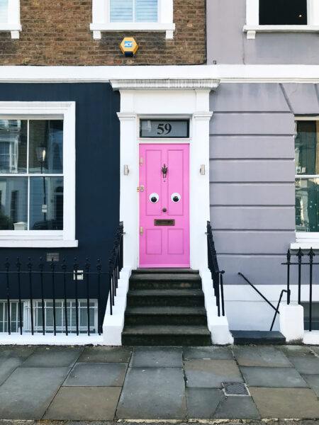
28 August 2009

brooklyn-flea

Happy weekend, everyone.

Before I sign off, I just wanted to post this short item on the Brooklyn Flea’s scavenger hunt. I love this idea. They post a couple of photos of items on the blog, and if you find one of them, you get to keep it for free! What a clever, playful way to increase traffic and get people to check out vendors they might normally bypass, without making them feel like it’s being pushed on them.

Enjoy your weekend. I’ll be out and about in Miami for a few more days, swishing my feet in the sand and spending some time with my family. I hope wherever you are, you’re doing something fun!

Treehouse joy

28 August 2009

27nest6505

When I was a kid I used to spend hours in the branches of an old beech tree. I knew every path to the sky through those gnarled branches, and used to sit up there just listening to the wind in the copper leaves, daydreaming of things to make and places to go. So if anyone could build me a studio of my dreams, it would be like this nest in a Hamptons backyard.

NYT: A Bird’s Eye View of Long Island

Joywashing, Canada-style

28 August 2009

joymeters

Who will win this summer’s battle for the title of Joywashiest Soft Drink?

On the one hand you have Coke, with its a ragtag assortment of musicians giddily opening happiness on a made-for-radio corporate-sponsored singalong. On the other you have Pepsi, joywashing its way into the lead in Canada with an effervescent (and slightly frightening) website determined to convince you that dancing birds and suns with sunglasses are the next best thing to mainlining the beverage straight to your forearm.

Upon arriving at the Pepsi Canada “Joy It Forward” website, you are first advised to “See the Joy” and then to “Pass it on,” with the Pepsified, Obamaesque O-replacements smiling at you like the millenial equivalent of the peace sign. It’s not hard to see the joy, being as everything is dancing at you in that toddler-on-a-sugar-high sort of way, and the word joy happens to be appear about once in every five words on the home page, slightly more frequently than on this joy-obsessed blog.

There are many appealing little gimmicks on the site. You can check joymeters that tell you, among other things, how many days are left in summer, how many mentions there are of joy on Twitter, and how many people at Pepsi Headquarters are “hugging it out.” At 9:19 last night that figure was 827,033, more than 4 times Pepsi’s entire global workforce, which prompted me to wonder when and where they do all this hugging. (I’ve worked with some Pepsi people in the past and they struck me as very normal people. I don’t remember an inordinate amount of embracing. But maybe they don’t hug consultants? Anyway, I digress.)

The site also offers a number of silly games, such as a staring contest, a bubble blaster, and a strangely addictive game where the goal is to inflate helium balloons without popping them. The liberal use of tried and true aesthetics of joy — bubbles, balloons, childhood games, etc. — brings a reflexive smile to your face. They do wear thin, but in that sense they’re very much like soda itself. Sweet, refreshing, uncomplicated. Not everything needs to be a deep, multisensory experience.

Yes, it’s over-the-top saccharine, but I give them points for execution. This is what Trident’s A Little Piece of Happy should have been, but unfortunately fell short of. The games are simplistic but well-designed (no Orisinal, but still enjoyable), the Joymeter widget interface is playable and fun, and the integration with social media is decently handled for a mainstream brand. The “Joy Now” button, found on the interactive Joymeters page, is a gem, producing a different infectious stream of laughter at each click.

joygles

A tiny but important gripe for me is the glaring TM screaming “I OWN THIS!” over the coined word JOYGLES. Aggressive TMing is anti-joy, a reminder of our me-first, legalistic society, an unwelcome reminder that this moment of pleasure isn’t brought to you by the Pepsi in the can you know and love, but by Pepsico (TM!) with its quarterly earnings and profit margins and corporate BS. Hovering over this otherwise cute nonsense word, it’s like an irritating little mosquito you just want to swat. In the 2000s, this behavior of TMing everything in sight looks a lot like a dog marking its territory — ok for a dog, but impolite verging on unseemly for the rest of us.

That gripe aside, I think it’s wonderfully self-aware joywashing, and actually is appropriately on-brand. Who has license to be this absurdly camp if not a soft drink? I much prefer this approach than a pretense to some higher meaning. Like the HFCS they sweeten the beverage with, it’s fake, sweet, and a little nauseating. But if it’s not your whole diet, what’s the harm?

If the Joywashiest Soft Drink title were a packaging competition, however, I would have to say that Coke is the clear victor, mostly for that Weber grill-inspired can (2nd from right) that is just charmingly, gorgeously summer. For me, that can says Open Happiness 1000x better than some cloyingly chipper extended pseudo-jingle.

6a00d8345250f069e20115706e7587970b-550wi

Finally, one footnote on the Coke Open Happiness campaign.

The Coca-Cola name in China was first read as “Kekoukela”, meaning “Bite the Wax Tadpole” or “Female Horse Stuffed with Wax”, depending on the dialect. Coke then researched 40,000 characters to find a phonetic equivalent “kokoukole”, translating into “Happiness in the Mouth.”

So maybe we own this whole happiness-marketing race to a lost-in-translation moment? I don’t know, and I have to say, I don’t really care. It’s still summer, for 10 more days at least, and I’m savoring the last sips of this free season and the cheery glow of its over-the-top joywashed marketing.

Stamps to make you repatriate…

27 August 2009

stamps

I’d consider leaving the country to get to use these on my mail, if only they weren’t fictitious!

From A Field Guide to the Stamps of the World by Gavin Potenza, available in poster form here.

More anonymous positivity

27 August 2009

hopenotes

Along the lines of the You Are Beautiful and Operation Nice projects I wrote about last month, HopeRevo aims to produce a “hope revolution” through the leaving of positive affirmations in notes around cities. The element of surprise is key here; messages we might tune out in expected places have a way of striking us differently when they come at us out of context.

A similar initiative, which strives to create a more personal, hopeful connection is Hope Is In The Cards, which asks every American to send just one message of hope to someone else.

I love that these initiatives rely on the old tradition of notes and letters. It’s often said that paper and ink seems more special than digital communications. Aside from the extra effort such a missive demands, there’s also the sensory impact: the experience and anticipation of opening an envelope, the texture of the paper, the scent and weight of it all. It’s a beautiful way to spread more joy in the world.

Thanks Matt for the tip!

Joyful online retail: Supermarket Sarah

27 August 2009

supermarketsarah

New technologies and creative attention have liberated online retail from the tyranny of the grid in recent years. Here’s a particularly whimsical example, which somehow brings that perfectly curated Grandma’s attic vibe to your computer screen, and makes you feel like whatever you choose is an undiscovered treasure.

Anyone out there have examples of favorite unconventional online store formats that make them smile?

via @swissmiss

Confetti graffiti

27 August 2009

shacks

Outdoor art by Samuel Francois plays with contexts urban and rural using color and pattern. He considers himself “a joyful manipulator of symbols,” stating “his goal is above all to preach a transitory art of which spontaneity and decasualization of the images are the bases of the work.”

via Oh Joy!

Breathtaking birds

26 August 2009

622682566_ac913ed069_o

3196899522_4f186214bc_o

631626282_ec158dc9ae_o

Today I’m mesmerized by these photographs by the Taiwanese brother and sister photographers John&Fish. More on their photostream.

Joyful home: Angela Adams’s Sunset rug

25 August 2009

0729rugs

This rug by designer Angela Adams is joyful, but not exactly cheap. ($18,000? I can hear my grandfather asking, “Does it fly?”) Alas, we might have to content ourselves instead with some stationery or a nice tote.

via The Moment

ps: I just noticed this is my 100th post! A small but happy milestone to celebrate…

Joyspotting in Brooklyn

25 August 2009

img_3358

If the poor dog must have a cast, at least it’s a joyful one!

Joyful detangling

25 August 2009

dotz-entertainment-identifiers

I’m glad someone’s trying to bring some joy to the cord problem, because that consistently ranks as one of the least delightful places in my home. It reminds me of Christoph Niemann’s wonderful “My Life With Cables” illustrated essay on his Abstract City blog.

03desk

My desk is even worse than this! So I like where Dotz is going with the concept — these cord identifiers remind me of hard candies! — but I think they’re indulging in a little oversimplification for the purpose of a clean photograph. How many of your cords are white with neat small ends like that? Most of mine are some shade of black or gray and have a giant fatso converter covering three outlets, necessitating daisy-chained power strips that make the whole operation look a little sub-code. Dotz’s setup looks joyful and colorful when you simplify the backdrop, but I’d like to see a similarly sweet-looking problem solver for the way cords really look.

via @vpostrel

Emotion creates space

24 August 2009

This short snippet of conversation (2:34 mins — short and worth a watch) with architect Lars Spuybroek reverses the conventional paradigm around how we perceive space. Typically we think of space as static and ourselves as dynamic beings that move through it. But Spuybroek asserts that our sense of space is shaped by emotion, and is therefore much more fluid than we imagine.

When you’re happy, so to speak, or when you’re exhilirated your whole sense of space is totally different than when you’re moody or neutral or whatever. So there’s this whole idea of space being a byproduct of feeling instead of the other way around. That there is space and you just feel in there, no no, it’s feeling itself that actually creates space.

I think this is something we can all intuitvely relate to, and it has wonderful implications for design. If emotion can open up space, then inducing positive emotion can completely alter the way people experience a space. Aesthetics of joy, properly applied, could create a sense of expansion that could transform existing structures into spaces that feel good to inhabit. And as Spuybroek suggests, the aesthetics of joy that transform a space could even be portable, emanating from the people who occupy it.

Interview recorded by the Sputnik Observatory

The scent of joy

24 August 2009

nyt_illus

In last weekend’s T Magazine, Chandler Burr wrote about the smell of the recession. The recession smells empty, he writes; it’s the smell of “the absence of people, of circulated air, of the layers of plastic, fiberboard and carpeting with which we surround ourselves.”

In fragrance, we find a replacement. He writes:

Jean Patou created Joy in 1930, at the start of the Depression — it was allegedly the most expensive perfume in the world — and I swear I smelled it on Fifth Avenue a few weeks ago. In plush times, it came off as an outdated French floral, a 100-carat diamond. Too much. In the summer of 2009, it smelled resolute, determined and weirdly appropriate. You wanted to applaud.

I love the idea that aesthetics of joy can be like aromatic stimulus package. We inject money into the economy to jumpstart growth; we also need to inject emotion into ourselves to find the energy and motivation to create and survive. As I wrote in my last post, joy is valuable not just as an end in itself but also for what it might lead to. Scent is so deeply connected to memory and emotion; who knows where the chance inspiration of a vibrant scent might lead?

Another reason why joy is good for you

24 August 2009

240389468_eae91116d1_b

We often think about joy as an end, something we want to achieve. Happiness is a goal, feeling good is desirable for its own sake, not for what it leads to. But one of the hypotheses behind Aesthetics of Joy is that positive emotion can lead to other things, such as heightened creativity, more fruitful collaboration, and social change.

At the end of an essay on enjoyment, neuroscientist Huda Akil suggests another possible benefit of bringing more joy into our lives: intelligence. The science behind it is still in its infancy, but she speculates that we will eventually discover a connection between pleasurable activity and child neurodevelopment. While playing with her granddaughter Sophie in the park, Akil observes:

On that day in the park, I realized that Sophie knows something essential that we adults tend to forget: Having fun is important! It entails unexpected sensations, novel situations, body contact, and physical challenge (as long as these are not extreme or threatening). I imagine that the motor and sensory stimulation and the ensuing exhilaration are doing something special to her young brain, possibly much more important than reading a book. I know with even greater certainty that playing with her–experiencing the simple joy of being silly and making her happy–is wonderful for my brain.

It all comes back to why we have joy in the first place. If I learned one thing from the Galapagos it is that evolution is not wasteful. These features of our bodies and minds have survived nature’s ruthless selection because they enhance our survival. The capacity for joy enhances our survival by inspiring us to seek out new sources of things that might be beneficial to the continuation of the species: food, territory, social connection, mates, etc. The aesthetic and emotional experience of joy rewards the effort.

Now that psychobiology has started to turn its lens on positive emotion, it will be exciting to see what discoveries they bring forward, and how that may influence how seriously we take the need for play, joy, and recreation in our lives.

Article: The Pursuit of Happiness
Image: Shoothead (one of my all-time favoritest Flickr finds)

Red sunrise

21 August 2009

294375401

“Sunrise” by Georgia O’Keefe. Featured in the exhibit Dove/O’Keefe: Circles of Influence at the Sterling and Francine Clark Art Institute in Williamstown, Mass. The exhibit traces the mutual influence and development of early American abstract painter Arthur Dove and the very famous Georgia O’Keefe.

O’Keefe’s work is usually perceived to have sensual overtones (all those unfurling flowers) but there is also a naively, viscerally joyful quality to her work as well. Dove’s work, too, speaks to me of a certain joyful spirit as well, particularly this painting.

To me, the aesthetics of joy really come alive in abstraction. Removed from clear representation, emotion is carried by color, form, texture, light, and gesture. If the artist can replicate the emotional response s/he felt on first experience, or even intensify or modulate it, using form unmoored from its object, it is an enormous statement on the power of aesthetics as emotional language.

NYT: “Partners in Abstraction, Viewed in Tandem”
Thanks, Dad, for the tip

Joyspotting in SoHo

21 August 2009

img_3327

“Spotted” in the window of Lisa Perry on Spring St. this week. Do you think you’d even notice it was raining if you had this umbrella?

Japanese packaging characters: joy?

21 August 2009

snackcharacters01

Tania sent me this great roundup of Japanese packaging characters from the now hiatused PingMag. Most of the examples on this site are sweet and charming, though we know Japanese character obsession can cross the line from cute to creepy. To Westerners, it can seem an odd intrusion — childlike cartoons on products made for adults, and hard to parse whether this is a joyful phenomenon or something darker. Having lived in Japan for a time and experienced the culture first hand, Tania offers this perspective: “Perhaps it has something to do with re-creating moments of child like wonder, innocence, creativity and freedom in a society that is otherwise highly controlled, regimented and driven by social hierarchy-based codes of behaviour.”

Personally, I happen to like the characters for just that reason. Never mind cultural hierarchies and codes of behavior; what about the rigid conventions of packaging design? Letting the inner child out to play is much more emotionally inspiring than subjecting us to even more overstyled, staid cookie photography. I’m also enchanted by the idea that a pink rabbit could appear on packaging for “Men’s” cookies! Maybe it makes it look like all the food in the world is candy, but hey, is that really so bad?

snackcharacters14

Thanks Tania for the tip

Happy Friday!

21 August 2009

dylan

Happy Friday everyone, and hello from Miami, where I’m working for the next two weeks. Today I’m all about the many joyful odds and ends that nearly got lost in the craziness of this week.

This post on the evolution of the typeface used by Michael Beirut in the design of the MAD logo (a logo I love) references this joyful poster done by Milton Glaser for Bob Dylan. The psychedelic swirls and colors just vibrate right off the page.