Month: September 2009
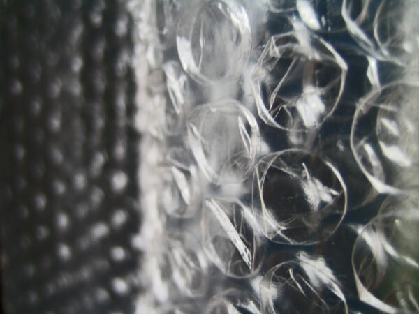
Why is bubble wrap so good?
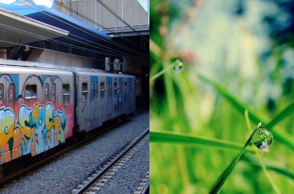
Aromatic graffiti
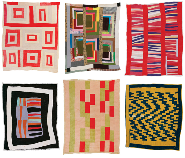
Joyful craft: Quilts of Gee’s Bend
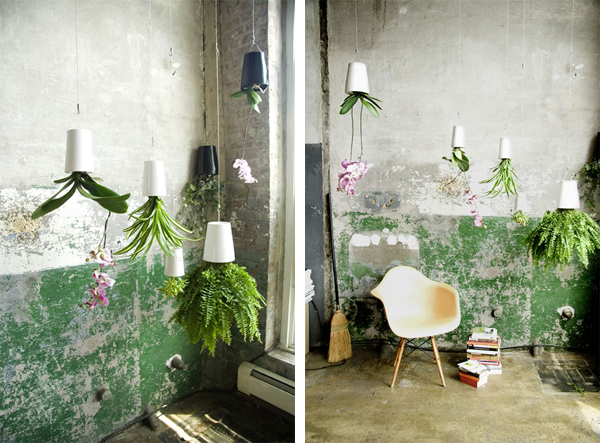
Magic plants
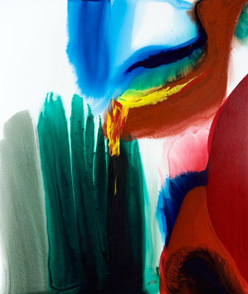
I must say I like bright colours
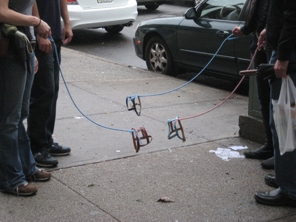
Invisible dogs
Aesthetics of joy or eyesore? happy roses
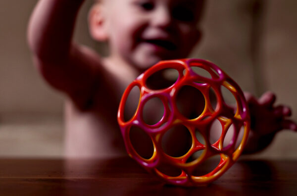
Aesthetics of play: simplicity
Paul Smith + Evian, redux
Find more joy every day
Our free workbook has 5 simple strategies that will make life better right now.
You'll also receive periodic updates on new things from The Aesthetics of Joy. We respect your privacy. Unsubscribe at any time.