Month: September 2009
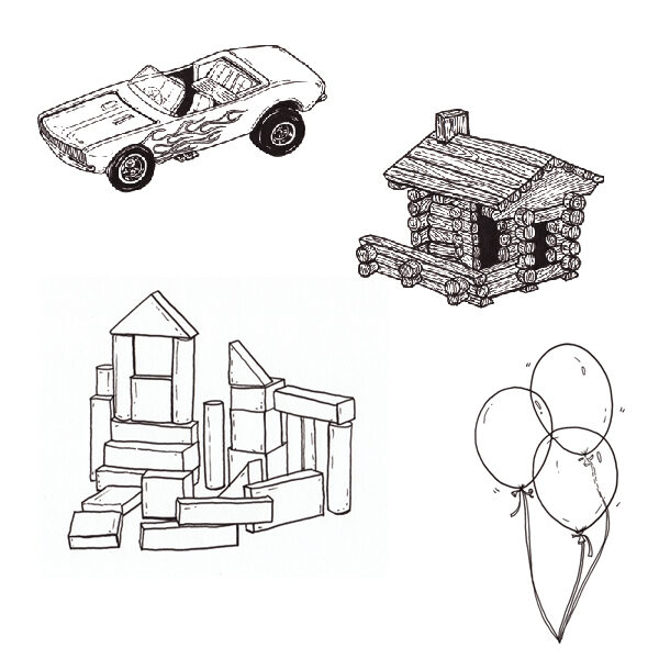
Designers on classic toys
Share and share alike…
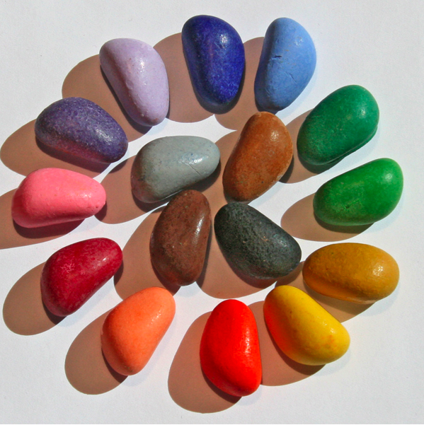
Crayon stones
Plaaaaaaaay
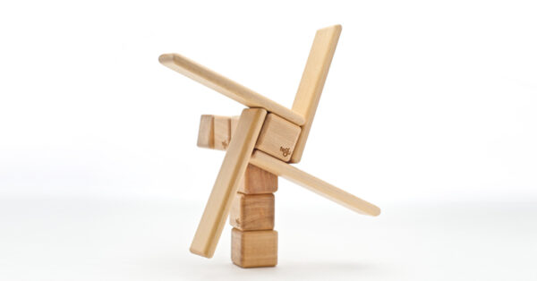
Magic blocks
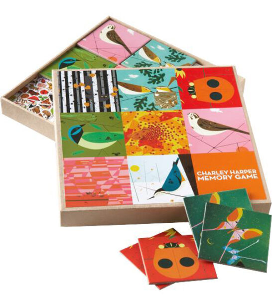
Wednesday joyful art: Kimberly Hennessey
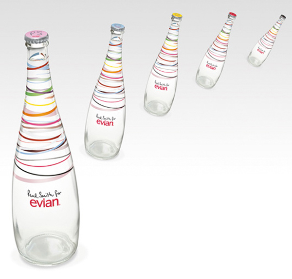
Evian + Paul Smith
Eerie aesthetics of a red sky
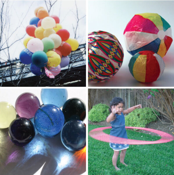
Aesthetics of play: roundness
Find more joy every day
Our free workbook has 5 simple strategies that will make life better right now.
You'll also receive periodic updates on new things from The Aesthetics of Joy. We respect your privacy. Unsubscribe at any time.