Month: October 2009
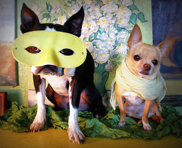
Joy is…dogs in costume.
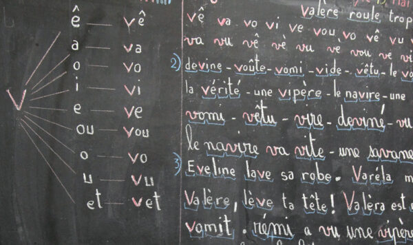
Languages of happiness
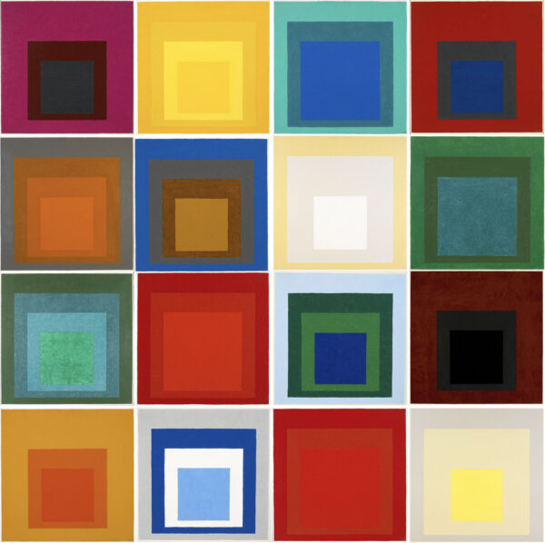
Vibrant, uncompromising color
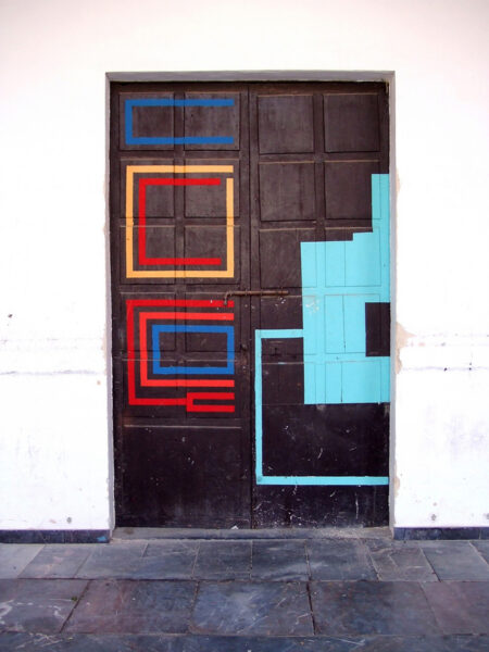
Portals to somewhere special
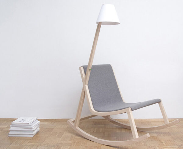
Practical magic
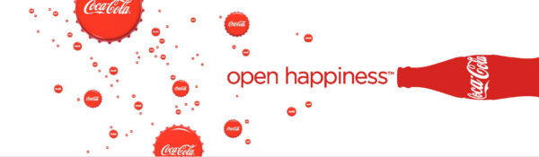
Coke’s joywashing expedition
People in order
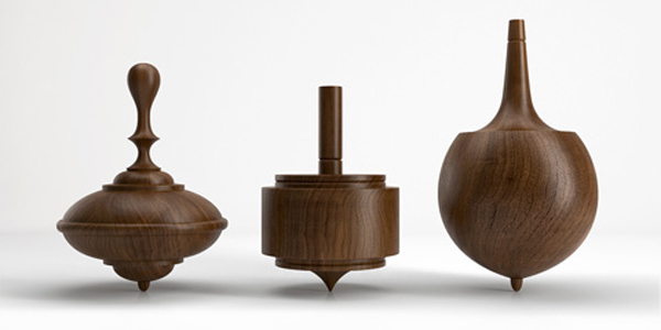
Decorative play
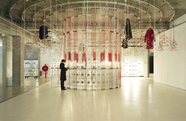
Making merry
Find more joy every day
Our free workbook has 5 simple strategies that will make life better right now.
You'll also receive periodic updates on new things from The Aesthetics of Joy. We respect your privacy. Unsubscribe at any time.