Month: October 2009
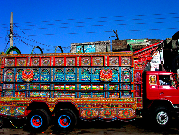
Joyful trucking
Joy is relentless exuberance.
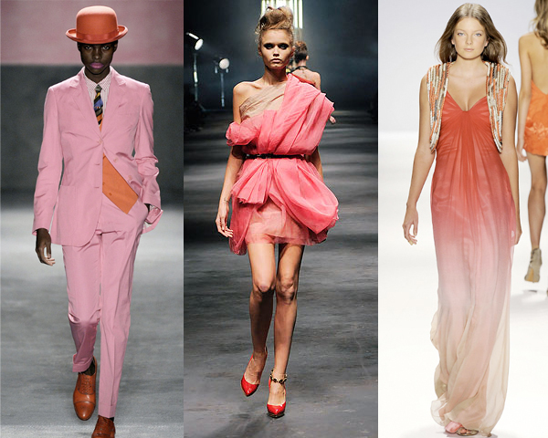
Cotton candy
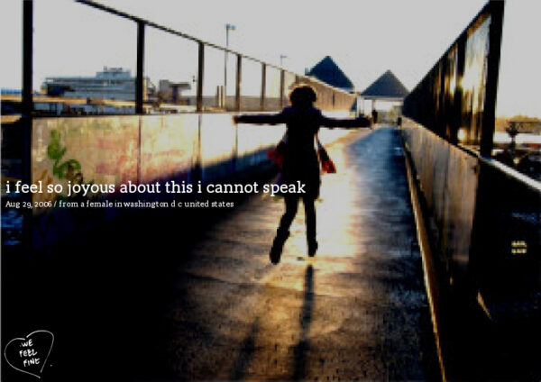
How are we feeling today?
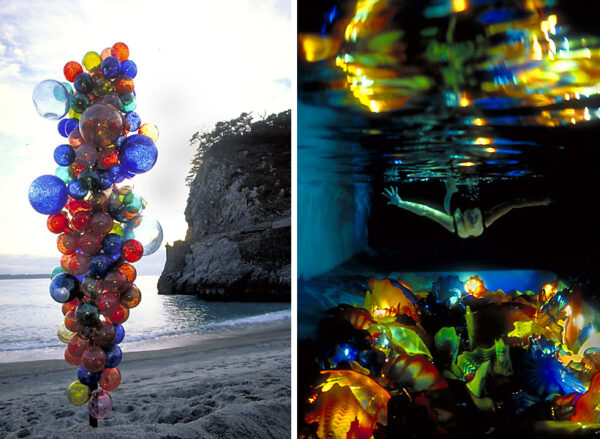
Angelic transparency
Comical violence
Using aesthetics of joy to create behavioral change
Cutevertising: high and low
Light and airy
Find more joy every day
Our free workbook has 5 simple strategies that will make life better right now.
You'll also receive periodic updates on new things from The Aesthetics of Joy. We respect your privacy. Unsubscribe at any time.