Archive for April, 2010

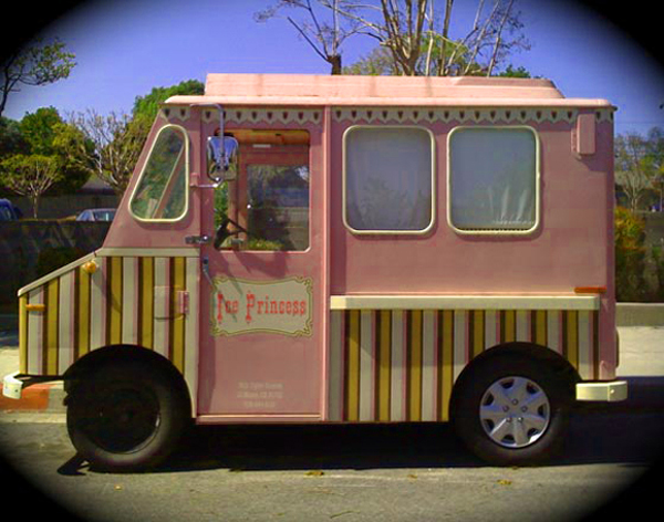
Ice cream trucks around the world
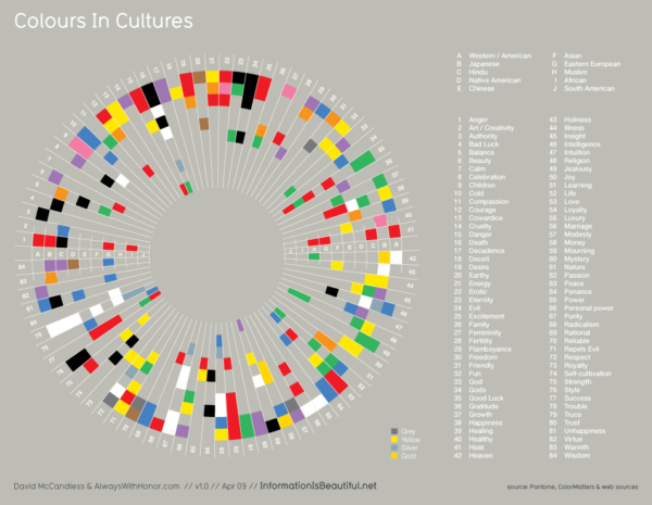
29 April 2010

Ice cream trucks from around the world! What is it about trucks that lend themselves so readily to decorating?

via Let’s Color

Colors in cultures

27 April 2010

What a great visualization (click image to see larger) of color associations with emotions and other abstract ideas across different cultures from the people at Information is Beautiful. A nice complement to Emotionally Vague, a project I wrote about last year that looked at color associations across a narrower set of emotions.

It’s especially interesting to see what color associations are near universal: Passion, Purity, Truce, Cold, and Evil all have consistent meaning. Of course, my eye first went to joy, which appears to have consensus on yellow, until you realize only two cultures are represented. I’d bet that association would reasonably widespread, though.

One thing I’m wishing for here is a little more rigor on the sourcing. “Web sources” sounds dodgy; I’d love it if someone out there would do a proper survey, at least of the primary emotions, across a large number of cultures. My hypothesis would be that the more visceral and affective a concept is, the less culturally determined and more universal the color response would be. So physiological concepts like hot and cold, and emotional terms like passion, anger, sadness, and joy would be more consistent across cultures. More rational concepts like luck, luxury, and marriage, would be cultural determined and therefore prone to variation. Just a hypothesis, at this point.

via R. Walker (thanks!)

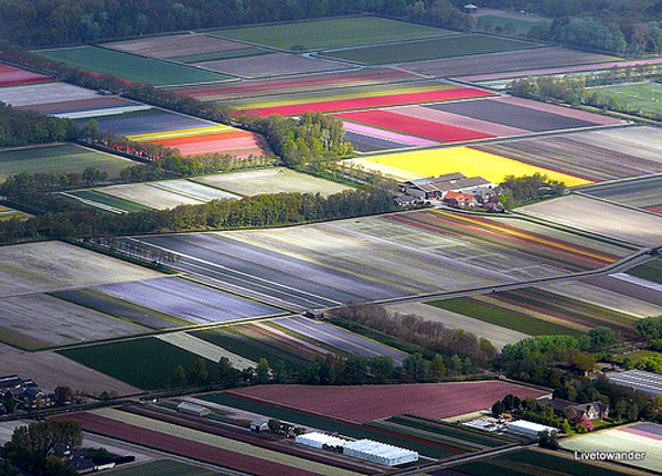
Technicolor landscapes
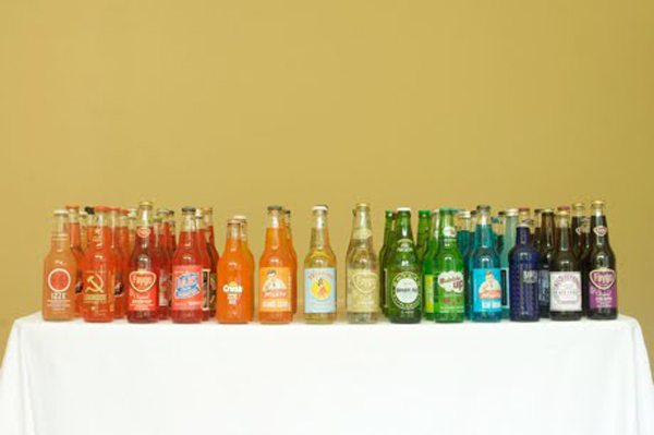
25 April 2010

I’ve taken many plane rides before, but never seen a landscape quite like this. I recently stumbled upon this article showing Holland’s tulip fields from above. Can you believe there’s a landscape that actually looks like this? It’s like agricultural earth art. I had to dig up some more images for inspiration. Let’s hope all these April showers will bring us some, well, you know…

Images: livetowander, Daily Mail, powerfocusfotografie, Daily Mail, Samuel_Leo, _Darek, heavenuphere.

Soda rainbow

21 April 2010

Spotted this on Oh Happy Day! I don’t drink soda but what a joyful idea for a party or event. And of course I’m a sucker for anything color-coded so this gave me a real thrill!

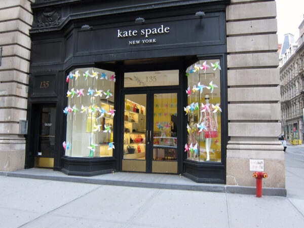
Pinwheels + whirligigs: the joy of things that spin in the wind

16 April 2010

Several things have conspired to get me thinking about the joy of spinning these last few weeks. First there were Kate Spade’s joyful pinwheels, free for the taking and adorning the outsides of their New York shop windows. If any brand out there has embraced the aesthetics of joy and run with it, it has to be Kate Spade. Recent campaigns and store visuals have included cheery colors, hula hoops, polka dots, and artist Rebecca Ward’s colorful striped tape installations — whether by intent or intuition, they have a feel for visual elements of whimsy and delight.

The pinwheel idea seemed particularly clever to me because of its interactive component. Because they were offered up free to passers by, they tended to pop up in all kinds of places. I have one on my desk from the Soho store, which is a few blocks from my office. I have another at home (below), brought to my birthday party by a coworker (photo adorned by late night graffitoists).

In fact, Kate Spade had a contest encouraging people to send in pinwheel sightings, which were then tweeted, resulting in sweetly surprising images like this:

And this:

And then, in the subway recently, among a bag ladies prized possessions, I spied:

There’s a nice visual for me in the idea that the pinwheels are like seeds blown off a dandelion, scattered to the wind. And in fact, they do resemble the seeds with their long stems and wind-philic tops. The wind is of course the critical element in the pinwheel, a form of negative space (or force) that completes the design. A still pinwheel is an elegant thing, maybe even delightful, but it’s the almost-magical spinning movement that brings out the joy.

As I was pondering this, I received an email from a reader about a piece I’d missed in the NYT arts section, entitled, “Junkyard Poet of Whirligigs and Windmills.” A delicious headline if ever one existed, and the piece did not disappoint. The “junkyard poet” in question is Vollis Simpson, an accidental artist who at 91 is still making extraordinary sculptures from fan blades, propellers, and other scrap metal.

Originally a farm equipment repairman, Simpson began making things from scrap as a hobby, but has lived to see his work become highly regarded in the art world. This quote, in particular, struck me because it notes the universality of the emotion triggered by the spinning movement:

…he went to work, eventually coming up with a 55-foot high, 45-foot wide, three-ton whirligig of whirligigs that now towers outside the museum. Built atop a sign pole salvaged from a gas station, topped by a bicycle rider, cats and angels, and incorporating oil filters, milkshake canisters and waffle-iron parts, it prompts incredulous grins from passing tourists and draws locals to watch its wild spinning during thunderstorms…

…In Ms. [Rebecca Alban] Hoffberger, who has become a major figure in the national movement to champion the art of the self-trained, he found a “rabid fan” (her words) who once brought two busloads of his relatives up from North Carolina to admire his masterpiece. She calls Mr. Simpson one of the “true visionaries,” whose wit and genius for color and balance never fails to move people.

“You put one of his freshly painted pieces, moving as he designed it, anywhere in the world, and people will stop what they’re doing and stare and smile and say, ‘Oh, my God,’ ” Ms. Hoffberger said.

I have to give the NYT a little bit of a tough time here for not including a video slide show with this. Fortunately, we have YouTube to let us get a sense of these things the way they were meant to be experienced (minus the wind in your hair feel and the grassy aroma).

Lots of joyful things spin — Ferris wheels, Merry-go-rounds, tops, dogs chasing their tails. When it’s experienced physically, there’s something about the movement, the way it disrupts our balance and creates a transient loss of control, that triggers an unconscious sense of freedom. When it’s experienced visually, it becomes a display of unseen forces (centripetal, mostly), that is enchanting — I’m thinking here of tops and gyroscopes, spinning children and the undulating skirts of dervishes. I wonder, too, if there isn’t something happening with our mirror neurons that makes this a vicarious pleasure, that as we watch there is a part of our brains that feels it is spinning too, which leads to that visceral soaring feeling and Duchenne smile.

The wind adds another layer, another unseen force to the mix that makes pinwheels and whirligigs feel delightful. As humans we are used to power being emitted by things we can see — a hand or a motor — but the mercurial fluctuations of an invisible wind make things seem to be moving by themselves. Depending on the  other elements of the design (color, form, texture) and its context, this can be spooky (Hitchcock-esque) or, as in these examples, it can feel magical and joyful.

Images: policeman image and girls with pinwheels, via @katespadeny. Vollis Simpson images, Jeremy Lange for NYT.

NYT: Junkyard Poet of Whirligigs and Windmills

The joy (and pain) of abundance

4 April 2010

Rob Walker (of Consumed) had an interesting post on his blog recently evolving the discussion around my Psychology Today post about Unhappy Hipsters and the emotional tenor of modern design. He picks up on my assertion that delight is at root an emotion connected with abundance. In my post, I wrote:

I think that modernism’s restrained quality is fundamentally in tension with the idea of delight. Delight is an emotion of abundance — a celebration of sensation and richness. Delight and joy are primally connected to wellness, and wellness in nature is lush, plump, vibrant, and bountiful.

Walker observes that there’s often something enchanting about abundance in the context of interior design, such as in many of the homes featured in “Sneak Peeks” on the blog Design*Sponge. (The photo above is from a similar type of series: The Selby‘s photos of the homes of creative people. This one is from the home of Sydney gallerist Sarah Cottier, photographer Ashley Barber, and their daughter Ruby.) We value a little abundance in the form of creative clutter because it makes a space invitingly human; collections of real things arranged at non-90 degree angles tell us we’re in a home, rather than a sanitized photo studio or furniture showroom. At the same time, Walker voices a healthy skepticism about the joys of abundance:

I am somewhat cautious about that connection between delight and abundance. Buying into that idea full-on would be emotionally catastrophic — I mean, maybe those “hipsters” are unhappy, but watch an episode of Hoarders and decide for yourself how delightful that abundance seems.

This contrast — between joyful collecting and anxious hoarding — raises some big questions that push the discussion on abundance into an important area. It’s clear there’s a line where things go from joyful plenty to horrifying excess. But where is that line? And why do many of us seem to have so much trouble staying on the healthy side of it?

A clue to our precarious relationship with abundance lies within our own brains, and the neural wiring that underpins our emotional responses. Many emotional reactions are triggered unconsciously by aesthetic (or sensory) elements. Aesthetic elements can take on different meanings through cultural encoding and personal experience, but underneath these layers there is often a kernel of biological inclination, shaped by evolution. One example, which I alluded to in my PT post, is people’s general preference for curves. A primal, unconscious part of our brain (the amygdala) has an intrinsic, background-level fear response to sharp corners, a reaction that makes sense. This emotional response raises our alertness around potentially harmful objects, and by consequence, our chances of survival. The response is purported to have developed over the more than 80,000 generations of the Pleistocene era when humans were evolving into their present form, and were surrounded by an environment where the angular things they might have encountered included cliff edges, tree branches, and predators’ claws — all things around which it’s unwise to be too cavalier.

I believe there’s a similar evolutionary principle going on with abundance, a hardwired predilection etched deep into our brains. My view is that a preference for abundance is a natural residue of generations of evolution in an environment where “too much of a good thing” conferred greater chances of survival. This is why we pig out beyond satiation at buffets and why candy stores make us feel like kids — because these things are aesthetic signifiers of a secure resource stream, something we are predisposed to celebrate and revel in.

At the same time, what was adaptive in the Pleistocene can be maladaptive in the post-industrial age, especially when taken to extremes. For most of us living in the first world, the unpredictable cycles of plenty and privation have been leveled out to such an extent that our greatest want is a lack of ripe mangoes in January. Abundance runs amok; it clogs our arteries and our atmosphere and it accumulates not just in the homes of hoarders, but throughout our environment. It hogs resources, giving some people unimaginable riches while consigning many more to persistent scarcity. This state of affairs is clearly not joyful; it’s rife with guilt, anxiety, and shame. When the population of humans was small relative to the available resources, and resources came and went in uncertain cycles, an insatiable craving for abundance made sense; now, this proclivity can be a truly destructive influence.

But our genes don’t know this. So the hardwired emotional responses that once worked so well to enhance our well-being and survival are now sometimes odds with the same ends. We stuff ourselves, shop-till-we-drop, and hoard because on some level it feels good, even if consciously we know it’s not good for us. Fortunately, we are not slaves to our genetic predispositions. While their influence over our behavior can be profound, it is modulated and controlled by a frontal cortex capable of understanding the dilemmas we face and making necessary tradeoffs. One way we do this is by exercising control over our actions, turning down a second helping or politely declining a tempting sales pitch. Another way is through the design of our environment, and this is where I think an aesthetics of abundance could be quite powerful. Can we design a feeling of abundance without the actual abundance, i.e. without having to use a lot of material, or hoard a whole ton of stuff?

What follows are a few early observations on the idea of aesthetics of abundance, along with some examples. Celebrations such as festivals are a big inspiration in this area, because they often feature abundant, yet temporary, displays, meaning they often need to feel big but be small enough to pack away later. Balloons are often used to create a sense of abundance, even though the actual material they consume is comparatively small. Confetti (though problematic in the cleanup), is another example of a product that creates a sense of abundance with little material. Surface treatments, such as patterns, can also create a feeling of abundance, particularly stripes and polka dots. I love how these stripes on the side of the Barcelona Flower Market seem to swell and move, suggesting the bounty inside:

Designer Paul Smith certainly understands this principle as well:

Another example — these polka dots from the Trash: Any Color You Like project take a feature of city life that normally fades into the background and makes it feel more abundant (an effective way to get people to reflect on the consequences of abundance!).

Variegated color and texture treatments also work to create abundance. Because of the rainbow hues, these chopsticks feel like “more” than they would if they were all one color.

A feeling of abundance can also be created with form and texture, such as with the ruffles that are in shop windows across the country right now for spring.

Abundance is not just about form, but also about context. A teaspoon of sprinkles feels abundant on an ice cream cone; in a giant field, the same teaspoon is insignificant. The cornucopia symbol is apt — abundance needs something to spill out from, a container to press against. It’s easier to make a small home feel abundant than a big one, which is a counterintuitive principle of some comfort to us small-apartment city dwellers. By designing small frames, we can make the things inside feel more bountiful. There’s also a role for design in illustrating the line between abundance and pure excess. That’s part of why the Design*Sponge “Sneak Peeks” are so satisfying. They show managed clutter, abundance in balance. Like a healthy psyche, they are full of emotional experiences, memories, and desires, arranged with some acknowledgment of a rational super-structure. Effusive, but not chaotic.

Like anything taken to extreme, abundance ceases to be joyful once it crosses a certain line. Science doesn’t offer much insight as to where the line is; we just know it when we see it. Love in excess becomes infatuation. Self-confidence becomes narcissism. Neatness becomes compulsion. Too much of any good thing is no good at all. The overstuffed houses of hoarders and the ultra-minimal, bare bones interiors featured in design magazines are two ends of a spectrum of beliefs about homes and happiness. I could just as easily take on the hoarders as the zen-modernists, except for one thing — no one is advocating the hoarder lifestyle. Even the hoarders view their condition with shame. Minimalism, on the other hand, is often preached as a lifestyle nirvana — a blissful, transcendent state achieved by letting go of material things. For some people, this kind of muted emotional landscape is a relief, a break from a high-stress job, information overload, or a plethora of buzzing devices. But for most of us, I’d contend that this kind of environment runs against our emotional nature. We’re made to feel joy in an abundance of color, texture, and sensory stimulation; it’s what makes the neurons fire and the brain grow and develop. Rather than fight it, I’d love to see us use design to create a more sustainable kind of abundance, one that gives us delight without compromising the joy of generations to come.

Images: Barcelona Flower Market via yatzer; Paul Smith Mini via Flickr; trashbags by Adrian Kondratowicz; chopsticks via DWR; ruffles: S/S 2010 shows by Oscar de la Renta, Valentino, and Colette Dinnigan, via Style.com.

Murketing: Clutter, Objects, Joy
Psychology Today / Design and the Mind: Unhappy Hipsters: Does Modern Architecture Make Us Gloomy?

The joy of jumping on the bed

4 April 2010

Yes, that is Desmond Tutu in the midst of all those children jumping on a bed! For a project called Play Jump Eat, Kelly Wainwright of Messy Monkey Arts managed to coax not just the Reverend Archbishop, but also fishermen, surfers, schoolkids, and others to let go of their inhibitions and be photographed in odd situations, bed-jumping.

Jumping on the bed is an example of a joyful pleasure at its most democratic: an activity that is accessible to nearly everyone. It’s a childish pleasure, one we associate with being small in the expanse of our parents’ beds, but it can be rediscovered at any time. (Confession: I sometimes can’t resist a jump or two in a hotel room.) There’s just something so totally liberating about jumping; it’s a slightly transgressive, freeing feeling that brings laughter and optimism up to the surface. Even just looking at these photos evokes a vicarious burst of delight!

I hope the full series will eventually be posted online. Read more about the project here.

{Via @vpostrel}

Update: Kelly pointed out to me that prints are available here and that a portion of the proceeds benefit the Tertia Kindo Arts Project, a children’s dance school. The comments also made me realize that I failed to credit Inge Prins, the photographer on the project. Lovely work!