Month: August 2012
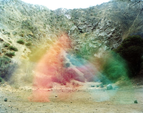
Vibrant apparitions
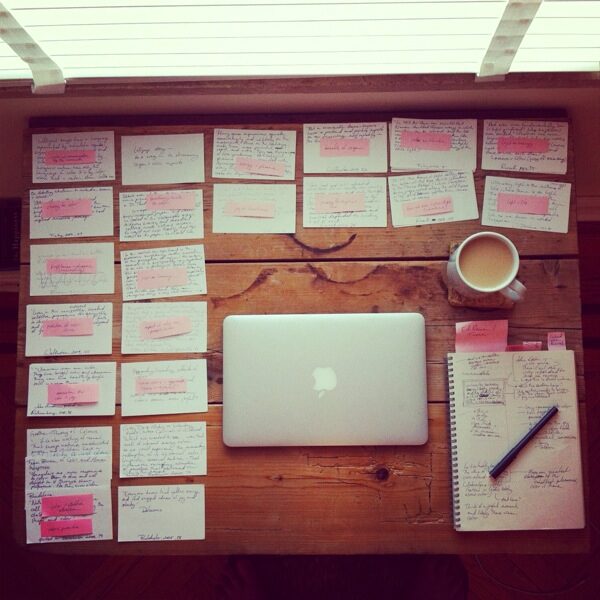
Writing retreat
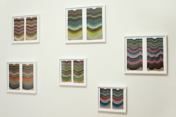
Joyful art: Kristen Rego
Joymaker: Emmanuelle Moureaux, architect
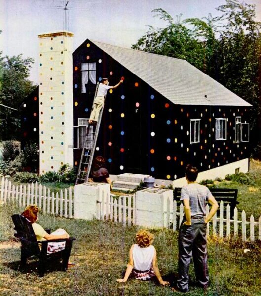
Polka-dotted house
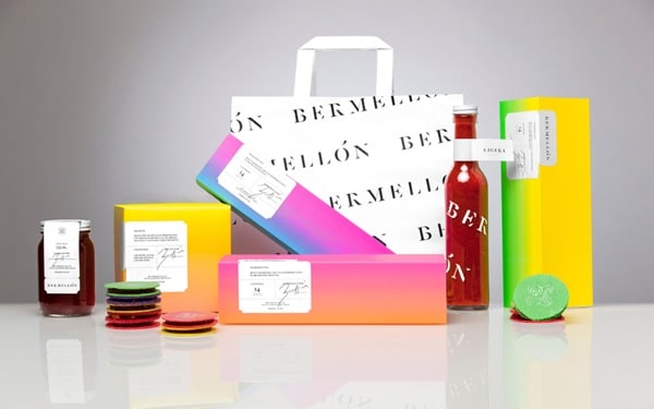
Joyful packaging: Bermellón
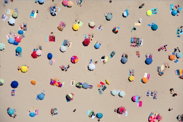
Gray Malin, À la plage
Find more joy every day
Our free workbook has 5 simple strategies that will make life better right now.
You'll also receive periodic updates on new things from The Aesthetics of Joy. We respect your privacy. Unsubscribe at any time.