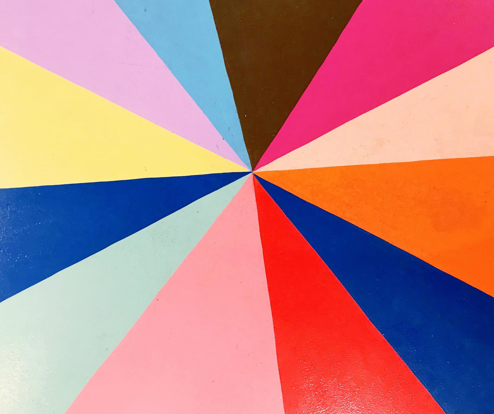
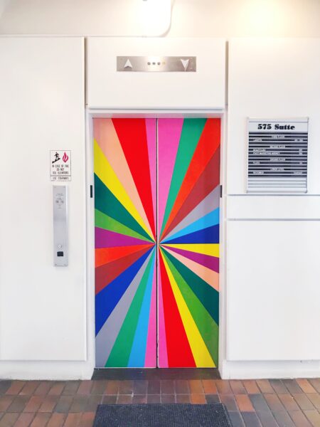
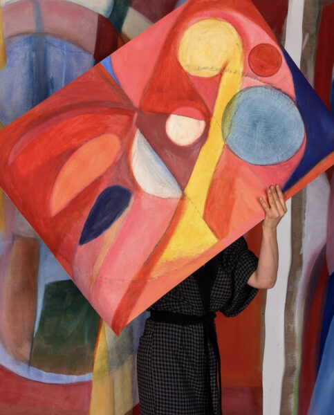
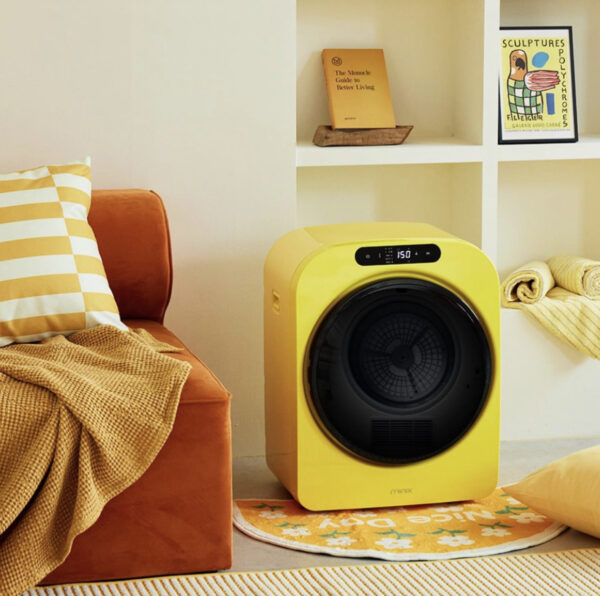
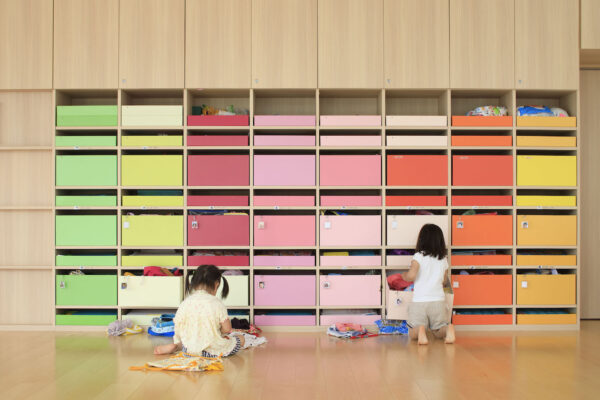
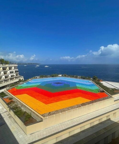
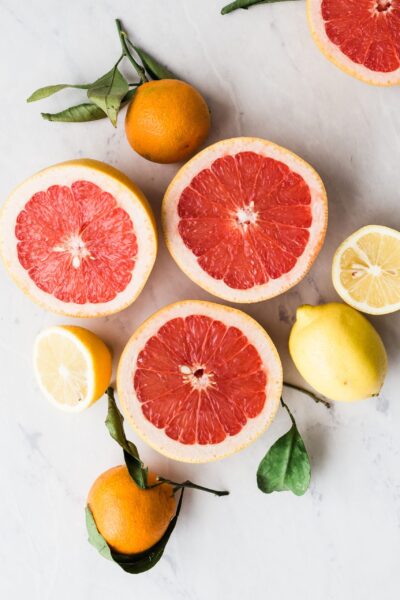
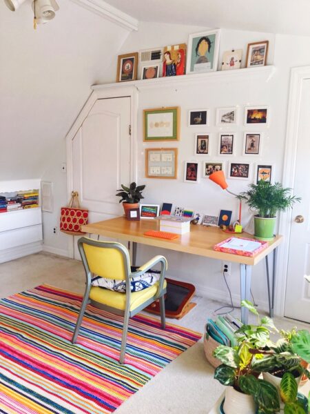
Art, sexual selection, and renewal

5 June 2010

Feeling arty today, inspired by a semi-monthly art outing tradition I have with a couple of friends this afternoon. Most of the time this blog focuses on explaining joy, but today I just feel like sharing some. These paintings are by Berlin-based Barcelona artist Yago Hortal.

Ok, I changed my mind. I was going to just post some art, but as the title of this post suggests, I can’t help but noodle this a little more. Why do colorful swirls of paint make us feel so stimulated and uplifted? Why does art move us so? This question is especially significant in abstraction, where there’s no subject matter to react to, no inherent narrative, just pure sensation dancing about on our rods and cones. I’ve offered up a bunch of ideas on this blog about color, curves, and so on — why specific aesthetic elements may have evolved to make us feel joy. Recently I’ve come across a theory that puts our desire to make and view art in a more macro evolutionary context. In his book The Art Instinct, philosopher Denis Dutton contends that art arose as a (rather sophisticated) way of attracting a mate. He connects art with evolution through sexual selection, the aspect of evolutionary theory that deeply troubled Darwin before he was able to explain it, because it fostered the success of traits at cross-purposes with survival. (The peacock’s tail is the classic example here: Large and brightly colored tails may make a peacock more vulnerable to predators, but they’re selected for anyway because peahens prefer them. Research suggests this is because they indicate a peacock carries a lower parasite load than his dull-plumed buddies.)

Making art may once have said, “I’d make a good mate because I’m clever and creative,” selecting the desire to make and appreciate art, music, literature, and performance into the human genetic makeup. Of course, that doesn’t mean that the link between art and sex is persistent, that our current appreciation of art is akin to artist-lust, that a gift of a painting is foreplay. Evolutionary theory doesn’t offer explanations for our reasoned behavior in the present; it merely gives us origin stories, roots that help explain the common ancestry of our universal predilections. Rather, for me, it’s interesting to know that when we view art, somewhere deep in our brain may be the trace of a neural connection that links such apparently purposeless beauty with the desire that fuels our renewal. That our joy in art is not detached contemplation, but visceral, emotional, and vital.

Yago Hortal via but does it float

Joyfully uninviting

3 June 2010

Can something say “Keep Out!” and still be joyful?

This was the question that popped into my head as I considered the Razzle Dazzle Sculptural Security object, the angular plywood contraption jammed in the window of the house pictured above, by Detroit-based Design 99. The purpose of the Razzle Dazzle (more examples of which you can see below) is to protect empty houses from squatting and vandalization, a common problem in Detroit neighborhoods. An alternative to boarding up doors and windows, the method signifies that someone is interested in looking after a place.

A strong thread of joyful activism runs through all of Design 99′s projects: the brightly-painted Power House, a community space cum sculpture made from a previously empty house, or the Neighborhood Machine, a similarly hued Bobcat with trailers that can be appended for various urban renewal tasks, such as gardening and collecting found material. For these projects, aesthetics of joy such as bright color, stripes, and other patterns catch the eye and raise awareness for urban renewal projects. They also telegraph the spirit of the movement, and offer an exuberant energy that might inspire volunteers and invite onlookers to join in. The aesthetics visually convey the intent of the artists behind Design 99, Gina Reichert and Mitch Cope:

The Power House intends to be a stimulator and not an end in itself as a singular art object. The Power House is a broadcaster of potential ideas and a place to plug those ideas into. The Power House will be used as an interactive site, by us and by our neighbors. The Power House will become a symbol for creativity, new beginnings and social interaction within the neighborhood.

But while the house and the machine seek to invite, the purpose of the Razzle Dazzle is entirely different. It’s a three-dimensional “No Trespassing” sign. So there’s an inherent tension between the spiky, angular form, which articulates (and enforces) the “stay away” message, and the vibrant pattern, which is a visceral enticement. There is also a tension in the way the piece is crafted. The Razzle Dazzle’s form is haphazard, seemingly cobbled together from debris — something you might expect to see at an abandoned site. It looks like it might itself be an act of vandalism. But the deliberate color treatment transforms the meaning of the piece. It says, “Someone put me here on purpose,” and therefore, “Someone cares about this place.”

In this way, the Razzle Dazzle is inviting. Through a splash of color, it offers the promise that a space will be inhabited by people who will care for it and restore it. It’s an invitation to return, suggesting that next time you visit, it may not be an abandoned shack, but a lively business, a vibrant community gathering space, or a home. It’s a joyful “Keep Out,” because it’s also a “Come Back Soon.”

{via Core77}

Power House and Neighborhood Machine

Neighborhood Machine with solar panel trailer attached

Gardening trailer for Neighborhood Machine

Razzle Dazzle Sculptural Security objects

Worrying, joyfully

18 May 2010

In case you missed it, this Idea Lab visualization from Sunday’s NYT Magazine made me smile, and made me think.

It’s interesting to me the way aesthetics can transform the emotional tenor of content. Though the subject matter has a negative slant (partially genuine, partially comic), the circular shape, colors, and stripes emanating like rays of light from the center make the whole thing kind of delightful. But why? I think it’s because our emotions react to aesthetics before they process content. Even when the aesthetics and content are dissonant, the aesthetics guide our reactions, I guess because in most circumstances, aesthetics are an accurate shortcut to understanding content.

What are other good examples?

Ice cream trucks around the world

29 April 2010

Ice cream trucks from around the world! What is it about trucks that lend themselves so readily to decorating?

via Let’s Color

The joy of jumping on the bed

4 April 2010

Yes, that is Desmond Tutu in the midst of all those children jumping on a bed! For a project called Play Jump Eat, Kelly Wainwright of Messy Monkey Arts managed to coax not just the Reverend Archbishop, but also fishermen, surfers, schoolkids, and others to let go of their inhibitions and be photographed in odd situations, bed-jumping.

Jumping on the bed is an example of a joyful pleasure at its most democratic: an activity that is accessible to nearly everyone. It’s a childish pleasure, one we associate with being small in the expanse of our parents’ beds, but it can be rediscovered at any time. (Confession: I sometimes can’t resist a jump or two in a hotel room.) There’s just something so totally liberating about jumping; it’s a slightly transgressive, freeing feeling that brings laughter and optimism up to the surface. Even just looking at these photos evokes a vicarious burst of delight!

I hope the full series will eventually be posted online. Read more about the project here.

{Via @vpostrel}

Update: Kelly pointed out to me that prints are available here and that a portion of the proceeds benefit the Tertia Kindo Arts Project, a children’s dance school. The comments also made me realize that I failed to credit Inge Prins, the photographer on the project. Lovely work!

Joyspotting: 33rd and Lex

15 February 2010

Spotted this installation near the corner of 33rd and Lex a few weeks ago. Despite the bitter cold, people kept stopping to play. Does anyone know whose work this is?

Joyful art: Morgan Blair

9 February 2010

Morgan Blair‘s Diamond Collection. Like a pile of technicolor paper airplanes….

{via mandr}

Gerhard Richter’s abstraction

8 January 2010

gerhard_richter9b5cb679

These abstract paintings by Gerhard Richter make my heart sing. They seem of a piece with these paint-over-photo works I posted back in October. I think I could stare at the one above for hours just finding stories in these swirls.

On view at the Marian Goodman gallery in New York until tomorrow.

{via Artkrush}

It’s an arty weekend for me, catching up on all the things I missed in late 2009. Today, the Bauhaus at MoMA; tomorrow Georgia O’Keefe at Whitney. I’ll have thoughts early next week. Happy weekend!

gerhard_richter6dc931c5

gerhard_richter2ed29e8d1

gerhard_richterbde24fb0

gerhard_richterb747ee47

Joyful spinners

5 January 2010

My studiomate Rikki sent me a link to these joyful spinners months ago and I’m just now getting to post them. The installation is Les Danseuses by Swiss design group Atelier Oï, and it was displayed in the Vitra showroom in Zurich. (It looks particularly gorgeous in these photos.) They remind me of flamenco dancers or whirling dervishes, and they make me wonder what other wonderful things you could create with a bare ceiling fan mount as a starting point.

Something about the display reminded me of these striking images from Prada’s “Waist Down” exhibit from a few years ago.

prada_green_apr_06-1

prada-skirt-spring-summer-2004

prada_td_apr_06

prada_print_apr_06

The displays are delightful acts of transformation. Arranged this way, the pieces cease to be skirts — they are visual metaphors: a cabbage leaf, a tutu, a circular painting, a textile doughnut. Then, while digging up the images, I found that the Prada exhibit, designed by OMA, used an identical spinning device to the one in the video above to show some of the skirts, right down to the mirrors on the floor reflecting upwards.

20090506_skirts

Which came first? The Prada exhibit occurred in the mid-2000s, while the Les Danseuses is dated 2009. Is it a creative homage or just a case of “great minds think alike”? I dunno, but for me the edge goes to OMA for execution. I guess when your raw material is Prada, it’s pretty tough to make it look anything but beautiful.

What else could you put on a spinner? And what else spins? I’m envisioning some kick-ass joyful store displays using record turntables, toy tops, and a merry-go-round…

Joy is a green Christmas tree

15 December 2009

tree_power1

These joyful Christmas cones in Barcelona’s Mercat Santa Catarina square are bike powered! Passersby can hop on for a few minutes to keep the LEDs going. Now if only they could find a way to get the Rockefeller Center skaters to fire up NYC’s big tree…

See more bike-powered holiday installations on Vanessa’s joyful blog for the love of bikes.