Style
16 Multicolor Nail Ideas to Inspire Your Next Manicure
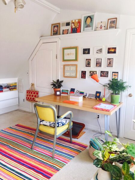
How To Conquer Your Fear of Color
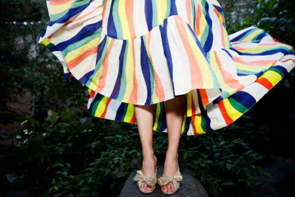
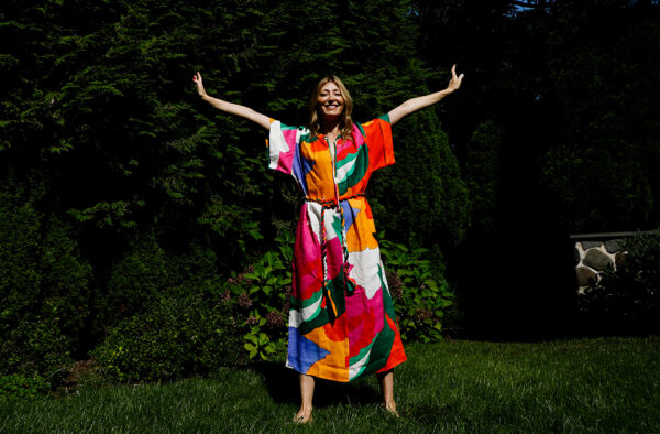
How to dress for the joy you want
Does Wearing Colored Clothes Change Our Feelings?
What’s your design superpower?
Timeless or trendy? How to avoid impulse buying and choose items you’ll love for the long-haul
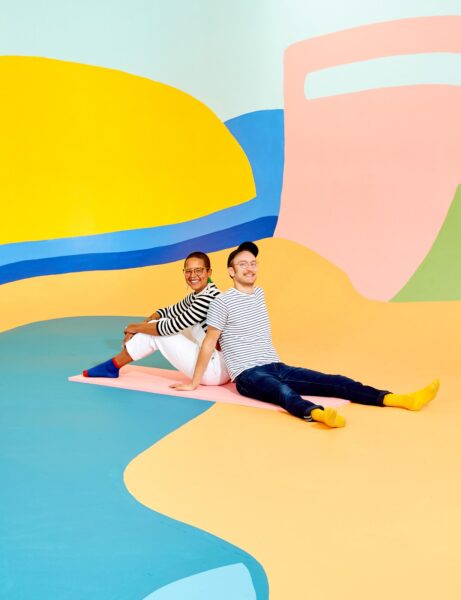
Joymakers: Michelle Norris + Forrest Aguar
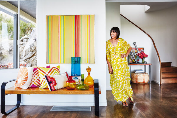
Joymaker: Trina Turk, Designer
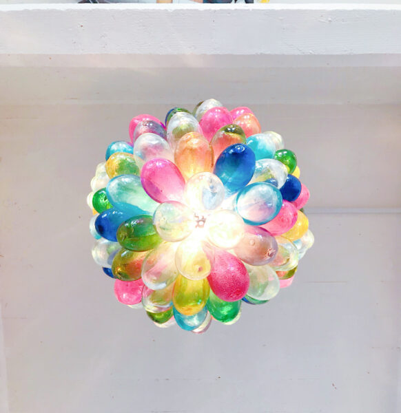
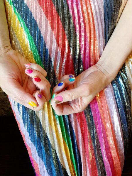
The surprising power of a Joyful Manicure
Find more joy every day
Our free workbook has 5 simple strategies that will make life better right now.
You'll also receive periodic updates on new things from The Aesthetics of Joy. We respect your privacy. Unsubscribe at any time.