artists
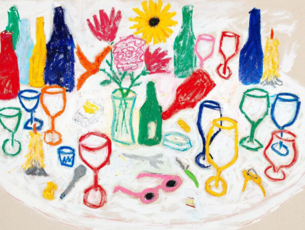
Colorful Still Life Artists to Follow on Instagram
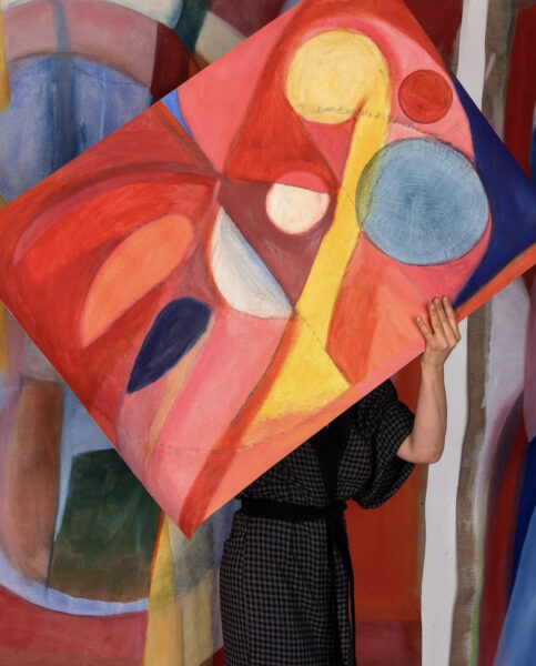
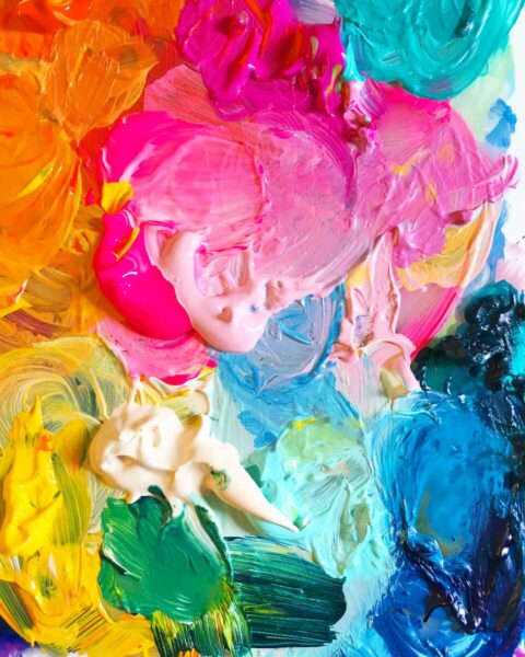
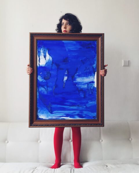
9 Colorful Abstract Artists to Follow on Instagram
The creative principles I live by
Joymakers: Michelle Norris + Forrest Aguar
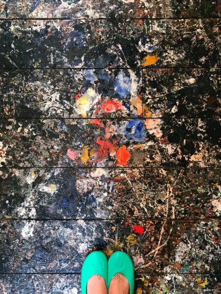
Joy Field Trip: The Pollock-Krasner House in Springs, NY
Joymaker: Jessi Raulet
Joymaker: Sara Emami
Joymaker: Dana Fortune
Joymaker: artist Lauren Salgado
Find more joy every day
Our free workbook has 5 simple strategies that will make life better right now.
You'll also receive periodic updates on new things from The Aesthetics of Joy. We respect your privacy. Unsubscribe at any time.