spaces
Joymaker: Emmanuelle Moureaux, architect
Designing joyful cities
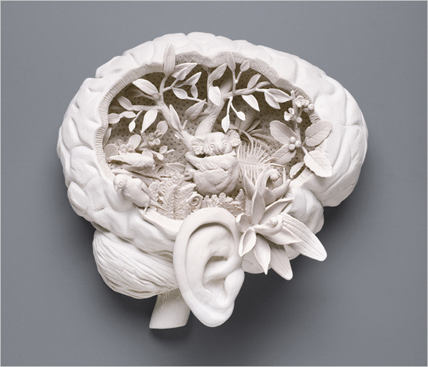
House of dreams
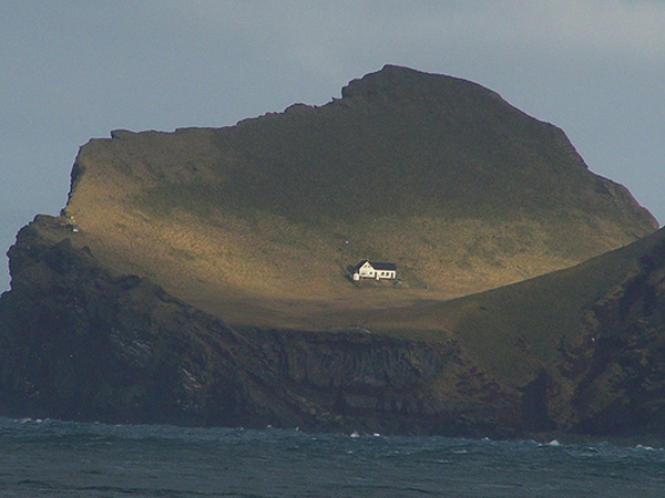
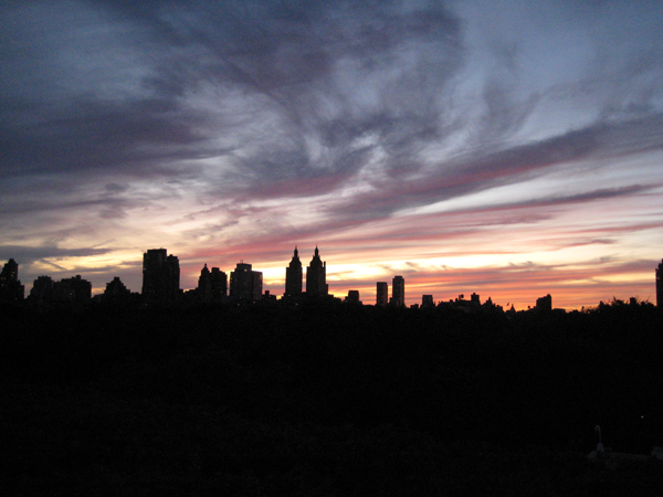
Solastalgia
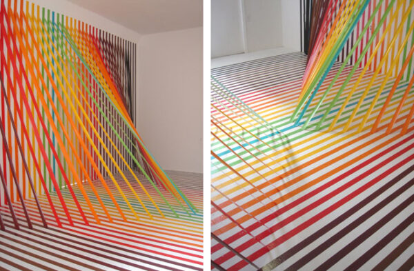
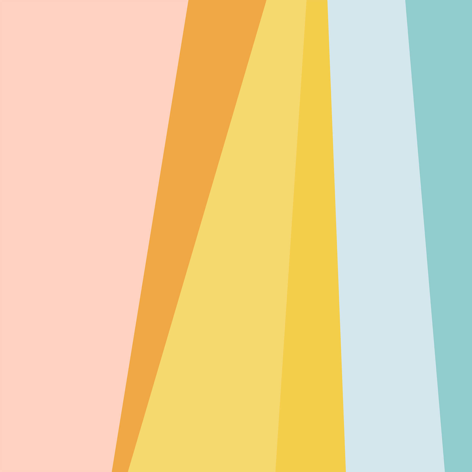
Stripes!
Making merry
Using aesthetics of joy to create behavioral change
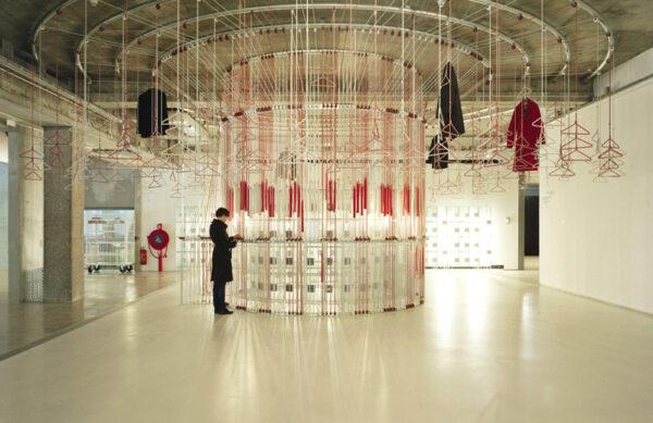
Visible storage
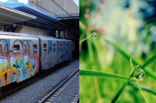
Aromatic graffiti
Find more joy every day
Our free workbook has 5 simple strategies that will make life better right now.
You'll also receive periodic updates on new things from The Aesthetics of Joy. We respect your privacy. Unsubscribe at any time.