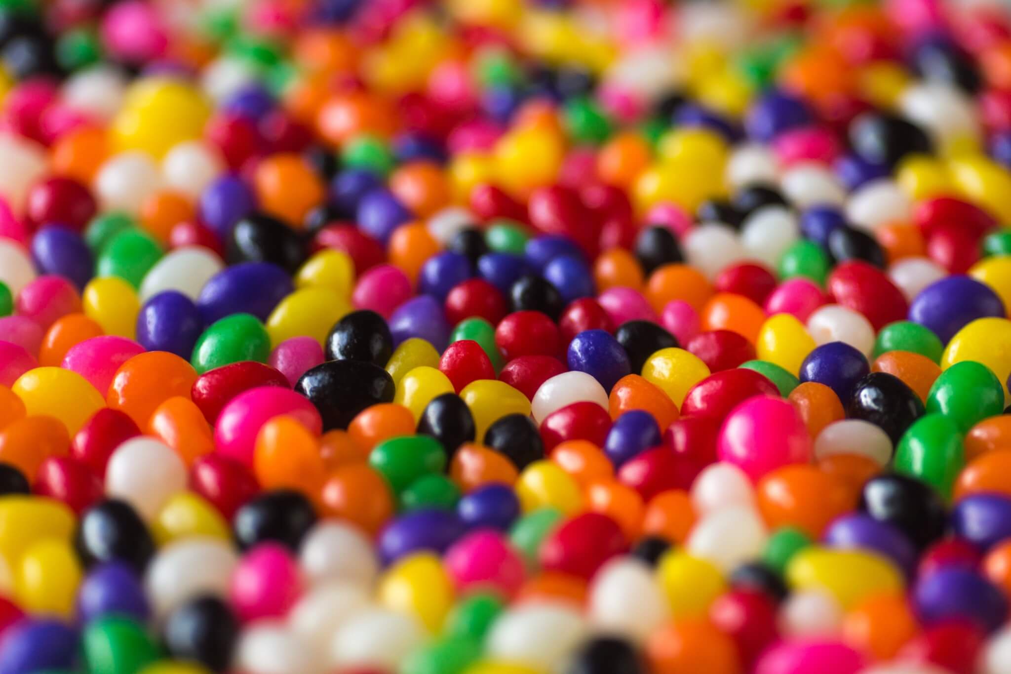
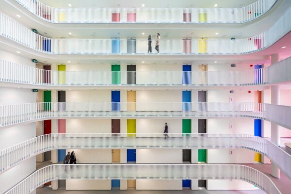
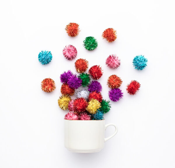
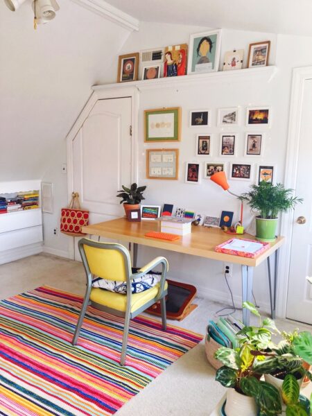
A thousand cranes for Paulo

29 March 2013

IMG 2876

A couple of days ago my friend and IDEO colleague Erika shared some sad news. A friend of hers who had been diagnosed with a brain tumor several years ago is now facing his last weeks. He is younger than me.

In these terrible moments, I think most of us have a comforting instinct: to make something. And designers especially. For the creative act is both a gift to the person leaving this world — a tangible expression of love — and an affirmation of life for the living. We exist to create: we build tools and buildings and cities, we make art and food and music, we make friendships and of course, we make families, extending ourselves through the lives we make possible. Creating something, anything, is how we grab ahold of the time between birth and death, and make it meaningful.

When Erika said she and her friends were making a thousand cranes for Paulo, and she coordinated an origami session at the studio yesterday, it felt bittersweet to be able to join in. A thousand origami cranes are a Japanese good luck tradition. It is a joyful tradition, one of vibrance and abundance — to receive a thousand cranes, carefully folded by hand, how could you not feel loved? I was moved by how joyful even just our small contribution of cranes looks together, and how unifying the experience was of folding them, knowing that others were folding for the same purpose, with the same prayers for someone who is a stranger to many of us, but very dear to someone we care about.

The late Irish philosopher John O’Donohue once described being with a friend in her last moments, a kind woman who was deeply loved by friends and family. He wrote:

It showed me that if you live in this world with kindness, if you do not add to other people’s burdens, but if you try to serve love, when the time comes for you to make the journey, you will receive a serenity, peace, and a welcoming freedom that will enable you to go to the other world with great elegance, grace, and acceptance.

Thank you, E, for letting us be part of your kindness to your friend. I hope they help Paulo, his friends, and family find some small moment of joy in the sadness.

IMG 2865

IMG 2873

IMG 2879

Tickled by Tokyo

18 July 2012

Tokyo7x

In May, I went to Tokyo for work. (If you follow me on Instagram, you may have seen a number of photos with the tag #joyinjapan.) For some, this might mean sitting in a conference center most of the time, getting to eat some sushi between lectures and walk around Shibuya a bit. But lucky me (and I mean that — lucky, lucky me), my job involves being completely out there, talking to people, experiencing the city’s smells, sounds, and colors, drinking a place in until I’m drunk.

Where do I begin with it all? I felt so joyful in Japan I could hardly stand it. Like when someone is tickling you and you’re laughing and you get to a point where feel like you’re going to explode and you beg them to stop — “Please, please, no more!” — and as the feeling subsides and you’re able to breathe again a quiet little voice pipes up inside you, whispering…

“More. Please, just a little more.”

There isn’t one thing to point to, but a thousand small gestures that accumulate to leave you almost woozy with delight. Tokyo is a relentless layering of vibrant color palettes, cute icons, sweet miniatures, subtle textures, and delicate objects arranged just so. (And also some things that are so crazy they make your head spin around in full revolutions.) It’s a testament to a people that has a true material culture, a people that feels kinship with the objects in their lives and understands that beautiful things are valuable not as status symbols but because they suffuse beauty into the spaces around them.

Alain de Botton writes: “What we seek, at the deepest level, is inwardly to resemble, rather than physically to possess, the objects and places that touch us through their beauty.” This is the crux of what I felt in Tokyo. I sensed the beauty that emanated from the perfectly balanced, crafted way of things, and wanted to strive for more of this in myself. A beautifully crafted plate of food or a carefully lettered sign showed care, and it made me want to slow down and appreciate the care my hosts put into these small gestures. My travel companions and I all changed our behavior over the course of the week. We were more polite, we noticed more, we ate more slowly. We let the place change us in a good way.

IMG 7950

Tokyo7x6

IMG 3821

Every day we walked the city until our feet hurt. At night, I would wake up at about 4am from the jet lag, my feet still pulsing, hoping a few more hours of sleep would ease them. We took thousands of photos. There was a surprise around nearly every corner — we were afraid to put our cameras away. My travel companions, fellow IDEOers Anthony and Erika, and I (all above) were lucky to have some amazing hosts. In some of my photos you’ll see Mike, a good friend of mine since my first day at IDEO, who is now in our Tokyo office. He wins the “host of the year” award, making sure we saw his favorite places (such as the tiny coffee shop pictured top right and lower left, below), ordered for us in places with no English menus, and even pointed us towards very specific observations, like that that gorgeous reflection of the copper sink in Higashiyama’s bathrooms (below).

I was also excited to spend some time with Azusa, a friend of mine from Pratt (you may remember her joyful work from this post a few years back). Azusa took us one night to get yuzu ramen (noodles flavored with yuzu, a Japanese citrus fruit) and after, we discovered a tiny little bar with only about ten seats. There, a bartender proceeded to make the most thoughtful screwdriver I’ve ever seen. The screwdriver must be the most thoughtless of cocktails, sloshed together in questionable proportions, often in a Solo cup. But this bartender showed me the screwdriver-as-art-form: squeezing the juice by hand, shaking the drink as if he were in slow motion. I don’t think I will ever see a cocktail performed in that way again, totally simple, yet with honor for its simplicity.

Tokyo7x7

We stayed our last few nights at the Claska, technically the only boutique hotel in Tokyo. The Claska is a wonderful, odd place for many reasons. It is a bit out of the way, but it has a gorgeous sixties modern lobby and the most beautiful gift shop, full of perfect, quirky artifacts. But by far my favorite feature of the Claska is the retro dog grooming salon just off the lobby (pictured above). A long window, positioned at eye level just by the lobby bar, peeks into the space, where you can watch dogs get fluffed to the max by a passel of groomers using humorously space-age dryers. I never saw a dog walk out of there that didn’t look like it couldn’t blow away on a light wind.

Sushi

A highlight was a visit to Midori Sushi in Shibuya, where you order from an iPad and the sushi is delivered to your table by toy trains. Toy! Trains! You might think that with such an emphasis on precision and self-control, the Japanese would not show much evidence of their “inner child.” But in fact, the inner child is alive and well in Japan, breaking through in an unabashed embrace of cuteness and play, even in serious situations. The toy train idea is something that seems to have been thought up by an eight year-old. Here in the states it would be discarded as ridiculous, but fortunately the Japanese don’t censor themselves in this way.

Tokyo7x5

On our very last day in Tokyo, Erika and I were wandering around the area near Gakugei-Daigaku station and spotted these beautiful books. Stripped of their jackets, they were selling for pennies apiece, and we spent the better part of an hour looking for ones with interesting illustrations to bring back with us. Inside one were these very simple, beautiful erotic line drawings. (Japan has a long tradition of exuberant erotic art, mostly woodblock prints known as shunga.) Azusa was embarrassed but obliging in translating the chapter headers for us. (Nothing too exciting, or I promise I would’ve written them down to share.)

IMG 3837

Hidari Pocket in Naka Meguro is the tiniest, cutest café I have ever seen. The garlands, the little drawings on the side of the van, the tiny weathered stools, the drawings of flowers in the foam on the mocha — it was just too much. In moments like this, we often found ourselves overcome, aesthetically, with the experiences we were having. It was almost as if the circuits in our brains couldn’t handle all the beauty, harmony, cuteness, and cleverness. By a few days in, we actually coined a name for this: design convulsions. Suffice it to say, when three out of four designers at a table have their cameras pointed at a very ordinary object, you can be pretty sure it’s a collective design convulsion.

IMG 7039

Tokyo7x4

There is a palimpsestic quality to Tokyo that you start to discover, as you adjust to it and it starts to unfold for you. There are layers that smack you in the face with their daring or their sweetness. But underpinning these are tiers of sensation: patterns, textures, and reflections that are seductive in their simplicity. I came back so filled with inspiration, I was nearly vibrating. I’ll share more in the coming days, about some specific things that just took my breath away. In the meantime, have you been to Tokyo? What joys did you see there?

Images: a mix of mine and Erika Lee’s; most of the better ones are Erika’s!

Dior’s joyful abundance

12 July 2012

Christian dior raf simons autumn winter show

Have you seen the madness that is the installation created for the Dior 2012 AW haute couture show? These photos leave me a bit breathless. Giddy, like I could forget the clothes entirely, see a show of forty models in paper bags, and rave that it was the best thing I’d ever seen in fashion. Flowers can make even the sanest person lose their mind.

This joyful superabundance is the work of Raf Simons (and dozens of floral stylists — view the “Making of…” here), who debuted as Dior’s new creative director with this show. Clearly, he felt he needed to make an impact. The inspiration is Christian Dior’s own idea of the “flower women,” referring to his famous, very feminine silhouettes of the 40s. Beyond that, I don’t think we can get too analytical about it. The show notes are mostly gobbledygook. (A sample:  ”This is one of the ways Christian Dior’s ‘Flower Women’… become contemporary in the collection; the architecture of flowers is analysed in a different way for the contemporary world.”)

Anyway, the experience speaks for itself. This isn’t about the architecture of flowers, it’s about the pleasure of flowers. It’s about a fantasy made real. It is pure, immersive, sensory joy. There’s really only one thing to do with it, and that’s to enjoy it. Happy daydreaming!

Christiandiorrafsimons02

Christiandiorrafsimons022

Christiandiorrafsimons05

Christiandiorrafsimons03

Christiandiorrafsimons09

Christiandiorrafsimons07

Via: The House That Lars Built

And if you want more flowers, check out the technicolor landscapes of the Netherlands as the tulips are blooming.

Landscapes of renewal

2 April 2012

Green1

Green2

The painter of Ireland works with a green brush – this is nothing new. But I was unprepared for the extravagance of it all. On arriving in the Southeast, near Cork, my jet-lagged eyes had to recalibrate to process all the shades of green, all the textures. It is a kind of vegetal madness here, a raucous glut of sun-soaked growth. It is a cliché illustrated in hyperbole.

No surface is uncovered by moss or grass or lichen, no branch left unbowed by a corolla of leaves. The plant kingdom sorts itself messily into layers. Ferns spring out of tufts of olive-hued moss, on tree trunks filmed with algae. Grasses race skyward, indecorously. Duckweed forgets its place; it traces a lacy path up drains onto driveways, a cheery, swampy carpet. Frills of perennials pour out of crevices in walls. Spring got the memo here: It. Is. On.

I walk until I hit a fence, trace it until I find a gate and walk on. My footsteps compress the grass, scenting the air with chlorophyll. A rabbit skitters nervously across the field. Flora own this place; the fauna are just tenants here. And we modern, house-dwelling humans are only visitors – guests if we behave ourselves, interlopers if we misstep.

With fresh memories of winter, it is a joy to be in this landscape of renewal, immersed in such giddy reanimation. Liberated from ice and hard ground, the yellow-green fronds thrum with audible energy. Something in our souls is listening. This verdant quickening is our reveille, a call to slough off winter’s slowness and participate in regeneration. In temperate climates, it’s a profound inflection point in our relationship with our surroundings, marking the moment where the landscape begins to feel alive to us, and to be a source of energy.

I’ve been thinking a lot about this after listening to a wonderful interview with the late Irish poet and philosopher John O’Donohue (on a recommendation from my dear friend Mara). O’Donohue brims with wisdom about the relevance of beauty to meaning in life, and speaking of landscapes, he observes:

I think it makes a huge difference when you wake in the morning and come out of your house whether you believe your are walking into a dead geographical location which is used to get to a destination or whether you are emerging into a landscape that is just as much if not more alive as you but in a totally different form. And if you go towards it with an open heart and a real watchful reverence, that you will be absolutely amazed at what it will reveal to you.

(Before I go on, I must urge you to listen to the interview because reading the quote cannot give you the feeling you get from hearing O’Donohue’s placid, lyrical voice. I hope you will.)

Now, coming back to the topic at hand, the frenzy of unfurling and blossoming, the green, the growth – these aesthetics of renewal, the reminders of the simmering life in our surroundings. Why should we care about these artifacts of the landscape? Why, as O’Donohue says, should we be bothered with what they might reveal to us? Or rather, in an age where foraging is a hobby rather than a subsistence strategy, why should these inedible, unsellable displays matter to us at all?

Our emotions are often vestigial imprints of our ancestors’ rhythms, and without conscious explanation our neurotransmitters soak our brains with pleasure chemicals in these same cycles. No matter how detached from the earth we are in our workaday existence, our bodies vibrate to its frequencies. The return of greenness feels like a return to life. It’s why we hold festivals to celebrate cherry blossoms. It’s why we freak out about ramps. Spring is our stirring. It rises into us from the ground up.

(Also, a lush environment signals other things that might be beneficial. Clean air. Unpolluted rainwater. Sunshine. Good property values. This practical lens can’t be underestimated.)

Of course, the greenness is just the surface. That lush field is all cell division, pollen, and spores – plants grasping for one another like freshman at a frat party. All this wild greening is nature’s adolescence, and those allergies are testament to a large-scale seduction. These aesthetics of vibrance are also aesthetics of sex. And plant sex brings about all kinds of things we like, such as those that might be baked in a pie, or those that taste best with a sprinkling of sea salt and some Tuscan olive oil.

It’s strange to say from this vantage that I had no particular interest in Ireland before I ended up here. Soul-starved by a winter that dragged despite its mildness, I had a craving for verdure. But despite the platitudes of an emerald isle, sold to us Americans by cereal box leprechauns and intensely scented soap, I hadn’t thought about the greenness in the planning. It was almost an accident that I ended up here: a workshop that never happened, a scrambled plan, an affordable airfare. And suddenly I was here, submerged in it, and grateful.

Landscapes can wake us up, recall us to ourselves, stir us out of apathy, heal pains. They absorb tremendous anxiety and radiate energy. We are just starting to understand the emotional impacts of nature, but they seem to parallel the physical effects of plants, which complement our physiology, breathing in our effluent carbon dioxide, and exhaling oxygen. In seeing some rare, wild landscapes this week, I’m reminded of the destruction we are bringing to so many of these sacred places. I hope through a deeper understanding of what they give us, we might feel inspired to take better care of them.

IMG 9011a

Polka-dotted joy

5 January 2012

It’s a good thing on this blog when something like consensus emerges, and so many of you have sent this my way that it seems we all agree: This is joyful!

An interactive installation at the Queensland Gallery of Modern Art by the self-described “obsessive artist” Yayoi Kusama, The obliteration room offers a whitewashed home interior as a blank canvas for children visiting the museum to cover with colorful dots. It’s a joyful exercise in participatory art, in abundance, in layering and accretion. Visitors leave their traces on the space. Their experience of the exhibit becomes manifest in the exhibit. And through the innocent randomness of children’s choices, a pleasurable kind of order emerges. The impulses to cover and to cluster — to cover and conquer a new white space or to cluster around a social crowd of others — make the distribution playful and human.

You wonder about the title: obliteration room. Obliteration feels like a word of violence, of emptiness and destruction. How does this jibe with the impetus towards joy? I believe what Kusama is after here is a kind of transcendence. Though the dot has always been a motif in her work (a childhood portrait of her mother shows it covered with polka dots), these vast fields started to become most prominent in her “happenings,” public events designed as protests to the Vietnam War, where people would gather naked to be painted with dots. As Kusama writes in her autobiography Infinity Nets:

Polka dots, the trademark of “Kusama Happening.” Red, green and yellow polka dots can be the circles representing the earth, the sun, or the moon. Their shapes and what they signify do not really matter. I paint polka dots on the bodies of people, and with those polka dots, the people will self-obliterate and return to the nature of the universe.

The polka dots are unifying; they transform individuals and bodies into a larger being. In that process, the self is “obliterated,” so that this sublime feeling of unity can be obtained. You know it if you’ve been part of a synchronized dance, sung in a choir, or participated in another kind of expression of collective joy — for some moments, you cease to be you-in-the-world, and you become an element in a larger organism, a symbiotic cell in a web that sustains and is sustained by you. In this process, pattern and repetition are intensely powerful mechanisms of transcendence (more on this here).

What about the dot itself? Kusama says the shapes do not really matter, but I don’t believe her. The shape of the dot is the cell; it’s the module upon which the whole system is built. A brick of a charcoal is not a block of ice because the atoms of their essence are different. The dot is the atom of the pattern, and it matters. Kusama describes the significance of the dots in her book Manhattan Suicide Addict:

…a polka-dot has the form of the sun, which is a symbol of the energy of the whole world and our living life, and also the form of the moon, which is calm. Round, soft, colorful, senseless and unknowing. Polka-dots become movement… Polka dots are a way to infinity.

There’s an elemental quality to the circle, a primal symmetry that makes it naturally joyful. Roundness connotes safety, invites touch and play. (More on the joy of circles here.) Which brings us back to The obliteration room, which is at its heart deeply playful. Kusama is a heady woman, and there’s a darkness at the root of much of her work (she suffers from hallucinations and lives by choice in a mental institution near her studio in Tokyo), but what I love is that play and joy rise up through these struggles to become the overriding impression of her work. What Kusama achieves in her work is perhaps the greatest transcendence of all: the transformation of pain into joy.

Part of a larger exhibit of Kusama’s work (much of it joyful) called Look Now, See Forever, The obliteration room is on view until March 2012. Thank you to @benbob2u, @jacobyryan, and Liz McCarty for the tips.

For more kids and Kusama, check out this joyful video of a child’s delight at discovering one of her dot rooms.

Via: This is Colossal.
Images: the first four from Queensland Art Gallery and photographer Mark Sherwood, others from Stuart Addelsee, and heybubbles.

Joyspotting 2: little, simple, wonderful

18 December 2011

Extraordinary art on pencil tips by dalton ghetti

In the busyness of the holidays, sometimes it’s hard to find time to stop, breathe, and take note of joyful moments. Slow down for a minute with some tiny things:

Artist Dalton Ghetti carved this amazing alphabet on pencils. Odd but lovely. {via Odd Stuff Magazine}

Many small pleasures beat a few larger ones. (More reason to indulge in tiny sweets!)

Bees have feelings, too. New research in Scientific American suggests these remarkable little insects have an emotional life.

Silly little art project, low-fi and delightful: Single Lane Superhighway. Go draw a car. It makes you feel a part of something. {via @alexandrapulver}

“It was like finding little gems.” Photographer David Liitschwager captured all the living creatures within a cubic foot in a variety of different climates to draw attention to the abundance of denizens of a swath of habitat that “could fit in your lap.” National Geographic. {via The Guardian}

Stay sane this pre-holiday week. Try not to rush through, but find the beauty in the craziness, and savor it!

Joy in the news: Small wonders

26 October 2011

26ALTSMALL SPAN articleLarge

Last week I was interviewed for this great piece on the trend towards “tiny sweets” by New York Times writer Julia Moskin. In the article I try to demystify why it is we’re attracted to mini-canolis or Baked by Melissa cupcakes (above) and talk about the “Alice in Wonderland effect,” where big changes in the scale of objects around us, either tiny or huge, make us reconsider our scale in relation to the world in a joyful way.

For more, check out past posts on tiny sweets, giant sweets, and the joy of miniaturization.

NYT: “Small Wonders”
Image: Tony Cenicola/New York Times

Stick bombs (what the?)

6 October 2011

Stick bombs. Did you know such a thing existed? This is totally something I would’ve been building as a kid (along with those extremely satisfying domino chains) had I known it were possible. I put a lot of stock in this kind of play: mundane objects elevated by creativity. It’s through these kinds of hands-on explorations that we learn the forces that govern the world, both their limits and their potential.

The best part is the kid’s tutorial about how to make a stick bomb. I especially love the distinction between a “baby cobra weave” and “the other kind of weave.” Send it along to all the kids in your life with a pack of jumbo* popsicle sticks, and get cracking!

*Don’t forget to get the jumbo kind, otherwise it will be really really really really really really hard!

The joy of good food, in abundance

11 September 2011

Amidst numerous disappointments for me in the redesign of the New York Times Magazine, there is one thing the new editors got very, very right, this being the presentation of Mark Bittman’s wonderful Eat column. If you’ve been exposed to Bittman through his Minimalist column, or his myriad cookbooks, you know that he stands for beautifully real food, simply prepared. He is a voice for restoring the place of cooking among the palette of basic skills possessed by all adults, and his adroitness at balancing elegance with ease in his recipes makes his body of work an important entry point for those “too busy to cook.” His philosophy of approximate measures, devotion to high quality ingredients, and embrace of the seasonal and sustainable have inspired me on more than one occasion, and so it’s a joy to see his recipes matched by visuals convey their exuberance.

Bittman’s organizing principle is theme and variation. The theme is of the moment: heirloom tomatoes, asparagus, pasta primavera, lobster. It is a carpe diem call, an urging to revel in an evanescent largess of some kind. It is rooted in abundance, a perennial theme of Aesthetics of Joy, and this is what we see brought to the forefront in the visuals. The theme unfolds in variations, typically four movements, that burst with color and possibility. It has become a weekend ritual for me to eagerly anticipate the column, tearing through the magazine to find this page, and add it to the collection on my fridge door. (It’s worth noting that it is nearly as lovely in the online version – in some ways more so, with more emphasis on the food.)

I find these arrays irresistible, and I can’t overstate what a victory I believe this is for real food. In the modern age of mass production, comestible abundance has been claimed by Big Food, by double cheeseburgers and all-you-can-eat buffets, by the Big Gulp and the Venti latte. Aesthetics of abundance are especially prominent in confectionary. It’s the “taste the rainbow” of Skittles, which overflow their boundaries in the ads, an industrial bumper crop. It’s the giddy experience Willy Wonka, vivid M&Ms, everlasting gobstobbers, and Mr. Softee with hundreds and thousands. The association between sugar and joy and abundance is primal – it derives from harvests, and our genetic predisposition to take advantage of excess while we have access to it. Waste not, want not.

But the ecstatic sugar-high has overshadowed the natural abundance available from real food, the kind that comes from a farm, not a factory. It excites me to see an aesthetic treatment that imbues real food with this feeling of plenty. After all, we eat with our eyes as much as our mouths, and for all our best intentions, there is an unconscious craving for muchness.

If there is thing I hope people take away from this blog, it’s that things are easier to change than people. And changing things often leads to changes in people. It may seem trivial, but I see the Eat column as an example of design used to outsmart our cravings, to realign our desires with the needs of our bodies in a contemporary context. I hope this is just the beginning of Aesthetics of Joy in the food revolution.

Now go make yourself some corn and blueberry crisp and savor these last days of summer!

Images: Heirloom tomatoes Yunhee Kim for The New York Times. Food stylist: Maggie Ruggiero. Prop stylist: Deborah Williams. Layout from Margaret & Joy’s gorgeous food blog. Asparagus Yunhee Kim for The New York Times. Food stylist: Maggie Ruggiero. Prop stylist: Deborah Williams. Fruit desserts Yunhee Kim for The New York Times. Food stylist: Megan Schlow. Prop stylist: Deborah Williams.

Color languages, redux

4 June 2011

Lesquatrestacions 2 copia


If you’re anything like me, your first reaction on seeing the above was “What is that?” – a question fueled by equal parts wonderment and curiosity.

Since my recent post on the idea of a color language, inspired by Hyo Myoung Kim’s Nineteen Eighty-Four, I’ve been seeing color languages all around. These prints, above and below, by graphic designer Laia Clos of Barcelona’s Mot Studio, explore a color-based translation of musical notation. SisTeMu, as the notational schema is called, relies on simple geometric forms and colors to make a piece of music (in this case, the lead violin of Vivaldi’s Four Seasons) tantalizingly visible. How intelligible it might be is another matter, but for the way it dimensionalizes the experience of music, I find it captivating.

Music is one of the most visceral of art forms, capable of evoking intense emotions without a descriptive or narrative thread. It is pure abstraction. Can you imagine opening up a playbill at the philharmonic to find a set of visuals like this inside? It would be so wonderful to try to follow the measures along. I love how the variations in the scale and color of the bubbles create an instantaneous sense of tempo and intensity – it’s a synesthetic experience of sound.

This piece, from Eugene Ysaÿe’s Sonata Nº5 is so wonderfully varied. I think I like the visualization even more than the Vivaldis. Which made me wonder, would I like the music better as well? And, I think I do. Wouldn’t you like to see the below as an animation with the piece?

I especially love the stamps for each of the seasons, which are like melodic snapshots. Sonic triggers, in visual form. Both the stamps and the posters are available on Clos’s site, here.

Another color language discovery comes via Anna of the awesome Birds of Ohio blog. She pointed out to me the work of artist Lauren DiCioccio, who, like Hyo Myoung Kim, translates text into color, albeit with a softer, more organic style. These pieces, which DiCioccio calls her color codification dot drawings, take pages from popular magazines such as Vogue and Vanity Fair and reinterpret them in color using a painstaking process with a mylar overlay. She describes them as a kind of “Braille for the color-inclined.” They feel to me almost like an impressionistic language. Poetry, Seurat-style.

Dicioccio2 Vanity Fair MAY08 pg269  and incredibly looking not a day older

Stephanie Posavec’s Writing Without Words similarly explores reading as an experience that is about more than content. Zooming out – way out – Posavec’s visualizations of books function like a Powers of Ten for literature, giving us a visual image of the structure we sense intuitively as we work our way through a book. This first image shows the chapters of Jack Kerouac’s On The Road, broken into paragraphs and sentences, color-coded by theme. Rhythm Textures, below it, visualizes sentence structures with words as radiating circles, pauses in white. I love how the seeds of all these patterns are visible in the highlighted versions of the manuscripts that Posavec used in constructing these studies.


Litorg2

Rhythm textures poster thumb 600x848

Highlightpstr

Posavec’s First Chapters, below, is especially fascinating to me. This set of visualizations (only a subset of which is shown below), looks at the first chapters of famous books to illustrate the writing styles of different authors. Line length is based on sentence length, so tighter drawings suggest shorter, crisper style, while looser, more open sketches indicate a more languid style. Could there be a more perfect juxtaposition than Faulkner and Hemingway? Expansive vs. economical, loose loops vs. a tight knot – there’s a real joy in seeing these styles exposed through a system.


Posavec

Much of the work of both DiCioccio and Posavec seems to concern the visceral and immersive quality of reading and grapples with the fading of this pleasure as so much of our reading now moves onto devices. These color languages, all print projects, manifest the craving for a more emotional, less efficient experience of reading (or listening, as the case may be). After all, a color language is illegible* in terms of content, but emotionally, it is fecund. It simultaneously slows the process down and makes it more immediate, refocusing our attention on the sensorial aspects of narrative, obfuscating content to illuminate meaning.

On the other hand, these projects also make me wonder if the move to devices might hold the possibility of making reading more sensorial, rather than less. True, for me there is no more exquisite literary sensation than the aroma of a good book, whether it’s the musty smell of an aged classic or the pungent, chemical tang of a new one. But imagine being able to see these sentence structures or thematic progressions visualized alongside or overlaid upon your text in an e-book. Reading would be both linear and non-linear, abstract and concrete, intuitive and literal all at once. Through the design of the book, or the e-reading software, we could discover the joy of a completely new and beautiful understanding of the craft of writing.

Finally, before I close, I want to highlight just one more color language, also from Posavec. This piece, from her 11x series, looks at mathematics through the lens of form and color. I figured there had to be someone out there translating numbers into color, and though I found Posavec’s work through the meta-narratives above, I was excited to discover these pieces, which visualize her fascination with “long multiplication and other types of handmade calculations” and unlock the “hidden beauty in the cascading lines of digits in this method of multiplying numbers.” Maybe there’s a seed of an idea in here about education, working between the modes of learning – verbal and visual, mathematical and kinesthetic, musical and spatial with translations that make the innate order and beauty of a process legible to the others. Through simple aesthetic delight, perhaps math problems become accessible to the numerically illiterate, or music becomes sensible to the tone-deaf.

48 11x equation3ibr

{Thank you @issue and Anna for the inspiration for this post.}

*Incidentally, there’s a reason for why a color language would be so much harder to read than standard human languages. Neuroscientist Marc Changizi writes in his book The Vision Revolution that the reason we read so easily is because our letterforms evolved to look like natural objects, (or more correctly, parts of objects) which our brains are primed to process quickly because they surrounded us in our ancestral environment. Reading a text is then very much like reading a landscape. Our letters look like they do because our brain is fast at processing edges and contours, which hold information about an object that could be urgently relevant to our survival, but slower at processing stimuli less urgently relevant to survival. (Is that a cliff edge or a gently sloping hillside? A tiger’s sabre tooth or a ripe apricot? The fastest way to know is shape.) Our letters are not colors because such a detailed level of color identification is not as urgent a mental task; the systems for “reading” color are just naturally slower, (though colors hold lots of intrinsic emotional significance… a topic for another post).