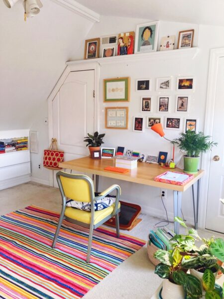
Designing joyful cities

30 September 2011

MakeCalgary

Tonight I had the privilege of speaking at makeCalgary, a conference that looks to design for inspiration on instigating catalytic change in cities. The theme is “provoking Calgary’s next chapter,” and to that end I’ll be sharing some design principles for joyful cities, using examples from New York (which has been experiencing its own waves of inspiring change lately). I was incredibly impressed with the level of dialogue and especially the sensitivity to emotion among the crowd. Calgary is clearly primed for joyful change.

One fascinating discussion emerged around the idea of winter. A commenter observed that very few images in the presentations showed winter, of which Calgary has a hefty one. How do we create joy when the landscape forces us indoors, or at least makes it less natural to want to be outside? A fellow speaker, Rob Adams, head of urban design for the city of Melbourne offered a nice piece of advice from the Danes: “There is no bad weather. Only bad clothing.” I love this because it underscores that joy so often lives outside of the comfort zone. In North America we overwhelmingly design for comfort. But comfort is often inimical to joy because it is so cozy we become complacent and insular, rather than openminded, exploratory, and social. Better to take the advice of a commenter from Winnipeg who noted that residents of that city often skate to work on their river once it has frozen over!

Tomorrow, I’ll be helping to lead a charrette to apply some of the diverse inspirations from different cities to a site within Calgary. Looking forward to sharing back after the conference.

If you’re curious to hear more about what I’ll be sharing, here’s a link to a podcast interview I did with two of the conference’s organizers, Matt Knapik and Kate van Fraassen. Fun!

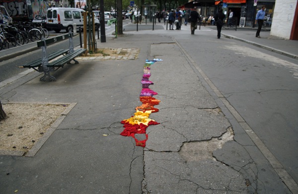
Joyful sidewalks, joyful cities

3 May 2011

Yarn01

They look almost like brightly colored mosses, don’t they? Like some new form of street lichen. Or a kind of chromatic filling compound. A rainbow grout.

This set of sculptures by artist Juliana Santacruz Herrera is a particularly striking example of yarnbombing, a form of knit or crochet-based street art that frequently reacts to the urban environment. In Herrera’s case, this means applying braided fabric in looped forms to cracks in the sidewalks of Paris. Like the pothole gardens and lego repairs I’ve written about in past posts, Herrera’s works use delight to call attention to the breakdown of infrastructure in the city. Like other yarnbombing projects, they work with maximal contrast – in color, contour, density, and texture – to catch our eyes and make us take notice. While they don’t actually fix the problems they’re addressing, it’s possible that inducing this kind of positive affect makes people more inclined to act to change their environments. More than an angry letter or a protest, these works create a desire to share with others, creating a kind of social momentum.

Herrera’s works are one more example of a phenomenon I call joyful repair – the act of mending or calling attention to a damaged element of the environment using color, texture, playful gestures, and other aesthetics of joy. It’s a form of joyful activism, which tries to bring about change through positive emotion, and it’s one of my very favorite applications of aesthetics of joy.

Yarn04

Yarn03

Yarn02

Yarn05

Yarn07

Yarn08

Yarn09

Here’s another example I’ve had in my files for awhile. Working at a slightly smaller scale, London artist Ben Wilson uses chewing gum splotches as a canvas for tiny, brightly colored sidewalk art. Wilson has been creating the paintings since 1998, and estimates he’s made over 10,000 of the little works! Interestingly, not long after he began his gum-painting endeavors, people began making requests for particular designs, often commemorative. So what began as litter has become an odd little system of tribute, like plaques on park benches or in front of newly planted trees. People want to be associated with something they feel good about, and with a little color and charm, that even could be improperly discarded chewing gum. The sidewalk at first seems an unusually mundane place for this sort of personal connection, but maybe not. After all, the sidewalk is the most intimate of transitory spaces in a community, the backdrop for so many of our daily dramas and spontaneous joys. Filling its holes, reclaiming its blemishes – in some way these are a deeply integral form of reconstruction.

Chewing Gum Art by Ben Wilson

Ben Wilson

Chewing gum art by ben wilson 7

There’s something else here, too. Projects like this are a signal that someone cares about a place, that the condition of that environment matters to someone. Someone is paying attention to the details. To make something beautiful is to invest time and energy in it, and these two are the most valuable, limited resources we have. We perceive this signal of caring and passion, often unconsciously, and we typically follow in kind. We read our landscape for cues about how to treat it, we draw inferences about the inhabitants, and we subtly alter our behavior to maintain this condition – or enhance it. These aesthetic signals often become a discourse of community, a conversation between the denizens of a place that leads, via a subtle form of one-upmanship, to the organic growth and improvement of our favorite places to call home. Alain de Botton has written (I’m paraphrasing here) that one of architecture’s purposes is to inspire us to be better people, and I would say the same for any of these urban interventions. We see improvements, and they unconsciously motivate us to improve ourselves.

Favela painting 1

Joyful repair projects can serve as jumpstarts for this process. This project, though not new, is a great example of this principle applied over a large scale. Called “Favela Painting,” this brightly colored village is the work of Dutch artists Jeroen Koolhaas and Dre Urhahn. Working in a slum outside Rio, their goal is to use art “as a tool to inspire, create beauty, combat prejudice, and attract attention.” The care and passion embodied by the murals effectively transforms the favela from outside in. Some really thoughtful words about the effects of this project, on the Magical Urbanism site:

‘Favela painting’ affects the aesthetic order of how favelas are perceived from within and outside its natural embryonic growth. Colour brings hope. It brings a different understanding of space and its people, inviting others to co-create and co-represent much more constructively and positively life here. It appeals to our senses in a way that we do not reject but embrace these places and the potential for better life. It articulates a different discourse of social change; of engagement, contributing to improve life for favela dwellers.

It’s hard to say it any more succinctly than “color brings hope.” It suggests energy, and as such it has an uplifting and an attractive power. It’s a harbinger of better things to come. As I think about the phenomenon of joyful repair, I’m reminded of the root of the word repair, the Latin parare, “to make ready.” By repairing things, we are making them ready again. By repairing them joyfully, we’re making them ready for wonderful things to happen in the future.

Favela painting 2

Favela painting 3

Favela painting 4

Images: Juliana Santacruz Herrera on Flickr via designboom; Ben Wilson via Inhabitat; Favela Painting via The Fox Is Black.

{Thank you Maggie and BD}

Joyful underdogs

28 March 2010

This unassuming little book caught my eye the other day. Inside is a series of simple photos highlighting a phenomenon I’ve long considered joyful: plants that have managed to break through hard urban surfaces and green up the cracks in the city environment.

It’s hard not to feel a sense of delight at the pictures of these little sprouts, and their triumph of living matter over inert concrete, vegetable over mineral, soft over hard. As one reviewer put it, these scrappy, weedy things are “the underdogs of the plant world.” They’re like pioneers pitching a colorful tent in a harsh landscape, brave things that are cheerful in the face of long odds.

I Think I Can looks to be part of a six-book series by Partners & Spade. Another title in the series is The Benefits of Looking Up, which also seems to have joyful potential.

Joyspotting: 33rd and Lex

15 February 2010

Spotted this installation near the corner of 33rd and Lex a few weeks ago. Despite the bitter cold, people kept stopping to play. Does anyone know whose work this is?

Solastalgia

4 February 2010

Fascinating piece by Daniel B. Smith in Sunday’s NYT magazine about the emerging field of ecopsychology, which studies the relationship between the health of the natural world and that of the mind. The field views mental health more broadly than any preceding branch of psychology, suggesting that our sanity is inextricable from the vitality of our surroundings and the strength of our connection to them.

This makes intuitive sense to me. After all, our physical health is deeply dependent on the health of our immediate environment. Perhaps before the Industrial Revolution we could have conceived of our bodies as separate entities, impermeable to pollution. But now we know that chemicals in our waterways end up in our veins and that smog chokes our lungs as much as our visibility. The link between environmental soundness and mind is less apparent, but still plausible. If we evolved for an environment filled with the aesthetics of lush, green life, but we live in an environment that deprives us of these aesthetics, isn’t it possible that this state of being becomes like a nutritional deficit of the mind? That robbing our environment of certain essential stimuli decreases mental performance and makes us not only less happy but also less functional?

There are already disorders recognized to have a relationship to the stimuli we take in from our environment. The appropriately named SAD (seasonal affective disorder) is a kind of depression related to the low levels of available light in winter. SAD is worst at higher latitudes where the light difference between seasons is most extreme. Yet some Scandinavian peoples, such as Icelanders, have been found to have an immunity to this condition, perhaps because it was selected as a favorable survival condition by evolution. This is only one data point, but it suggests to me that people may evolve for certain environments, that our brains may be subtly wired through generations of interactions with a place, and that the rapid rate of change (/devastation) of those places could be a latent source of emotional trauma.

Australian philosopher Glenn Albrecht terms this trauma solastalgia, which combines the Latin solacium, meaning comfort, and the Greek root -algia, meaning pain. He defines his coinage as “the pain experienced when there is a recognition that the place where one resides and that one loves is under immediate assault…a form of homesickness one gets one when is still at ‘home.’ ” It’s an instantly evocative word to match an evocative concept (though perhaps not so precise — I can think of lots of cases of comfort-pain that have nothing to do with place). Smith notes that the word has spread rapidly, not just in academic or journalistic circles, but as a title for songs and works of art. The idea of defending our land as a people is nothing new, but throughout history usually it is from invasion, and what we are defending is livelihood — the resources for living and the livelihood we have created in a place. This goes much deeper to say that environmental destruction is a slow, creeping invasion, and what we are defending is not just our livelihood, but our sanity.

The most interesting aspect of this discussion, for me, is the recognition of certain kinds of environmental aesthetic stimuli as essential to mental health. We know that the brain is a sensing, processing machine, requiring constant stimuli to make sense of the world. Remove all stimuli, and people quickly go insane; without new data points, the brain stops making sense of itself. Too much stimuli and we become overloaded — equally unhealthy. But beyond variations in quantity, there are also variations in kind to pay attention to. Are there certain qualities of light that better enable us to function? Are there proportions and perspectives that make us feel in balance and emotionally secure? (For example, having evolved in an environment where trees have a certain proportional relationship to the human body, say between 2x and 8x as tall, does living in an environment that is more vertically structured, up to 220x in height maybe, create a sense of insecurity? I wonder this as a devoted city-dweller — I love skyscrapers, but is there another level on which they are making me anxious? Would I be smarter or calmer if I lived in the forest?)

One study, done by Peter Kahn, a developmental psychologist and member of the editorial board of a new journal called Ecopsychology, suggests that natural stimuli effect our physiology in basic ways. Kahn tested a group of adults subjected to mild stress while looking at one of three different views: a window looking out over a scene of grass and trees, a 50″ plasma screen of the same scene in real time, and a blank wall. Measuring the heart rates of the subjects showed that they decreased fastest in the group looking at the real nature scene, while those looking at the TV had the same results as those facing the wall. This suggests that not only does environment unconsciously effect our reactions, but also that we can’t fake it. An authentic aesthetic experience is necessary to feel the benefits of the interaction with the natural environment.

What does this have to do with joy? Many of the stimuli we consider to be aesthetics of joy are natural and environmental. Sunlight, lushness, open and expansive spaces. The emotion joy evolved at a time in human history where there was no dichotomy between artificial and natural — before industrialization, before agriculture, when our connection to the environment meant survival. The ideas of ecopsychology — solastalgia and the idea of an ecomental system — resonate so strongly with me because of this history. Joy isn’t a result of what goes on in the mind alone; joy is an ecomental interaction, a constant dialogue between the brain, the senses, and the things we encounter in the world. It’s often said that happiness comes from within, but joy comes from without — from the impressions made by pleasurable things on our retinas, our fingertips, and our tongues, the way they disrupt the flow our thoughts and focus them on beauty and wonder. For me, this piece was an important reminder that those wonderful, natural things may be instrumental not just in joy, but in the whole of mental health — and therefore an important reminder that so much depends on our willingness to defend them.

NYT: Is there an ecological unconscious?
Illustration: Artwork by Kate MacDowell; photograph by Dan Kvitka for The New York Times

Toyota’s flowers

10 November 2009

482268781_49dc6032cf_b

Nice mention of AoJ in this post on Brandchannel about Toyota’s creation of two new flower species that absorb nitrogen oxides and take heat out of the atmosphere. The two flowers, variants of the cherry sage and the gardenia, are planted at Toyota’s headquarters in Japan. Designed to highlight green improvements to Toyota’s manufacturing facilities, the flowers are an interesting marketing move and a great example of a joyful gesture. It may be “joywashing meets greenwashing,” but it’s hard to be skeptical when it just makes you want to smile.

{image: crossmage}

Joy + modernism

5 October 2009

glasshouse1

Another great weekend. Yesterday I took a day trip with my mom to see Philip Johnson’s amazing Glass House, in New Canaan, CT, which sparked some new reflection on a topic I’ve been pondering for some time: is there a relationship between joy and modernism?

In theory, that relationship is antithetical. Modernism strives for ideological purity, while joy revels in the odd, absurd, silly, and cute. Joy is obviously emotional, whereas modern design is guided by rationality — by principles of formal organization, visual proportion, and spatial balance. Joy is ebullient, modernism is restrained. Joy is youthful and lighthearted; modernism is serious and mature. The advent of modernism was really like a repression of joy, which burst forth in a haze of silliness in the post-modern era.

Form and color choices reflect modernism’s sober attitude, with a devotion to angles over curves and a limited color palette. It was interesting to see this study of average color calculated from MoMA’s art collection, the result being #A79F94, a dull warm gray. The study’s creator calls it “the color of art,” but I wonder if it’s more accurately “the color of modernism” — austere and serene.

Of course, this is not to say there are no joyful modernists. I think if you had to pick one, Eva Zeisel would be the obvious choice, but the Eames and the Scandinavians also had a more emotional, energetic sensibility. The movement evolved over time and softened. Still, a certain detachment and reserve is inscribed in modernism, and too exuberant a notion of form would be incompatible with the doctrine.

glasshouse2

Yet, I felt joy at the Glass House. Standing in that transparent box, immersed in the fantasy of a home without walls — it was an exultant feeling. Glass becomes wondrous in this context, creating a porous connection between home and environment that is profoundly emotional. From the outside, the home almost disappears, lost in the play of reflections across its surfaces. From the inside, it expands outward. With no walls, the space is voluminous, endless, growing. And this airy expansion is a definitive aesthetic of joy.

Most of the time, if modernism achieves an emotional quality, it’s neutral serenity. More often, it’s an emotionally-detached sense of awe and inspiration. But as my weekend experience showed me, there are exceptions. Perhaps in spite of all the efforts towards rational purity, the modernist spirit every now and then rises up and revels in the joy of light, space, and form.

Aromatic graffiti

30 September 2009

scent_graffiti

I love non-traditional street art. Yarnbombing, seedbombing, mossbombing, LED throwies — anything that brightens and transforms the urban environment really brings me a sense of joy.

So this scent graffiti by Mitchell Heinrich really charms me. Scent is a particularly interesting medium for several reasons. Heinrich says:

Scent is interpreted by the limbic system which is very closely tied to emotion and memory. This leads me to believe that interacting with people using scent can potentially be a much more powerful medium than paint since people experiencing it can’t help but react to it. The goal of this project is to realize the potential of smell as art and to explore different ways of using it to interact with people.

True, but this is only part of the story. Scent requires proximity in a way that vision does not. Visual understanding is nearly immediate once something enters our eyeline. But scent is based on the diffusion of volatile chemicals through the environment, so it reaches us in a more gradual way. It’s like vision is a sudden downpour and scent is a slowly increasing drizzle. So the quality of the surprise achieved is fundamentally different.

Also, in a chat I had a few weeks ago with Dr. Pamela Dalton at the Monell Chemical Senses Center, I learned one of the most important factors in scent processing is context. Many scents occur in multiple contexts. One example is butyric acid, a molecule that in some situations we recognize as aged cheese, and in others we recoil from as the odor of sweaty feet. Without realizing it, we constantly use contextual information to interpret scents and determine how to react emotionally to them. This fact creates some interesting possibilities for scent art. By taking scents strongly identified with a particular context — say cut grass or baking cookies — and pairing them with urban contexts that have a strong associated odor, the effect could be quite dazzling and dislocating. It could also work the other way, creating a powerful negative emotional response. But either way, it likely would cause to reflect on the environment more mundane sensory stimuli as well, and develop a clearer picture of how those make us feel.

Scent graffiti is also fleeting, and that transience is appealing. So often graffiti is not about destruction but about reclamation: the desire to form some kind of personal relationship with the anonymously-designed city that contains and constrains us. To shape this looming environment in some small way. The evanescence of aroma allows for continually shifting scent-images to alter the city, allowing a constant redesign and rediscovery of public space.

Here’s a link to an instructable on how to create your own scent spray cans. Images: attack the darkness and circulating.

{via PSFK}

Colorful living sculptures

17 September 2009

dorner3

Squeezing brightly dressed performers into tight urban spaces, Companie Willi Dorner creates surprising living sculptures. Dorner aims to shift our perspective and cause us to reflect on the scale and structure of our environment. As much as the contrast between the rigid environment and flexible performers illuminates some basic truths about the design of buildings and spaces, I think the more interesting revelations relate to behavior.

dorner1

Like the flash mobs I wrote about earlier this week, the behaviors force us to question the unspoken norms that govern behavior in a society. The positions and arrangements of the performers violate these norms in striking and significant ways. They’re too close together, they’re entwined and contorted, they’re upside down, they’re horizontal, they’re in places forbidden by law or general good taste to occupy. Encountering these behaviors reveals a second layer of structure in a city: an invisible structure formed by codes of behavior that work as well as fences or street markings to maintain our orderly coexistence. The photo below, of the blue-clad person upside-down against the gridded wall, shows this beautifully — an irreverent subversion of both kinds of order.

dorner2

dorner4

Something like this is a little piece of chaos, and it can be done in disturbing fashion, or it can be done whimsically. Clearly this is an example of the latter, with color a primary cue to the artist’s intent. There’s a real sense of play here, like a game of hide-and-seek (or in the first photo, sardines) being conducted in plain sight. It would be fun to witness, but I think out of anyone the greatest joy belongs the performers, who have license to indulge their inner child and color outside the lines for a day.

via PSFK

Big sweet tooth

11 September 2009

giant_sweets1

Yesterday I posted on miniature sweets and the perspective shift that comes from out-scaled items. On the opposite extreme, giant sweets seem to captivate artists and designers the world over. And because their enormity makes them impossible to overlook, the giant objects seem to have an even stronger Alice-in-Wonderland effect.

Claes Oldenburg and Coosje van Bruggen’s Dropped Cone makes me feel like a Lilliputian living in a land where if I’m lucky, I might catch a dripping from a giant toddler’s melting ice cream. Martha Friedman’s Waffle (currently on view here in Brooklyn) and street artist Celso’s Apples have the similar effect of making me reconsider my own scale and the scale of all the common objects around me.

Of course, scale shifts can go both ways. Oversized objects can have the effect of making us feel ill at ease with our place in the universe and out of control of the events that shape our lives. Oldenburg and van Bruggen’s Knife Slicing Through Wall sculpture highlights this darker side of scale shifting. But sweets are inherently joyful — the sugar, the color, the aroma of baking, the ritual of eating — so giant treats create a much more pleasurable transformation of perspective: magical, childlike, and fun.

Brooklyn designer and studiomate of mine Azusa Hirota brings this whimsical quality to functional objects, allowing interaction with these giant sweets, instead of just viewing. Her chair, a giant cupcake, puts the user in between the cake and icing, so that you’re literally surrounded by the experience. Everyone I’ve seen sitting in it seems to have a big smile on their face. Her giant doughnut, designed in collaboration with Tawny Hixson, transforms a common inner tube into an object of delight. I remember my days spent tubing down the Nam Song river in Vang Vieng, Laos, and it strikes me that it would have been such a wonderful thing to see fellow travelers drifting gently downstream on giant Krispy Kremes!

giant_sweets2

See more of Azusa’s work here. Thank you Maggie, for the waffle tip that inspired the idea for this whole post!

Did I miss any wonderful giant sweets out there? Let me know.