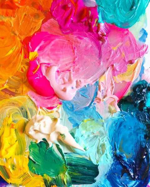
vibrant
Does Dopamine Decor Really Work?
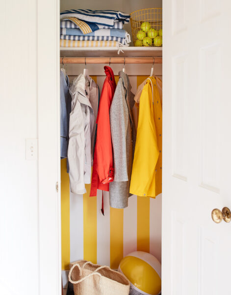
How bold design can actually make your home calmer
5 ways my work has changed my life
Timeless or trendy? How to avoid impulse buying and choose items you’ll love for the long-haul
Joymaker: Jessi Raulet
Joymaker: Sara Emami
Joymaker: Dana Fortune
A joyful journey to the seven magic mountains
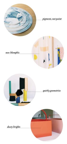
Four joyful design trends to watch
Find more joy every day
Our free workbook has 5 simple strategies that will make life better right now.
You'll also receive periodic updates on new things from The Aesthetics of Joy. We respect your privacy. Unsubscribe at any time.