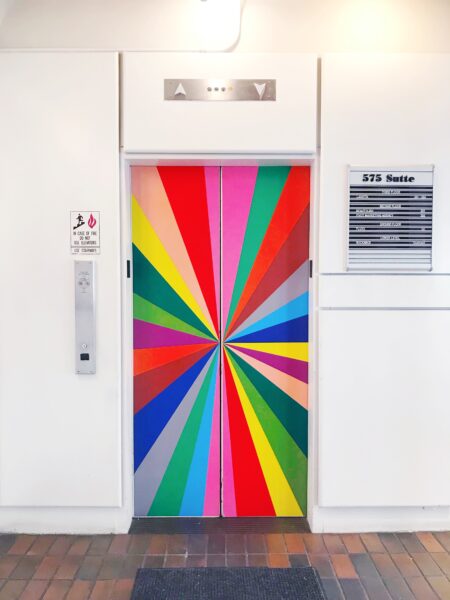
How bold design can actually make your home calmer

One summer when I was in college, I went traveling alone in Spain. By that point in my life, I’d gotten good at being alone. I was on the shy side and had good books and a journal to keep me company. Still, when a couple of American guys about my age (one of them very cute) checked into the hostel at the same time as me, I couldn’t help but feel like the trip would be more fun if I had some friends.
But I was SO nervous! As I walked past their room to the bathroom, their door was open. It would be so easy to go say hello. Instead, I darted back into my room and closed the door.
Inside the safety of my own room, I gave myself a pep talk. What is the worst that could happen? They could laugh at me. They could think I was pathetic, like I’m some loser with no friends. And they could be obnoxious or rude. They could brush me off.
It would sting if those things happened, I told myself. But I would never have to see them again.
So, I gathered all my courage and before I could chicken out, I went over to their open door and as casually as I could muster, I said, “Hi.”
Turns out, they were nice as could be. We ended up traveling through three cities together, and stayed in touch long after. I even saw one of them when I was living in Australia, when he came through after a tour as a firefighter in Antarctica. (Do you know what most of firefighting in Antarctica consists of? Shooing the penguins off the runway at the airport. And I never would’ve known that if I hadn’t been brave enough to say hello.)
Lately I’ve been thinking a lot about bravery. (See my prior post on the topic here.) And the more I think about it, the more I come to believe that it might just be the defining quality that makes for a life well-lived.
So much of the good in my life right now came to me only because I was brave enough to embrace it. Saying yes to a date with a coworker (now my husband). Overcoming my fear of giving myself injections (resulting in the child who is my son). Writing a book while being sure it will never live up to my hopes for it. Standing on a stage to give a TED talk. Leaving the city. I can’t help but think that life is richer when we take the leaps.
Which brings me to bold design. Painting your walls tangerine orange isn’t a leap on the same level as facing infertility or sharing your ideas with the world. But it’s not trivial either. A bold, expressive home runs against the grain of the minimal, “tasteful” norm. It risks raised eyebrows and backhanded compliments. It brings up all the same old fears of being “too much” for other people, of not being taken seriously, of being thought of as childish or frivolous. And we worry that we might get sick of all that color, and end up wishing we’d stuck with beige.
(Spoiler alert: do you know anyone who wishes they’d stuck with beige? Me neither.)
How Bold Design Can Actually Make Your Home Calmer
Bold design takes bravery, yet on the other side, you’re more likely to wonder why you didn’t do it sooner. Having just taken a wild leap into painting my very brown house in bright shades of blue and green, I’m finding that the benefits are surprising — and worth the risks. Specifically, there are five things I’ve experienced as a result of living in a more vibrant home.
It makes the space feel calmer
When we first came back into our house after painting, it was definitely a shock to the eyes. There was just SO. MUCH. COLOR. The bright green of the kitchen was much more energizing than the bland wood had been, but it was paradoxically also calmer.
The clutter felt much less noticeable. The toys (that are always everywhere), the stuff on the counters — these things used to be the first thing I’d see when I walked into the room. Now my eye goes to the expanse of green and the flower pattern on the walls. Even our sticker-covered trash can, which had always seemed like evidence of a “house that got taken over by the children” now seems cute in our redesigned kitchen. The scale of the stickers echoes the wallpaper in a way that feels charming, at least to me.


Similarly, I used to hate the glass-front upper cabinets. We needed the storage space, but I hated being able to see all the stuff inside. But now, contained within a field of color, the objects in those cabinets feel much more cohesive. I love those glassed in cabinets now — I feel like they lighten up the kitchen considerably — and can’t believe I almost got rid of them.
This is so counterintuitive, but clutter and mess are much more stressful in a minimalist space.
Against a clean, neutral background, any sign of untidiness is going to pop out into the foreground, drawing your attention. This is why there often feels like a big gap between the way those minimalist spaces look in photos and how they look in real life. It takes a lot of effort (and a very willing family) to keep a space like that looking as clean-lined as it is intended.
Adding bold patterns and strong colors capture your attention, making the clutter seem to recede into the background. In design terms, we would say that the color and wallpaper become the dominant elements in the space, and that the clutter becomes subordinate. The science behind this has to do with how our brain tries to make sense of a scene. The brain is always trying to figure out what is important to focus on in a scene. If there’s little other than clutter to look at, then the brain will conclude that is the most important thing, the most worthy of focus. But if there’s more ambient visual interest, then clutter seems less important by comparison.
Having an overall base level of color in a space also makes other colorful things feel contained, rather than leading them to pop out from the background. This is especially true with kids’ stuff. As a commenter on a recent Instagram post of mine pointed out, since kids’ things are usually colorful, a colorful home makes them seem right at home. Whereas in a neutral home, colorful kids’ things stand out as the dominant element in a room, despite what parents might wish. This is how you end up with parents wanting to confine all toys to a playroom or feeling like they need “sad beige” toys instead of just letting kids have the colorful toys they naturally gravitate towards.
The house’s flaws become less noticeable
Light has been a big struggle with this house. The long porches on the front and back mean that we have lovely outdoor living spaces, but the cost is that most of our indoor living spaces feel quite dark. I confess that it had me so down at one point last year that I was convinced we needed to move.
Fast forward to this week, when I walked into the kitchen and found it flooded in light. It didn’t feel dark at all. With all the heavy, brown wood gone, I find myself noticing beautiful patches of sunlight everywhere. It feels like a different house.
We all know that light influences how colors look, but it goes both ways. Color shapes light. When you add more color to a space, you give the light something to reflect off of, which makes it more dynamic and alive.

Similarly, those of you who have been reading for any length of time know my struggle with these floors. (Having seen them refinished by necessity in one area of the house, I can’t stop picturing how beautiful it would be if we could remove the yellowed finish and restore the soft warmth of the natural oak.) But since we redid these rooms, I almost never notice the floors. They just don’t bother me anymore.
Design is ultimately a process of directing attention. Bold design is like the diva that hogs all the attention for herself, rendering those things you’d rather not notice almost invisible in her shadow.
It has more staying power
There’s a common belief that bold design is a recipe for regret. We worry that the multicolored wallpaper that looks exciting on a moodboard is going to feel tired soon after we get home. Playing it safe seems like the smart, sustainable choice.
But science says the opposite is true.
In a study done at the University of Miami, researchers found that we’re actually more likely to get tired of plain, neutral objects than we are of vibrant or patterned ones.
The reason? We tend to like our surroundings to be in a moderate range of stimulation — not too intense, not too blah. Novel things are inherently more stimulating, so when we buy a beige sofa, it feels moderately stimulating at first, but soon settles to a ho hum low level.
Meanwhile, the bright yellow sofa is highly stimulating at first, which makes us worry it’s going to be too much. But as we get used to it, it settles into that Goldilocks midrange that feels just right for daily life.
I can confirm that the first few days of living with our new design were… a lot. But as the newness has worn off, I find myself falling deeper and deeper in love with our space. In fact, I have to admit that I’ve been catching myself smiling alone in the kitchen once or twice a day. Maybe we should call this approach to design “Big Dumb Grin” Design? I dunno, but in a world where we’ve been trained to expect hedonic adaptation, where things get old and we start craving something new to give us that hit of dopamine, it’s refreshing to think we can create spaces that get more desirable over time, not less.
It’s easier to be present
Ok, this is a weird one, but hear me out. I’m naturally prone to distraction. I’ve got a million things going on in my brain at any given moment, and I’m always curious about what’s going on in the world. So, it’s sometimes hard for me to stay in the moment, even when I know that that’s the best place in the world to be.
What does my home have to do with this? Well, since we redesigned our space, I’ve found that I’m less reflexively distracted. I wonder if it’s because I needed more visual stimulation to feel comfortable in this environment. Though it sounds paradoxical, having an under-stimulating environment can make us restless and agitated. (I talk more about this the Abundance chapter of JOYFUL.) And when we feel under-stimulated? We go looking for stimulation, often through the most stimulating object in our midst: our phones.
I believe that making our homes more sensorially enriching can be a way to feel more calm and present in our space.
A parallel for this is nature. Nature is highly stimulating, full of sounds, movements, scents, and textures. But in research we find that nature isn’t distracting. It actually restores our ability to concentrate. (This principle is known as Attention Restoration Theory, and has been demonstrated with a wide variety of audiences.) The built environment is not nature. And we don’t have clear evidence yet that indoor settings can restore attention in the same way. But it’s worth experimenting with tuning the level of sensory stimulation to a point that feels good. And helps keep your focus in the room.
I feel braver and more confident
In one study of color and work environments, researchers found that people working in more colorful offices were more confident than those working in drab spaces. I don’t know if we can absorb confidence just by looking at color. But I do feel that having created a colorful space gives me a confidence boost. It’s a tangible reminder that I’m not someone who is afraid to live the life that I want. I’m someone who will embrace the risk and go for it.
We draw courage from all different sources. I love the idea that my home can be a jumping off point for taking those big, brave leaps that expand my life and open me up to new discoveries.
I know that not everyone wants to live in a bright, colorful home. But we all have some version of a decision that feels risky in our homes. I hope this post encourages you to give it a whirl. Yes, there’s a chance you may not like it. But more likely you’ll find that it opens up a whole new world for you.
Ready to create your dream home, right where you are? Join the waitlist for Design a Joyful Home.

Discussion (6 Comments)
It’s so funny that you didn’t like the stickers on the bin. In all the pictures I’ve seen of your kitchen (and I LOVE it – especially the gorgeous wallpaper) that bin has jumped out at me as such a joyful thing. It’s what usually gets hidden away so it’s great to see a bin getting to be fabulous!
That is so interesting about nature being highly stimulating! I know nature is calming for uprooted from personal experience and from studies of biophilia in architecture school, but I had no idea about the “why”!
I enjoyed reading this immensely! The way you talk about how the things that bothered you in your space shifted when the attention was diverted away is making me consider some changes in my home now. Thank you!
I love this story! I read your book immediately when it was published & find ongoing inspiration there. I only wonder how you transition between rooms? Especially when the woodwork & trim is painted. Thank you for the inspiration & joy you share!
It’s a great question, and one that takes time to figure out. In our case, we are working to bring the colors across the rooms in a harmonious way. So for example, we are using the yellow and red from the wallpaper of the green room in the blue room. In the foyer we’ll use a warm gray to have a calmer offset, but the bench will have the same red. Also, there are a few small spots where I am painting woodwork back to white to make the transition work better. They are very small, but it’s just the kind of thing we couldn’t know until we painted it.
I agree with all of this.
What people really get tired of, and what dates quickly, is trends. The popular tile motifs, the popular neutral colors (gray or cool beige or warm beige or cool white or warm white). If people would just have the courage to do what they truly love they would be much happier.
But I still think that many many people, in fact most who haven’t studied design, have way to much junk and nothing is ever going to make that look good. (Although I agree that painted walls will help.) Doing what you love doesn’t mean you put different patterns and colors all over the place that compete, where the undertones don’t match, etc.