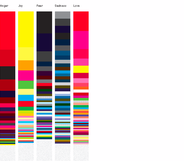
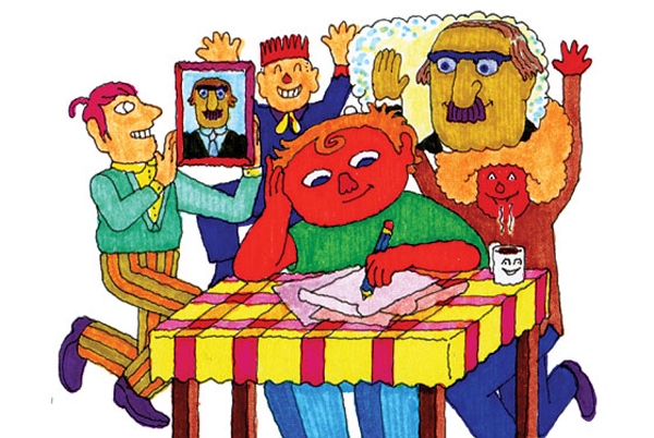
Here’s an interesting project from Orlagh O’Brien about the associations we form with emotions and the ways we express them. The project consists of maps of colors, words, and shaded bodies that show how and where people feel certain emotions. He says:
By gathering concepts of feeling by word, colour and line and creating visual languages for anger, joy, fear, sadness and love – a kind of democratic visual language is created – a backwards-brand. As a graphic designer, I am attempting to bring attention to the body’s patterns of feeling and innate intelligence in a systematic but playful way.
To me the color map says it all. Yellow and other bright, light colors for joy, dark muted colors for fear and sadness, and intense warm colors for the fiery emotions love and anger. It’s like a visual glossary for emotion.
I love this project because it makes a point I frequently am called upon to reiterate in the process of writing Aesthetics of Joy. People often tell me that joy is individual and personal, and that it’s impossible to come up with a consensus on what the aesthetics of joy are. Indeed, if you look at these color maps, you can see that some people find joy in intense red (the same red others associate with anger) and some people find joy in the kind of kelly green that makes others fall in love. But, overall, when you put all these people together, there’s a feeling that emerges that makes a kind of sense. It may be tyranny of the majority, but well over half of the joyful colors are warm, nearly all are saturated and pure, and none are black, maroon, navy, or gray. It may not be a universal consensus, but it’s a vibe that we see and intuitively feels right.
The graphics are also beautiful. They strike me as pH strips for emotion, as if you could take the emotional temperature of a culture, and it would come out like this. Very interesting work.
See the full joy page here.


Leave a Comment