New Melbourne identity
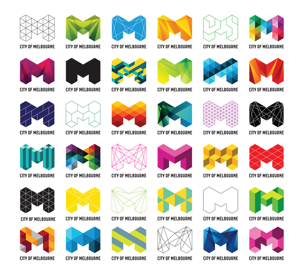
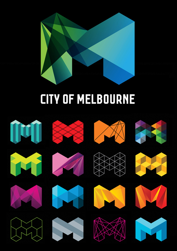
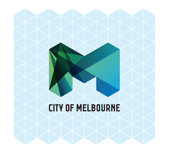
I’m really enjoying this redux of the City of Melbourne identity by Landor Sydney. Some permutations remind me a little of the Andy Gilmore piece I posted last week. I especially appreciate that Landor shared the grid so we can see how they constructed the system. It’s a nice way of allowing one mark to express itself in different ways, bringing in lots of color and vibrancy without losing cohesion.
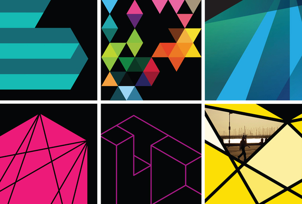
From an aesthetics of joy perspective, this sort of “theme and variation” identity makes a lot of sense. The theme keeps the whole thing recognizable, while the variations trigger a constant sense of surprise and anticipation. And it makes very good sense for a city, which is going to be applying the mark to everything from street signs to parking tickets. This is something people are going to be seeing a lot; it wouldn’t take long for them to get sick of a dull mark. Overall, I think it has a really great energy.



Leave a Comment