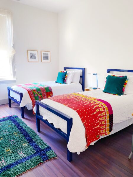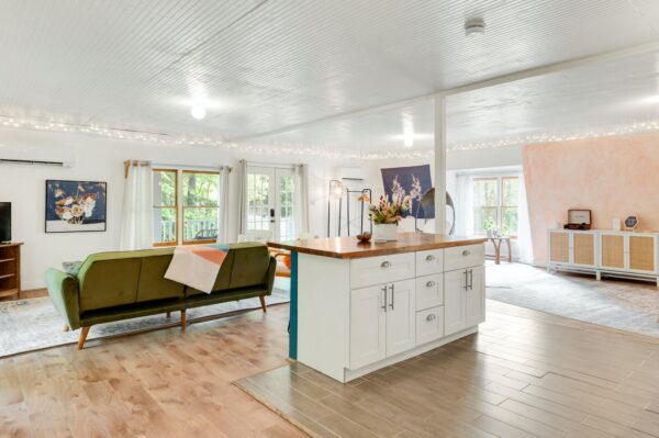


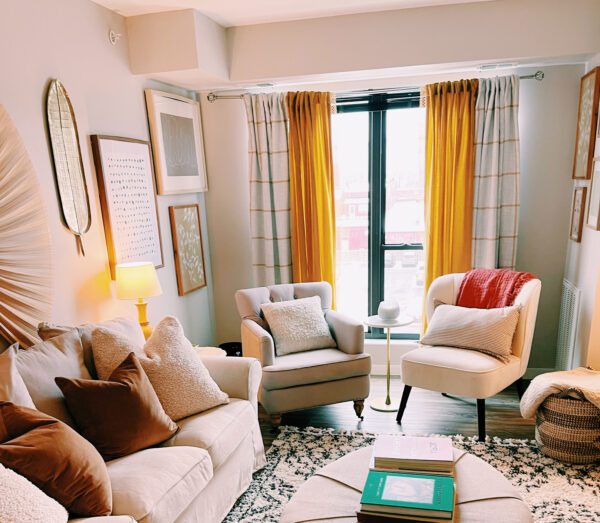
How changing just one room can transform your life (part 2)
See how real people transformed their homes and the surprising effects it had on their relationships, goals, and happiness.
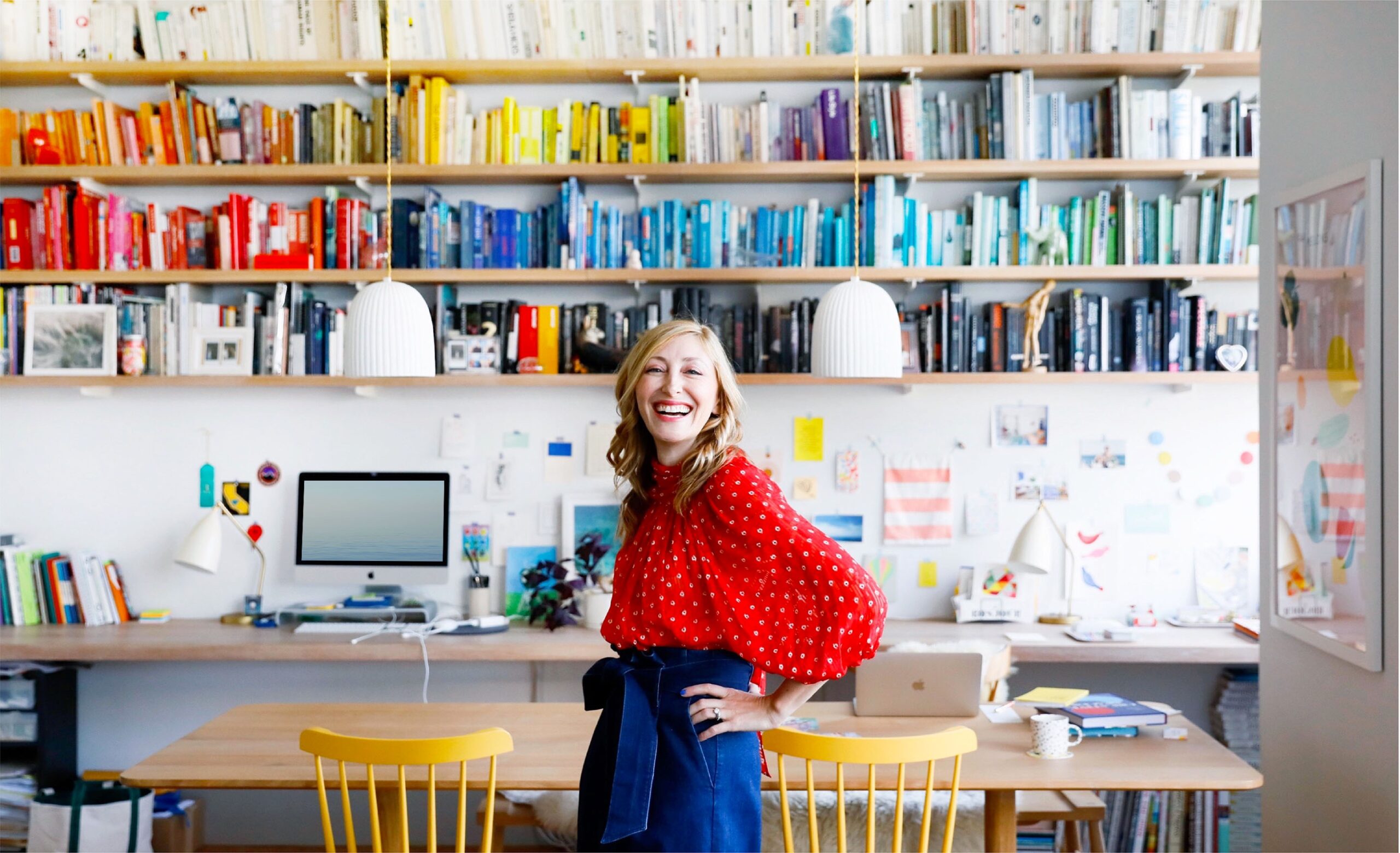
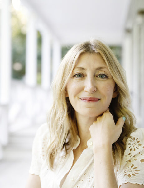
Hi, I’m Ingrid Fetell Lee. A designer and author, I founded the Aesthetics of Joy to help you create more joy in life and work through design.
I’m so glad you’re here.
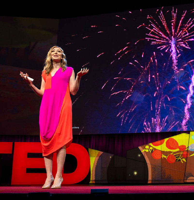
That has been viewed more than 17 million times.
See how real people transformed their homes and the surprising effects it had on their relationships, goals, and happiness.
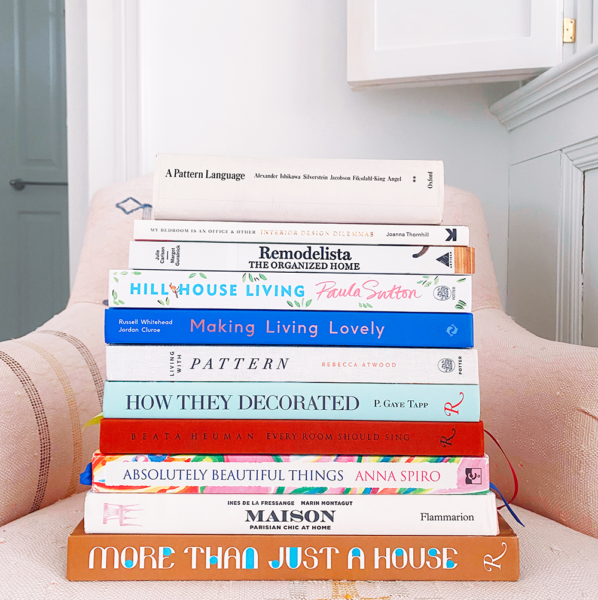
Decorating on a budget doesn't have to mean settling for less than you desire. These 5 tips will help you maximize your design joy on a minimal budget.

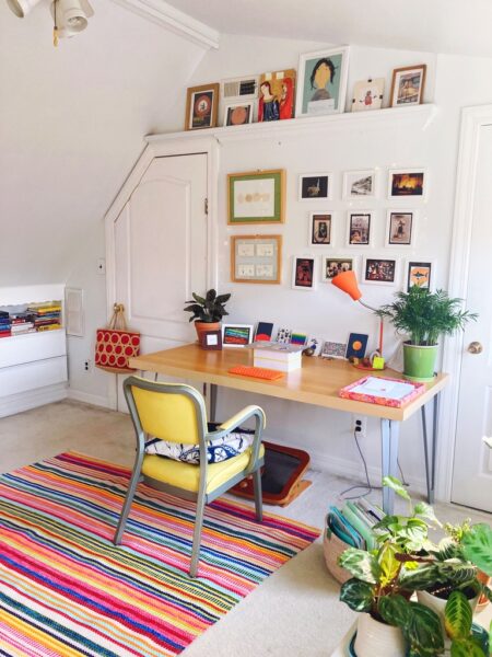
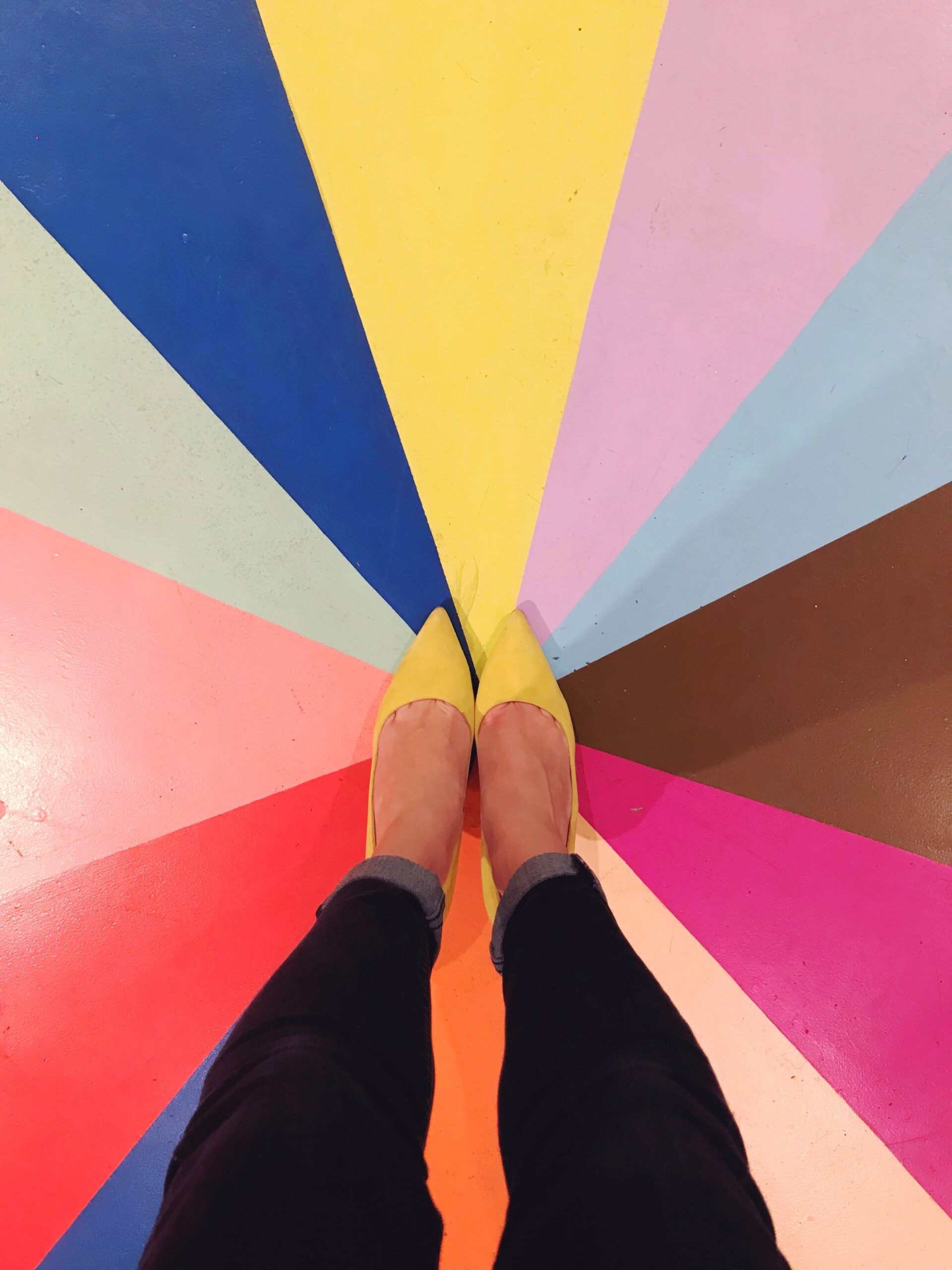
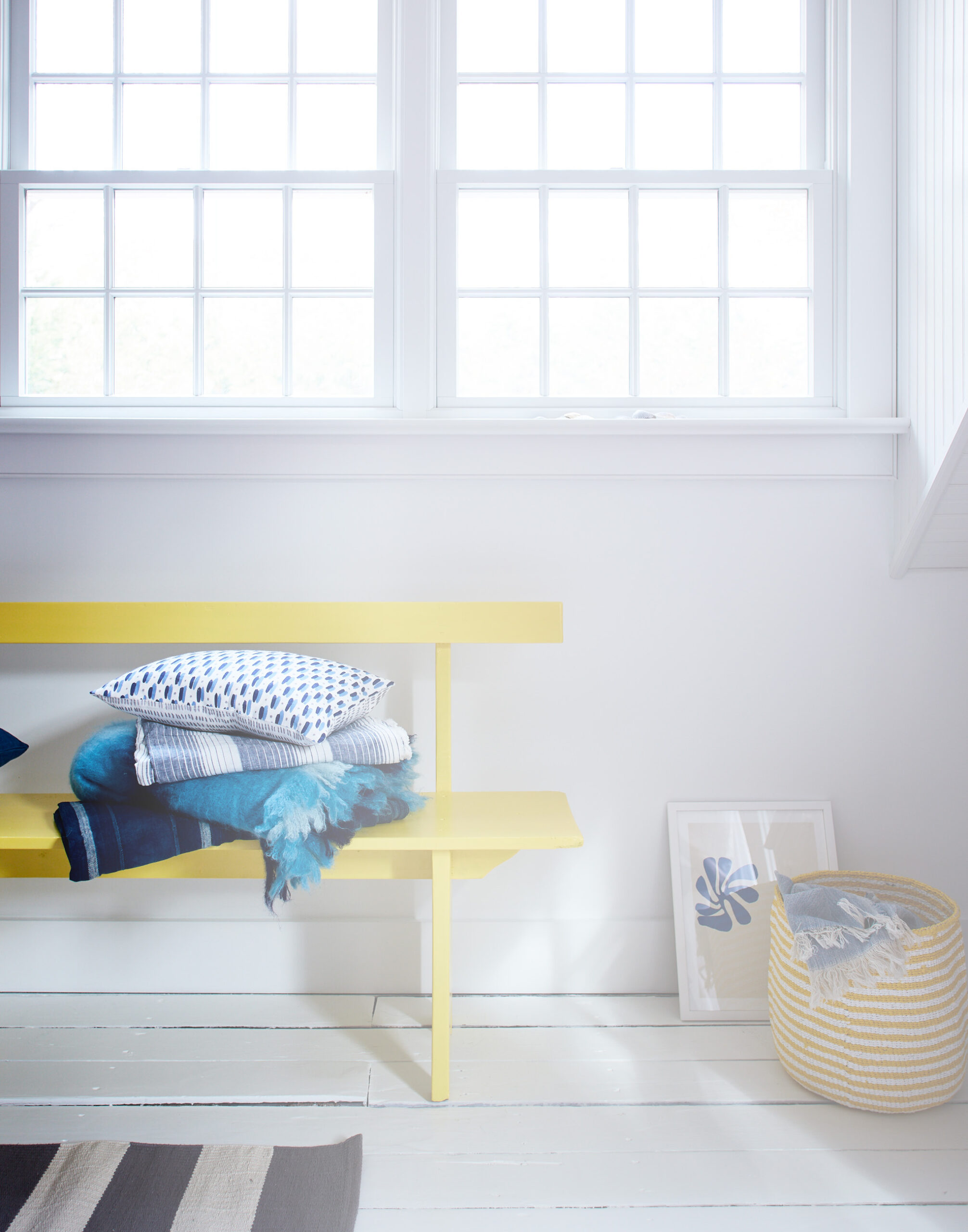
When you think of a joyful home, what do you see?
Learn how to turn any space into a sanctuary with our proven, step-by-step method. Design a Home You Love includes everything you need to create a living space that reflects your unique style and enhances your daily life — no renovation, big budget, or design degree required.
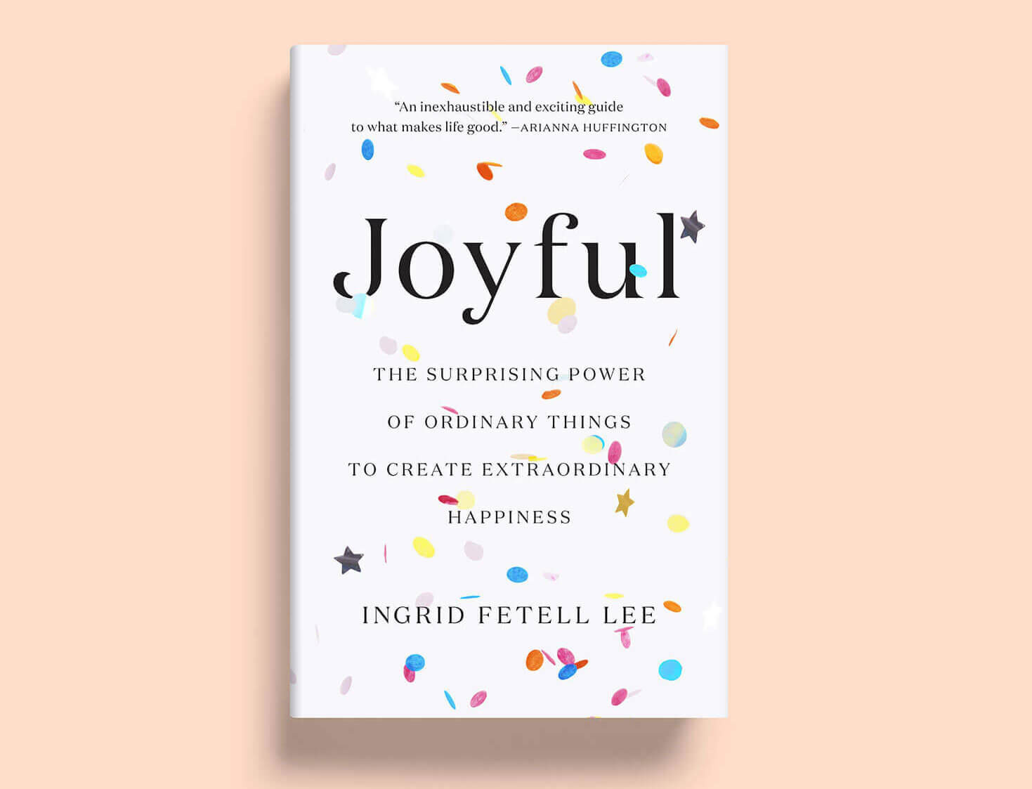
“This book has the power to change everything! Writing with depth, wit, and insight, Ingrid Fetell Lee shares all you need to know in order to create external environments that give rise to inner joy.”
- Susan Cain, Author of Quiet and Founder of Quiet Revolution

Follow us @aestheticsofjoy on Instagram. Don’t forget to tag your photos with #joyspotting when inspiration strikes.
Our free workbook has 5 simple strategies that will make life better right now.
You'll also receive periodic updates on new things from The Aesthetics of Joy. We respect your privacy. Unsubscribe at any time.