The science behind the “unexpected red theory”

If you’ve been online at all lately, you’ve probably heard about the “unexpected red theory.” This phenomenon was coined by a TikTokker, and it basically says that adding any amount of red to a room where it doesn’t belong automatically makes the room look more pulled together.
Since the theory was introduced, countless videos have been added where people have examined aspirational images of homes and found a pop of red was included, perhaps in a lampshade, a side chair, or a picture frame.
Of course, I love any trend that advocates for adding more color to a space. And given that red is my favorite color, I’m especially enthusiastic about this one. But being science-minded, I wanted to dig into the research to understand whether there’s a real benefit to “unexpected red.”
The Science Behind the Unexpected Red Theory
Why would adding red to a space change the way it feels?
One theory is that as our spaces have become stripped of color due to the minimalist trend that held sway up until a few years ago, the intensity of red helps counterbalance all that blandness. We know from research that saturated colors prompt a physiological response called arousal, which heightens energy and attention. It’s not surprising then that a cross-cultural study of work environments found that people working in more colorful offices are more alert, confident, and friendly than people working in drab spaces. Even a small pop of a bright color breaks the monotony of a greige interior and makes it feel fresh and alive.
But does that mean that any bright color would work the same way? Should we brace ourselves for the “unexpected blue theory” or “unexpected purple theory” next?
Well, not exactly. It turns out that red has some specific qualities that make it unique in the way it influences our mindset and behavior. Let’s take a look at what makes red so special.
Red Focuses Our Attention
Though red is not the most visible color (that honor belongs to a bright yellow-green), it is the color best at attracting our attention. Stop signs and stop lights are red, as are fire engines and the flashing lights of emergency vehicles. Red often serves as a “watch out” signal, whether literally or metaphorically (”red flag” for example). In studies, red has been shown to capture and hold attention in emotional situations better than other colors.
Why does red put us on high alert? One reason might be that red is the color of blood, and seeing blood suggests danger, which snaps us to attention. Red also plays a role in social signaling. Certain emotions, such as anger or embarrassment, cause blood to rush into the face. (We even say we’re “seeing red” when angry.) A flushed face might be a sign of someone to be more cautious around.
But red doesn’t always signal a threat. Sometimes it connotes opportunity. Red is that it is the complementary color of green, so it stands out best in natural landscapes. In fact, many evolutionary biologists believe that our color vision evolved in large part to help our primate ancestors find ripe fruits and young leaves (which naturally appear red) among the green leaves of the treetop canopy.
So perhaps “unexpected red” in a home functions more like seeing a bowl of ripe cherries than a cut to the finger: a bright and exciting burst of joy.

Red Is Exciting on a Physical Level
In addition to attracting our attention, red affects us on a physiological level. Studies have found that exposure to red light increases blood pressure, respiratory rate, skin conductance, and eye blinking, all measures of an increase in what psychologists call arousal, a physiological measure of excitement. Red also increases the speed and force of our physical responses. And red is explicitly associated with terms like “stimulating,” “exciting,” and “warmth.”
When we’re in a high arousal state, we’re more alert and more attuned to information coming in from our senses, which can be pleasant or unpleasant depending on the content. In a beautifully designed interior, it makes sense that “unexpected red” would feel more exciting than agitating.
On a less joyful note, red is also associated with inflammation. It turns out that when researchers used virtual reality to make a subject’s arm as if red light was shining on it, their pain threshold lowered compared to other colors. So maybe for now we should keep “unexpected red” out of hospitals and healthcare spaces.

Red is Associated with Dominance and Power
In many cultures, red is associated with power and high social status. In several ancient societies, red was used in body decoration and jewelry to signify high status. And among certain species of animals, red markings indicate a dominant position in the hierarchy. For example, among mandrill monkeys, males with the reddest coloration on their faces and bottoms are at the top of the heap. These markings help other, lower status monkeys understand their place in the order.
This effect has been shown to translate to competitive sports. Researchers analyzed the performance of contestants in four sports at the 2004 Olympic games who were randomly assigned to red or blue uniforms and found red contestants were significantly more likely to win. Out of 21 rounds, 16 saw more red winners than blue. Only four rounds had more blue winners.
Subsequent research suggests that this effect is likely due to bias on the part of the referee, perhaps because the referees see the players in red as more dominant. (Other research has shown that referees may penalize teams who wear black, viewing them as more aggressive.)
In another study, researchers found that gambling with red poker chips makes players feel more dominant, and makes them more intimidating to others. This translated to more aggressive playing behavior.
Perhaps on some level, seeing a flash of red in our environment makes us feel more powerful or confident.
Red Increases Attractiveness
Multiple studies have shown that wearing red makes both women and men seem more sexually attractive to a potential partner. (For more insight into how the colors of your clothes influence you and others, see this post.) And red is more broadly associated with romantic love and attraction. Red is the color of hearts, Valentine’s Day, and the roses that most typically signify “I’m into you.”
Coupled with red’s effect on physiological arousal, it seems that red primes us to be in the mood for love. Though most studies of red in this context relate to wearing red, it’s possible that “unexpected red” in an environment such as a bedroom or hotel room might subtly unlock our more sensual side. (Worth a try, anyway!)
Red Makes Things Taste Sweeter
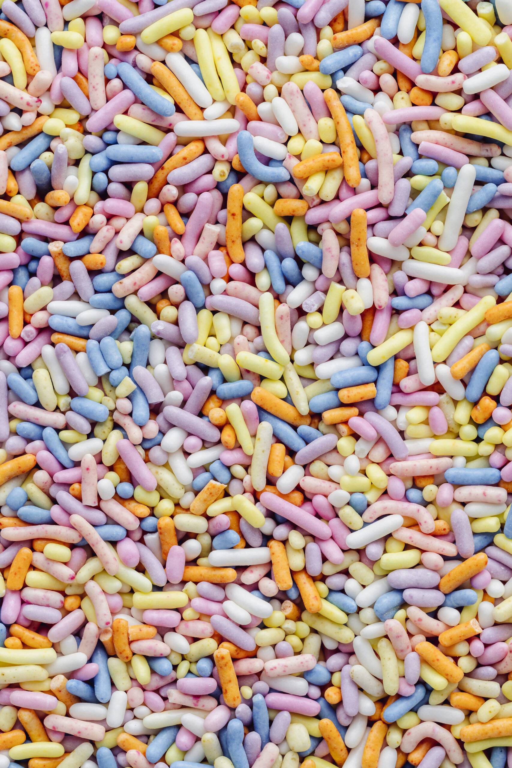
Red can influence the way we feel, sure, but did you know it also affects how things taste? In studies, the same liquid is commonly perceived as sweeter when it’s colored red than when it’s colored green. Drinking out a red container can have the same effect (perhaps explaining the ubiquity of those red Solo cups at parties).
Researchers are divided as to whether the association is learned (from having sweet candies like cherry colored red, and sour lime ones colored green) or innate (many fruits tend to move from green to red as they ripen), but perhaps a little of both is at play. Regardless, red is a sweet color and adding a little to your space certainly won’t hit a sour note.

Red trim wouldn’t be the obvious choice for the shade in this mint-and-orange nursery by Lonika Chande, but it works.
Don’t Underestimate the Power of Surprise
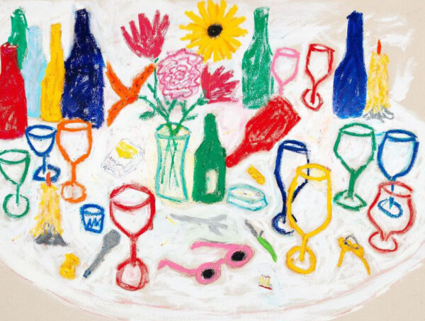
Of course, the other essential part of the “unexpected red theory” is the unexpected — the element of surprise. “Unexpected red” isn’t just about putting a ton of red in a space. The idea is that it really isn’t core to the design, but may even clash or distract a little bit.
This aligns with my research on the surprise aesthetic (ch 6 in Joyful), which shows that having an unexpected element in a space can add a significant boost of joy. Surprise disrupts our expectations and breaks the monotony of a space we inhabit day in and day out.
Perhaps because red is a color we often shy away from in decor because of its intensity, a little “unexpected red” goes a long way in making a space feel vibrant, unique, and alive.
How to incorporate “unexpected red” into your decor
If you’re inspired to try adding some “unexpected red” into your space, here are some ways to do it:
- Frame a piece of art in red
- Use red piping or trim on a cushion or shade
- Paint a door or door frame in red
- Add a red shade to a lamp
- Drape a red throw over a sofa
- Paint your kitchen island red to contrast with your cabinets
- Add a red side table or nightstand
Have you tried the “unexpected red theory” in your space? How has it worked for you?
Sources
Buechner and Maier, 2016
Elliot and Aarts, 2011
Femke et al 2012
Frank and Gilovich, 1988
Fetterman et al, 2012
Hagemann et al, 2008
Hill and Barton, 2005
Kayser et al, 2010
Kuller et al, 2006
Kuniecki, Pilarczyk, and Wichary, 2015
Lehmann et al, 2018
Martini et al 2013
Osorio and Vorobyev, 2005
Pazda et al, 2021
Discussion (11 Comments)
This is funny – everytime i moved in the last 20 years, i thought of designing a space in white, grey and wood. And never i ended up doing it. Rather I bought colored items – a used stool in red, a fridge in red, a colorful kelim for my living room …i have painted walls in mint and green, decoration in bluegreen and redish orange ….. i love blue and orange next to one another!
And since i read your book i am sure that i just physically and psychologically need color in my life! I tend to be depressed sometimes, so maybe it is necessary for me to get activation and joy from outside through my surroundings.
Loved this post! And your book!
Thanks for red color post
Does blue clothing calm us and calms or influences relationships connection ?
Great article. I was thinking of ways I could put unexpected red into the room I’m in, then realized I’m sitting in a big red plush chair! Ha!
Love this. I think of it as something rare in nature, which is mostly blue, green and browns. Red would be rare, a flower. And in design anything that doesn’t look to planned, a bit off, makes a space feel organic, not planned and therefore inherently more comfortable. Bright yellow is my favorite unexpected color. It’s such a joy, pure sunshine to brighten the mood.
Just purchased my first home at age 61. I operate on the slow decorating theory. Ideas that percolate seem to have more staying power. The first accessory I knew I wanted for the light-oak and beige-furniture kitchen sitting area was a mainly scarlet Navajo saddle blanket to cover the loveseat. It makes the space.
Wonderful article!
Red is also an important color in Feng shui, with emphasis on placement in the home. Something red at the entrance to the home and in the left corner of each room is thought to invite prosperity.
My kitchen stools are in need of recovering and it’s a great opportunity to change the color. I have been contemplating what color to change them to and hadn’t decided on anything till reading this. I think they’d be amazing in red.
Also couldn’t help but think of Star Trek and the red shirts. The red shirts were always the crew members who ended up dying on an away mission – makes sense. They were the ones attracting the most attention 🙂
This is fascinating! I write a wellbeing newsletter for healthcare workers, and I’m wondering how color could improve their mood and joy. Message received that red is probably not a good idea for them! Do you have any other suggestions?
This was so interesting. I have never been a fan of red in interiors though! I don’t have any red, not even clothing now that I think of it, I think it’s my least favourite colour. I unintentionally have pops of yellow everywhere in my house though so I think this is my unexpected joy colour. My mum has red pops in her house everywhere (red dutch oven, red pillows, red plates, even red sheets which I hate and i don’t think red is restful for sleep environment!) and i always think gosh, this would look so much nicer in another colour, haha. Personal taste i guess!
Me too Heather! I love yellow! Ingrid did a post a little while back saying that blue was the rarest colour in nature, which I thought was very interesting and I would never have guessed it!
I love this, I’ve been percolating ideas for my beige and brown lounge for too long! I want to go grey with a splash of red by my family were horrified at the idea so I haven’t decorated yet.
My Dad always claimed to have more accidents in the one red car he owned that the other colours (navy, blue, grey) put together! Did he anger people when he was driving it, or just distract them?