color
Does Dopamine Decor Really Work?
The science behind the “unexpected red theory”
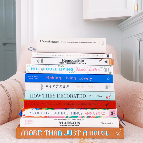
14 Essential Books for Home Design Inspiration
16 Multicolor Nail Ideas to Inspire Your Next Manicure
What To Do When Your House Doesn’t Feel Like Home
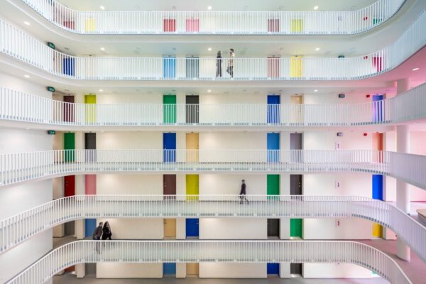
15 Beautiful Public Housing Developments From Around the World
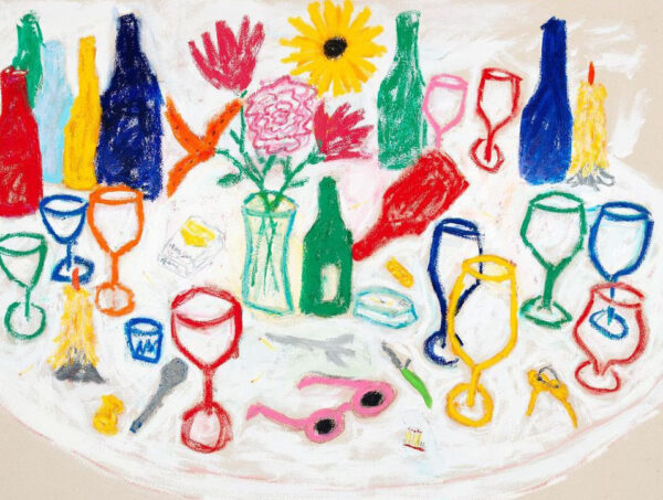
Colorful Still Life Artists to Follow on Instagram
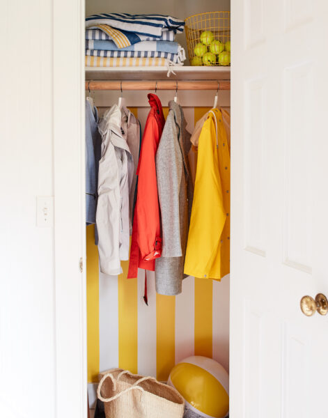
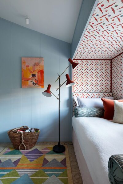
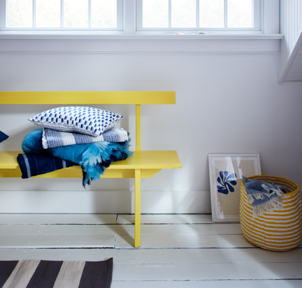
How to Add Pops of Color to Your Home on a Budget
How To Conquer Your Fear of Color
Find more joy every day
Our free workbook has 5 simple strategies that will make life better right now.
You'll also receive periodic updates on new things from The Aesthetics of Joy. We respect your privacy. Unsubscribe at any time.