Joymaker: Naomi London, visual artist

19 January 2012

Jamwall001

Joymaker is a new series spotlighting people who seek to create joy in their work.

It takes a kind of joyful madness to hand-apply 100 lbs. of raspberry jam to a gallery wall. And that’s exactly what attracted me to the work of Naomi London, a visual artist based in Montreal, who tries to bring a voice for joy and play to contemporary art. London uses joyful forms, visual metaphors, and textures (such as polka dots) to give her audience a sense of delight.

I’m fascinated by the shiny, sticky surface of this enormous red wall. While a red wall might typically take on a violent or alarming quality, the material makes it totally disarming, even childlike. I wonder if it stayed sticky throughout the installation, and slightly fluid, shifting its mottles in a slow gravitational creep towards the floor. Or whether it stayed firm, drying like a giant fruit roll-up. I didn’t ask Naomi these silly questions, but I did ask her some others:

How do you want people to feel when they engage with your work?

I’m very interested in the notion of play in art. I’m hoping that when people see the Jam Wall they can appreciate the unexpected beauty of the colour, as well as the playful absurdity of using this material.

Can you talk more about this connection between joy and absurdity?

I associate absurdity very much with play, and play is joyful. Other connections include humour in the absurd, e.g. the odd rhymes and tongue twisters of several early Dr. Seuss books. I find that there is pleasure in being in a ‘non-logical place’ in your head, which is how I think of the absurd. It’s about the unexpected, fun, and delight that can be felt when exploring things that deliberately don’t make logical sense, but are full of wonder and joy. There is an importance in the purposelessness of the absurd, which is something that makes is joyful (to me) and thus also linked to play.

Jam wall installing

Jam wall sample

What is the role of joy in your work?

I think that joy, beauty, humour and play have been underrepresented in contemporary art over the last few decades. I’ve been interested in trying to address joy and happiness in my work for past ten years or so. I’m currently working on a sculpture installation project in homage to my mother, (who died just over two years ago). Even though it is a memorial work of sorts, I hope that it still somehow evokes a sense of joy.

I’m making a series of balls which are made exclusively out of fabric inherited from my mom. (She was a talented seamstress and made almost all my clothes during my childhood.)

What one object most symbolizes joy to you?

I think I’m torn between seeing the first tulips in early Spring and my favorite large white mixing bowl that I use when I bake a cake.

What’s inspiring you right now?

Colour, and the unexpected use of saturated colour: chartreuse yellow + green, fire engine red, brilliant orange.

What other designers, artists, or creators should Aesthetics of Joy readers know about?

There is an interesting website run by a researcher/academic in Rotterdam:  The World Database of Happiness. The layout of the site is dry aesthetically but I think that its wonderful that the subject of happiness is being studied in this way.

I like the work of Franz West very much. Another artist whose work I really like is Ana Rewakowicz.

You can see more of Naomi’s work here. (In particular, make sure to check out Polka Dot Wall, a site-specific installation I find very joyful.) Images courtesy of Naomi London.

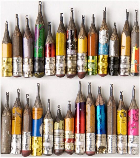
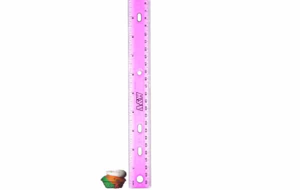
Joyspotting 2: little, simple, wonderful

18 December 2011

Extraordinary art on pencil tips by dalton ghetti

In the busyness of the holidays, sometimes it’s hard to find time to stop, breathe, and take note of joyful moments. Slow down for a minute with some tiny things:

Artist Dalton Ghetti carved this amazing alphabet on pencils. Odd but lovely. {via Odd Stuff Magazine}

Many small pleasures beat a few larger ones. (More reason to indulge in tiny sweets!)

Bees have feelings, too. New research in Scientific American suggests these remarkable little insects have an emotional life.

Silly little art project, low-fi and delightful: Single Lane Superhighway. Go draw a car. It makes you feel a part of something. {via @alexandrapulver}

“It was like finding little gems.” Photographer David Liitschwager captured all the living creatures within a cubic foot in a variety of different climates to draw attention to the abundance of denizens of a swath of habitat that “could fit in your lap.” National Geographic. {via The Guardian}

Stay sane this pre-holiday week. Try not to rush through, but find the beauty in the craziness, and savor it!

Joy in the news: Small wonders

26 October 2011

26ALTSMALL SPAN articleLarge

Last week I was interviewed for this great piece on the trend towards “tiny sweets” by New York Times writer Julia Moskin. In the article I try to demystify why it is we’re attracted to mini-canolis or Baked by Melissa cupcakes (above) and talk about the “Alice in Wonderland effect,” where big changes in the scale of objects around us, either tiny or huge, make us reconsider our scale in relation to the world in a joyful way.

For more, check out past posts on tiny sweets, giant sweets, and the joy of miniaturization.

NYT: “Small Wonders”
Image: Tony Cenicola/New York Times

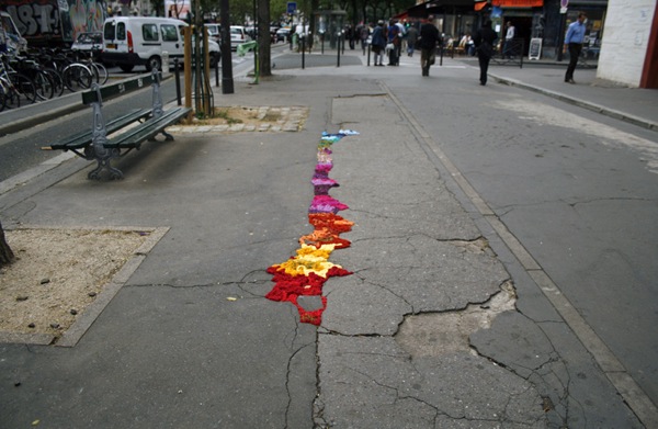
Color in the crevices
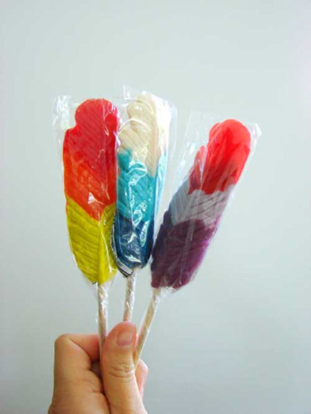
25 October 2011

Color doesn’t have to be poured out by the gallon to create a sense of joy. In fact, it’s often better in small doses, as in these works by Ethan Greenbaum. When people say “good fences make good neighbors,” maybe this is what they have in mind.

There’s also a human equivalent. I’ve featured in the past the kooky performance art of Companie Willi Dorner, a troupe of artists who wear brightly colored clothes and then squeeze themselves into tight urban spaces. I recently came across these images, which I hadn’t seen before, of a performance they did in New York last year.

OB KE584 0926bo J 20100926154404

OB KE583 0926bo J 20100926154402

OB KE599 0926bo J 20100926154415

Against a field of grey, color means more. It is a spark of something that has its own energy, something dynamic that has the potential to erupt, to bring more color. As Johannes Itten, father of contemporary color theory, put it: “Color is life: for a world without colors appears to us as dead.” Color, even in tiny doses, signals a desire for life.

Images: Ethan Greenbaum via the artist. Companie Willi Dorner via WSJ.

Lollipop law

18 August 2011

What do lollipops have to do with keeping the peace? Surprisingly, more than a little. A recent initiative by a city council in the city of Victoria in British Columbia offered free lollipops to drunken revelers leaving bars to cut down on noise and violence after a night out. Councillor Charlayne Thornton-Joe explained that the treats make it hard for inebriated partiers to be too loud, and that they minimize dialogue that could lead to brawls. More practically speaking, they also regulate blood sugar and, like pacifiers, have a calming effect.

While there’s no hard evidence that the lollipops worked, councillor Thornton-Joe says that it seemed to be so effective that the city is considering making it a permanent program. It’s a charming idea – that something so childlike and innocent could disarm a rowdy bunch. And it makes for a joyful image, to imagine adults appeased by candies on sticks.

This is aesthetics of joy at their beguiling best. Sugar, color, and a form that evokes nostalgia for childhood – these things have real power. Contrary to so much of what we are taught, they are not just styling or superficial extras. They are phrases in the language with which our stuff speaks to us, quietly shaping our desires and our behavior. It’s a joy to see them applied in a such a novel way, and for such playful problem-solving. I hope to see this idea take off in other places too.

Photo: Beautiful feather lollipops by Abbey Hendrickson of Aesthetic Outburst, via Pinterest
NPR: “Lollipops: Pacifiers for Bar Patrons?” 

Joyful sidewalks, joyful cities

3 May 2011

Yarn01

They look almost like brightly colored mosses, don’t they? Like some new form of street lichen. Or a kind of chromatic filling compound. A rainbow grout.

This set of sculptures by artist Juliana Santacruz Herrera is a particularly striking example of yarnbombing, a form of knit or crochet-based street art that frequently reacts to the urban environment. In Herrera’s case, this means applying braided fabric in looped forms to cracks in the sidewalks of Paris. Like the pothole gardens and lego repairs I’ve written about in past posts, Herrera’s works use delight to call attention to the breakdown of infrastructure in the city. Like other yarnbombing projects, they work with maximal contrast – in color, contour, density, and texture – to catch our eyes and make us take notice. While they don’t actually fix the problems they’re addressing, it’s possible that inducing this kind of positive affect makes people more inclined to act to change their environments. More than an angry letter or a protest, these works create a desire to share with others, creating a kind of social momentum.

Herrera’s works are one more example of a phenomenon I call joyful repair – the act of mending or calling attention to a damaged element of the environment using color, texture, playful gestures, and other aesthetics of joy. It’s a form of joyful activism, which tries to bring about change through positive emotion, and it’s one of my very favorite applications of aesthetics of joy.

Yarn04

Yarn03

Yarn02

Yarn05

Yarn07

Yarn08

Yarn09

Here’s another example I’ve had in my files for awhile. Working at a slightly smaller scale, London artist Ben Wilson uses chewing gum splotches as a canvas for tiny, brightly colored sidewalk art. Wilson has been creating the paintings since 1998, and estimates he’s made over 10,000 of the little works! Interestingly, not long after he began his gum-painting endeavors, people began making requests for particular designs, often commemorative. So what began as litter has become an odd little system of tribute, like plaques on park benches or in front of newly planted trees. People want to be associated with something they feel good about, and with a little color and charm, that even could be improperly discarded chewing gum. The sidewalk at first seems an unusually mundane place for this sort of personal connection, but maybe not. After all, the sidewalk is the most intimate of transitory spaces in a community, the backdrop for so many of our daily dramas and spontaneous joys. Filling its holes, reclaiming its blemishes – in some way these are a deeply integral form of reconstruction.

Chewing Gum Art by Ben Wilson

Ben Wilson

Chewing gum art by ben wilson 7

There’s something else here, too. Projects like this are a signal that someone cares about a place, that the condition of that environment matters to someone. Someone is paying attention to the details. To make something beautiful is to invest time and energy in it, and these two are the most valuable, limited resources we have. We perceive this signal of caring and passion, often unconsciously, and we typically follow in kind. We read our landscape for cues about how to treat it, we draw inferences about the inhabitants, and we subtly alter our behavior to maintain this condition – or enhance it. These aesthetic signals often become a discourse of community, a conversation between the denizens of a place that leads, via a subtle form of one-upmanship, to the organic growth and improvement of our favorite places to call home. Alain de Botton has written (I’m paraphrasing here) that one of architecture’s purposes is to inspire us to be better people, and I would say the same for any of these urban interventions. We see improvements, and they unconsciously motivate us to improve ourselves.

Favela painting 1

Joyful repair projects can serve as jumpstarts for this process. This project, though not new, is a great example of this principle applied over a large scale. Called “Favela Painting,” this brightly colored village is the work of Dutch artists Jeroen Koolhaas and Dre Urhahn. Working in a slum outside Rio, their goal is to use art “as a tool to inspire, create beauty, combat prejudice, and attract attention.” The care and passion embodied by the murals effectively transforms the favela from outside in. Some really thoughtful words about the effects of this project, on the Magical Urbanism site:

‘Favela painting’ affects the aesthetic order of how favelas are perceived from within and outside its natural embryonic growth. Colour brings hope. It brings a different understanding of space and its people, inviting others to co-create and co-represent much more constructively and positively life here. It appeals to our senses in a way that we do not reject but embrace these places and the potential for better life. It articulates a different discourse of social change; of engagement, contributing to improve life for favela dwellers.

It’s hard to say it any more succinctly than “color brings hope.” It suggests energy, and as such it has an uplifting and an attractive power. It’s a harbinger of better things to come. As I think about the phenomenon of joyful repair, I’m reminded of the root of the word repair, the Latin parare, “to make ready.” By repairing things, we are making them ready again. By repairing them joyfully, we’re making them ready for wonderful things to happen in the future.

Favela painting 2

Favela painting 3

Favela painting 4

Images: Juliana Santacruz Herrera on Flickr via designboom; Ben Wilson via Inhabitat; Favela Painting via The Fox Is Black.

{Thank you Maggie and BD}

The joy of implausible possibility

9 October 2010

How many times have you walked past an old abandoned building and thought: that would be a great place for a bar/library/gallery/fill-in-the-blank? On runs through Red Hook and along the Gowanus Canal, I often find myself struck by certain wabi sabi looking warehouses and industrial buildings and thinking about the wonderful kinds of “third places” that could inhabit them. Abandoned buildings are evocative substrates for this kind of architectural daydreaming — like discarded hermit crab shells, they have both history and possibility.

I love the way this idea, The Hypothetical Development Project, takes those germs of imagined futures and makes them visible. The project, a public art collaboration between Rob Walker, Ellen Susan, and G.K. Darby, creates renderings of ideas for uses of abandoned buildings in New Orleans, which will be posted at the sites like developers’ renderings. In this case, though, the envisioned uses are a bit left of center. A Museum of the Self, with an enormous Facebook-style thumbs up is one; a Loitering Centre is another. Juxtaposed against the forlorn emptiness of abandoned structures, these silly fantasies feel delightful — they are uninhibited manifestations of creative energy, filtered through a lens of hope.

That they are implausible is their charm, but I half-h0pe that one of them will be compelling enough to stick. The trio is raising funds via Kickstarter (they’re very close to their goal, and just need a little help getting over the line!), and I imagine a sequel where popular passion for one of the Hypothetical Development ideas becomes the seed for a real, crowdsourced development project. I feel like we need more unconventional spaces for people to convene in our urban environments, and it’s exciting to think about how fiction can find new possibilities in old structures. In effect, these renderings are like playful narrative prototypes, highlighting new ways and places to gather in the years to come.

The Hypothetical Development Project home page
Hypothetical Development Kickstarter campaign

The joy of jumping on the bed

4 April 2010

Yes, that is Desmond Tutu in the midst of all those children jumping on a bed! For a project called Play Jump Eat, Kelly Wainwright of Messy Monkey Arts managed to coax not just the Reverend Archbishop, but also fishermen, surfers, schoolkids, and others to let go of their inhibitions and be photographed in odd situations, bed-jumping.

Jumping on the bed is an example of a joyful pleasure at its most democratic: an activity that is accessible to nearly everyone. It’s a childish pleasure, one we associate with being small in the expanse of our parents’ beds, but it can be rediscovered at any time. (Confession: I sometimes can’t resist a jump or two in a hotel room.) There’s just something so totally liberating about jumping; it’s a slightly transgressive, freeing feeling that brings laughter and optimism up to the surface. Even just looking at these photos evokes a vicarious burst of delight!

I hope the full series will eventually be posted online. Read more about the project here.

{Via @vpostrel}

Update: Kelly pointed out to me that prints are available here and that a portion of the proceeds benefit the Tertia Kindo Arts Project, a children’s dance school. The comments also made me realize that I failed to credit Inge Prins, the photographer on the project. Lovely work!

Happy housewares

28 January 2010

I’m loving these new offerings from the brilliant duo behind quirky housewares company Alice Supply Co. The new nautical color scheme gives the plungers a kind of Dr. Seussian vibe — like the long tail of the Cat in the Hat. The ping-pong paddles are particularly inspired to me. While they don’t fall under the core mandate of housewares, they’re a natural opportunity to add joy to the mundane through color and pattern. Somehow, dressed in stripes, these paddles seem like they should always have looked that way.

Personally, though, the items I’m most coveting are the hammers. If I had a hammer like these, everything would be a nail!

Joyspotting: magenta hair

11 January 2010

pink_hair

Yes, the Georgia O’Keefe show at the Whitney was joyful, but this magenta-haired lady in the lobby stole the spotlight this weekend. Pink hair on a teenager is ho-hum, but the same shocking hue on a more mature subject is a delightful surprise.

I just hope when I get older I have similar confidence to not always act my age!