I used to have this pair of pants that I absolutely loved. I think I got them my first year out of college, and to be honest, they didn’t look that great on me. They were blue and white seersucker in a wide-legged cut and they were a bit too long, making me look a bit like an awkward sailor wearing hand-me-downs. And they weren’t actually that comfortable. They were a little tight in the hips in a way that made me feel like if I wasn’t quite careful, I might split them right down the center.
Oh, but I loved those pants. Why? Because inside the waistband they had this little strip of yellow piping, along with a floral lining. The yellow was inside the pockets too. Every time I went to put them on, I felt this intense burst of joy. So much so that even after I’d stopped wearing them, I still couldn’t bring myself to get rid of them — for years. I still think about them!
The designer of those pants understood something powerful about joy: small moments matter a whole lot, sometimes more than the overall experience. A tiny pop of color in an unexpected place can have disproportionate impact. It catches our attention, focuses it, and casts a halo effect on its surroundings, making a run-of-the-mill object or place feel more considered and special. And when it’s hidden, like the yellow lining on my trousers, it creates a feeling of having a joyful secret, one that you get to rediscover again and again.
With this in mind, I’ve been collecting some ideas for unexpected ways to use color at home, in products, and other items. What I love about these is that they offer an easy way to take a big risk with color, because they only require small doses of a shade. So if you’re not confident yet with color, or you’re afraid of committing to a particular hue, you don’t have to worry. It’s easy enough to redo any of these if you don’t like the results.
Give your art a colorful frame
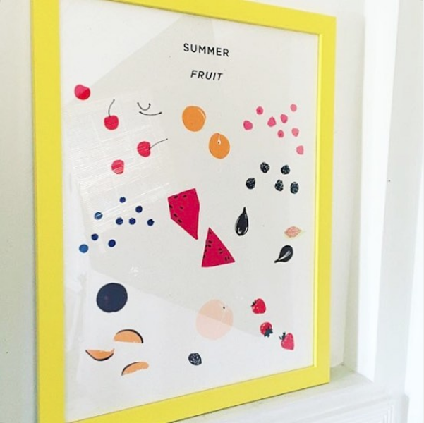
So often I look at gallery walls, and the frames are all black, white, and wood, with maybe a silver or gold one mixed in. But art gets such a lift from a colorful frame! I first got the idea to do this after seeing an image of Plant Planet’s Summer Fruits print framed in joyous yellow. In the past I might have worried that a colorful frame would overshadow the work but seeing it here I realized the bright color makes the print even more magnetic.
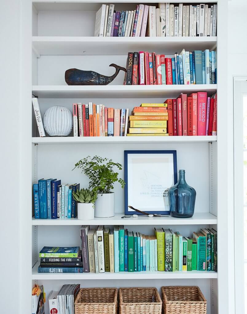
Since then, I’ve experimented with yellow, blue, and green frames, and have been consistently happy with the results. (A blue example in my bookshelves above, photographed by Johnny Miller for Real Simple.) Not every piece wants a bright frame, of course. You’ll want to go to a framer who has lots of samples and try them alongside the piece to see. If you’re looking for a place to start, I find this approach works especially well with black and white art, making it feel a bit less serious.
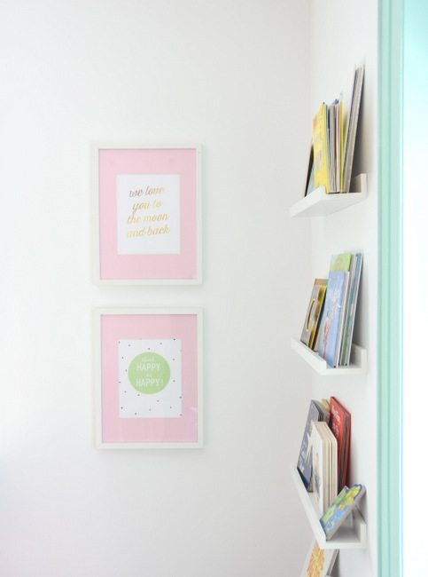
A similar, more subtle approach is to use colorful mats with a neutral frame, like these pink ones by Gemma of The Sweetest Digs. Believe it or not, these are IKEA Ribba frames and she just painted the mats. You can also cut your own mats from matboard you get at an art store. (Tutorial here.)
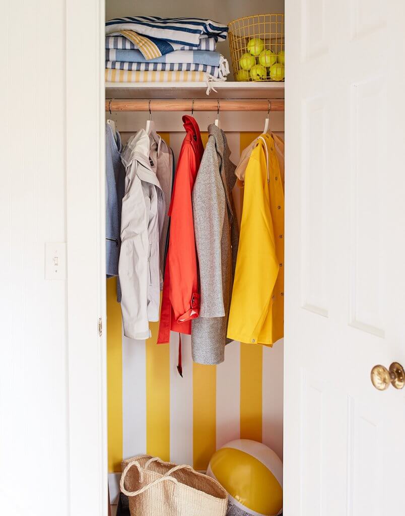
Hide color behind doors or in drawers
This approach uses the mechanism of “hide and reveal” to create a joyful surprise. I did this with my closet, painting big yellow cabana stripes on the back of it. I often forget about these when I’m distracted by other things, and get a burst of joy when I open the closet and remember they’re there!
Another example is this table salvaged and repainted by Zara Fina Stasi, which is plain white on the outside, but features drawers painted with vibrant designs. Zara writes that she was inspired by Joyful to do this makeover, which pretty much made my day!
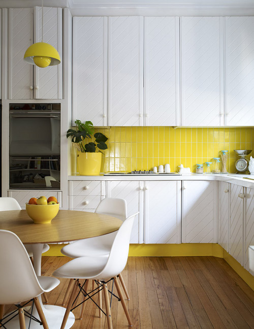
Use colorful tile
So often designers specify neutral tile in kitchens, so this yellow backsplash in Australian furniture designer Katie Graham’s kitchen is a refreshing change! She says that it is one of her favorite features of the home.
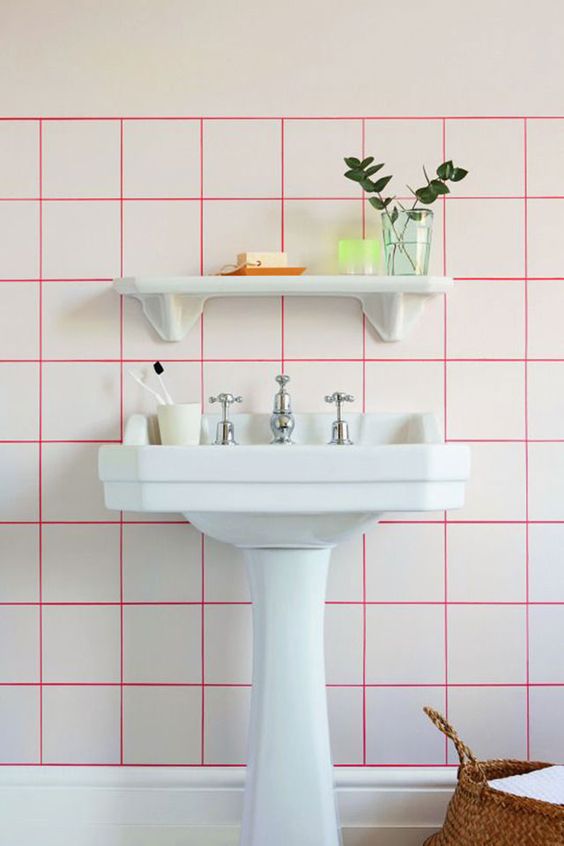
Another approach? Colored grout. It’s not as intense as colored tile, but it creates a subtle pattern that reminds me a little bit of graph paper. I love the effect of the hot pink grout in this bathroom by Milideas, which comes with a tutorial for how to do this in your own space.
Paint your trim
So often we paint our walls but leave the trim plain white. Trying the opposite approach is faster (so much less surface area to paint!) and is an easy way to give a room a real pop. I would totally have done this in our house if our trim was paintable.
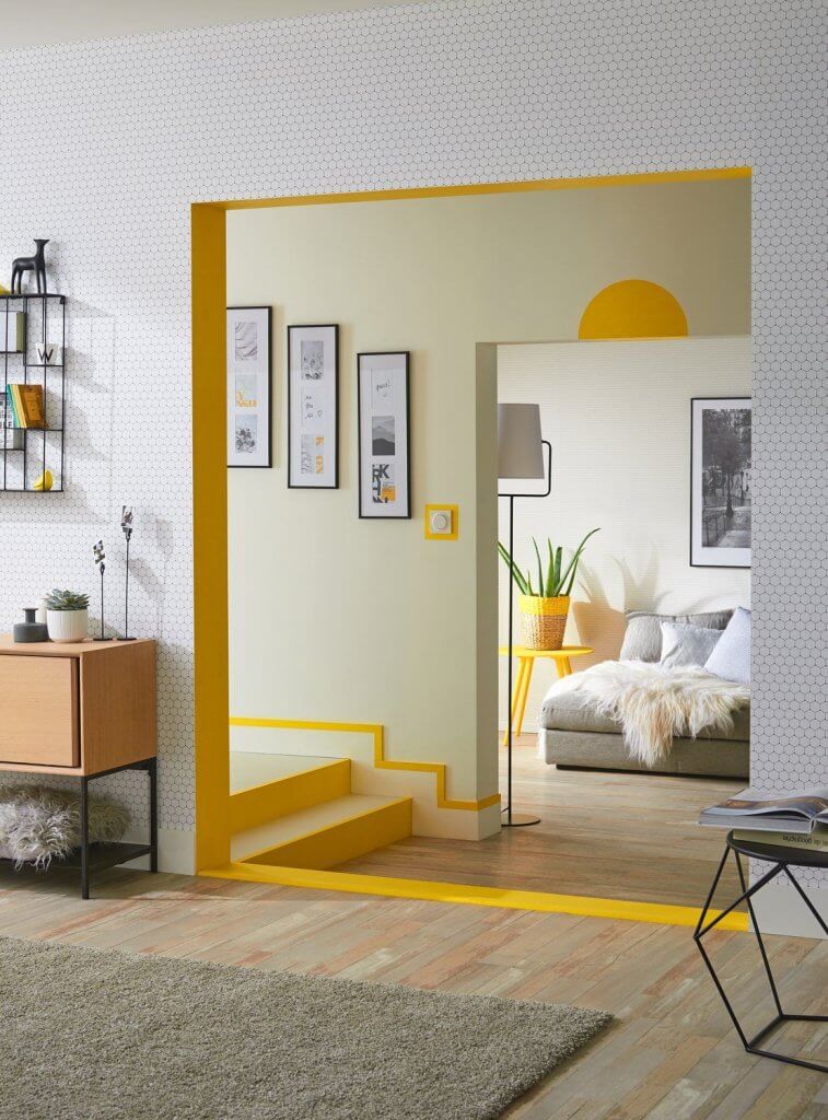
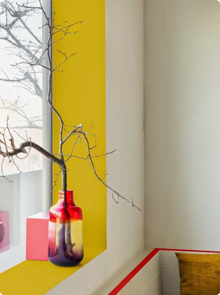
If like mine, your trim doesn’t lend itself to this option, you can also try painting a windowsill or doorframe, calling attention to an area that is often overlooked. I love how this example effectively creates trim where none exists, helping to define a space.
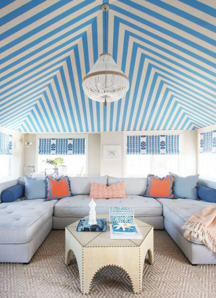
Paint your ceiling
Typically we paint our walls and leave our ceilings in boring old white, perhaps because of the conventional wisdom that white makes ceilings look higher. But putting a burst of color on the ceiling draws our attention up, changing our perspective on a room. This can be a really inexpensive way to call attention to great architectural features, such as beams or moldings, or add interest if your space lacks these features.

This striped ceiling, in a Jenny Wolf-designed beach house, just kills me. It’s like a very accessible circus tent and I’m definitely filing this idea away in case I have a chance to do something like it one day!
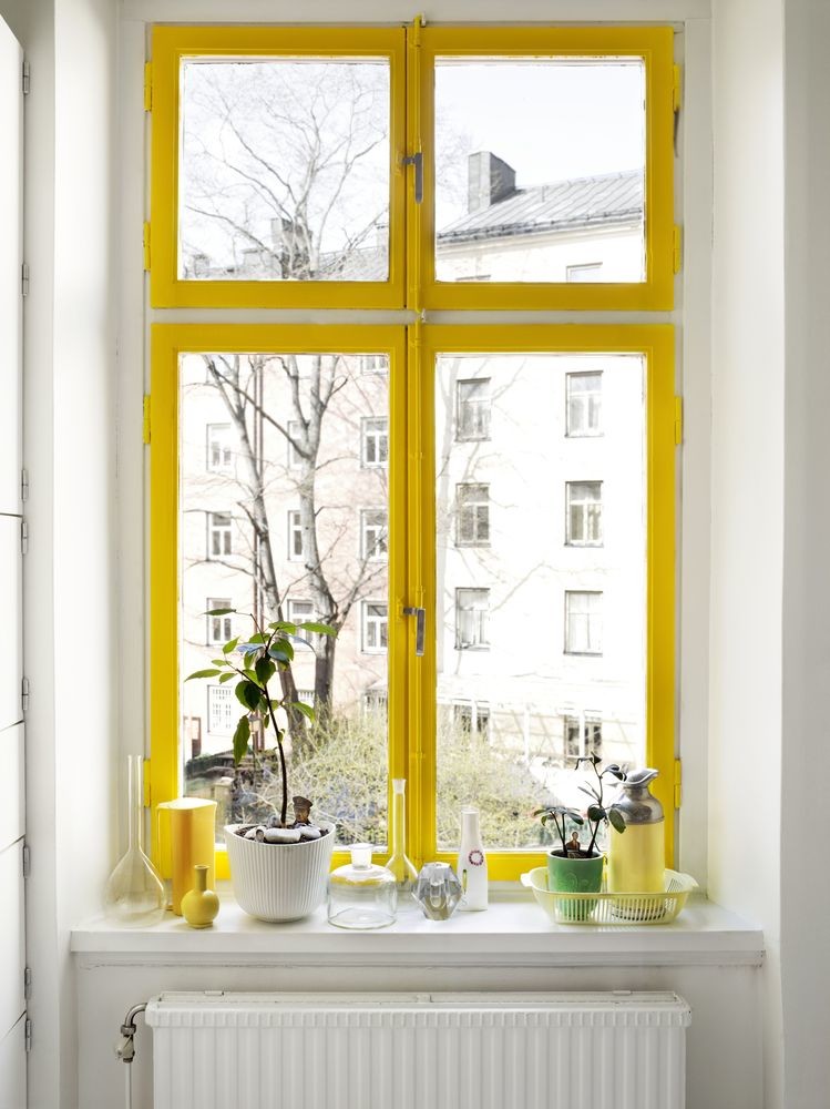
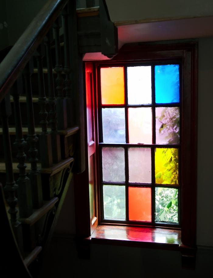
Tint your windows
Why should walls and ceilings have all the fun? I got inspired seeing these pictures of the colored glass window in Marianna Kennedy’s stairwell. Used sparingly, this can feel like a vibrant art installation rather than an homage to a cathedral.
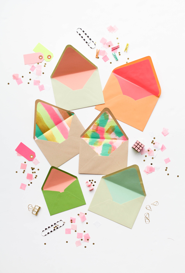
Embellish the inside of your envelopes
Envelope liners are a fun way to add a surprising pop of color to ordinary correspondence. This tutorial from Oh Happy Day! shows you how you can make your own.
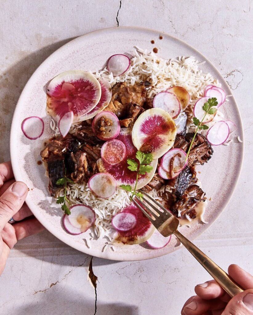
Choose fruits and veggies with surprises inside
I remember the first time I saw a blood orange. My dad had taken me to Italy to go skiing, and we were staying with friends in the Dolomites. They had blood oranges on their breakfast table and I remember looking at the orange peels and the deep red centers and thinking it was some sort of magic.
Lots of fruits and veggies do this: pink lemons, watermelon radishes, candy cane beets to name a few. Adding these to a salad or a crudité gives an ordinary plate a special, vibrant pop. For example, see Sarah Copeland’s gorgeous Braised Short Rib Supper with Radishes, from her new cookbook Every Day is Saturday.
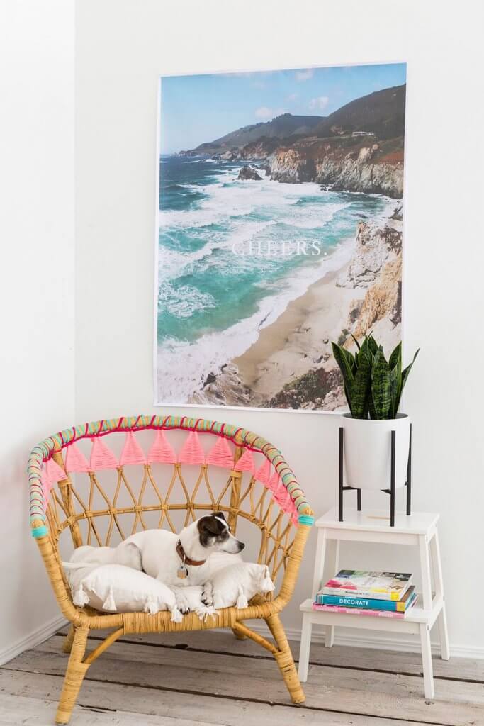
Weave color in
Another clever IKEA hack, this one from Brit + Co, showing how to use yarn to add a little bit of color to a basic chair.
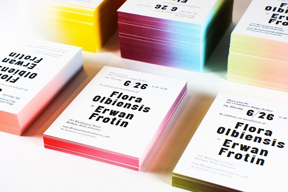
Paint the edges
This image of edge-painted postcards from Studio Lin has been in my inspiration files for a long time. The edges have the least surface area, so it’s easy to overlook them as an opportunity for color. But stacked, they reveal a joyful and surprising color pop.
I hope some of these ideas inspire you (even the chromophobes out there!) to look for new and surprising ways of bringing color into your life. And if they do, please share with me on Instagram @aestheticsofjoy or in the comments. I’m always so excited to see what you make and discover!
Images: 1, Direct Painting Group. 2, Lesley Arfin via Plant Planet. 3, Johnny Miller for Real Simple. 4, The Sweetest Digs. 5, Johnny Miller for Real Simple. 6, Zara Fina Stasi via Instagram. 7, Derek Swalwell via Design Sponge. 8, Milideas. 9, Tina Hellberg. 10, Levis Ambience via Apartment Therapy. 11, D. Gilbert for Disc Interiors. 12, Patrick Cline for Lonny Magazine. 13, Kristin Perers for Remodelista. 14, Oh Happy Day! 15, Sarah Copeland. 16, Brit + Co. 17, Studio Lin.

Discussion (14 Comments)
LOVE this! It’s amazing how much a subtle pop does for my mood. And I want to do that first photo with the yellow – OMG!!
I know, right? Hallway GOALS!
Your newsletters always make me so happy. I read it in the morning and am alert for the day. Thank you. Barbara
Thank you, Barbara! I’m so glad to hear it!!
After reading this newsletter, I am joy-filled. My JOY in my closet is Kevin the minion that is standing guard on a shelf. I smile and laugh when I see him.
Minions always make me smile. Pure joy!
I bought a teal colored puffer coat and the inside is a colorful tropical floral pattern. I am joyful every time I wear it especially when I walk by the sea in the winter. And I LOVE blood oranges!!!
Your coat sounds so joyful! Thanks for sharing!
I love the yellow window on this post!
Hello
What’s the name of the color paint used for the yellow stripes in your closet?
Thank you.
Hi Anouk, it’s Benjamin Moore Bold Yellow!
I can’t not comment on this post! this was the most touching text I read this month, a text about decoration, but so deep and sensitive, I felt joy just thinking about yellow pockets, I didn’t think I would feel that today, thank you, you are a wonderful writer.
You have moved me to design! thank you.
Hi! The room with the gorgeous coral ceiling and neutral walls – can you share the colors please?! L.O.V.E. – it’s literally glowing.