A simple way to feel more confident using color in your home
“I want to go bold with color but I’m afraid I’m going to make a mistake.”
“I made a mistake with color once and now I don’t trust myself.”
“I love color but I feel clueless about how to use it in my home.”
Every time I host the Joyful Home workshop series, I see tons of comments like these. And as a recovered chromophobe, I get it! Color can feel daunting, especially if you’ve mostly stayed with a neutral palette in your space.
As I was thinking about this, I came up with a simple way to approach color that makes it so much easier: choosing a color strategy. Unlike a color palette, which determines which colors you use in your home, a color strategy tells you how you use color. A color strategy helps you be more intentional about how you bring color into your space, so that it feels vibrant, rather than overwhelming. It also lets you tune the amount of color to your preferences, giving you guidance on how use color to create the feeling you want in your space.
Color Strategy: A Simple Way to Feel More Confident Using Color in Your Home
There two main color strategies to consider: color in the foreground and color in the background. Here’s a quick summary of each, with examples.
Color in the foreground
This strategy uses a more neutral background and introduces pops of color in textiles, furniture, and decorative objects. When using this strategy, I prefer a white background because of the way it reflects light and the clean canvas it creates for the colors.
I used this strategy in my last home because I wanted white walls to bring light into the space. I painted pieces of vintage furniture in bright colors and used bright area rugs, but did not paint any color on the walls or floors.


In these three images (shot by Johnny Miller for Real Simple), you can see a consistent approach: white walls, light or white floors, and neutral textures, contrasted with strong pops of saturated colors. This approach gives a cheerful, airy feeling that allows even very intense colors (like the bright yellow on the bench) to feel warm, rather than overbearing.
A few more examples of this approach in action:

Bright colors
Tina Seidenfaden Busck of The Apartment uses a wide variety of bright colors in this space. But the space still feels relaxed because of the ample white space. Notice too how the multicolor rug ties together many different elements.

Pops of yellow, red and pink
In this image, pops of yellow, red, and pink keep the color scheme feeling consistent against the white walls and wood floors.

Color in bathroom
Here’s a cheerful bathroom from designer Beata Heuman that also uses this strategy. With color highlighting the chair, bathtub, and window, and the walls left in a more muted hue.

Emerald green
Rosi de Ruig’s kitchen, photographed by Paul Massey, uses an emerald green as the dominant element in the space. Notice how it’s carried through from the lower cabinets to the door and doorframe, but the top of the kitchen is left white and open (except for the cabinets above the fridge). The green highlights the dominant elements of the space, pulling the eye from front to the back of the room. Other colors, like pink and red, support, but overall the canvas is wood and white.

Apply both color strategies
Frances Merrill’s Massachusetts home, designed by her Reath Design studio and photographed by Laure Joliet, uses both color strategies in different rooms. In the kitchen, she takes the “color in the foreground” strategy up a notch, mixing four strong solids are a couple of patterns. But the white walls and cabinets offer some breathing room for the bright pops of color.
I love the color in the foreground strategy as a first step for using color if you’re not that confident yet. It’s lower commitment. Because you can more easily repaint a piece of furniture than a whole room. And you can take time to learn what you like. It’s easy to dial the color up or down, by adding more pieces or more contrasting hues. Obviously, it’s also renter-friendly, because you can
Color in the foreground can also help clarify your space by adding focal points, drawing the eye to where you want it to go (and away from things you’re less excited to look at).
Other tips for using this strategy:
- Start with one or two colors you love and build up to more over time.
- Don’t be shy! Strong colors shine in this strategy.
- Small doses of black can be a helpful way to ground a space when using pops of color and white. I used to avoid black until I realized that it can be extremely helpful to have a few darker tones in a space. The trick is that lighter colors feel lighter, and whites brighter, when you have a tiny bit of black for contrast. (5% will do the trick!)
- A textile or art piece with multiple colors in is the perfect starting point for a palette. Pull out individual colors as accents to build your color scheme.
Color in the background
This strategy uses color as a background for your space, by painting or wallpapering walls, floors, and large surfaces in color. Background color creates an immersive feeling. The color surrounds you, imbuing the space with a clearly defined mood.
The advantage to this strategy is that you get a deep, rich experience of color and/or pattern. Your home can be more enveloping, more transporting. You also have the opportunity to work with layers. To keep things lighter, you can choose simple, neutral furnishings in tones of wood and metal, with neutral or soft-patterned upholstery. Or you can go tone-on-tone by having pops of color and pattern layered on top of your colorful background.
Let’s look at some examples of color in the background:

Blue walls and ceiling
Here’s another view of Frances Merrill’s home, referenced above, with color used in the background. With blue on the walls and ceiling, and view into a bathroom with a vibrantly patterned wallpaper, this entryway space surrounds you completely color. (I gasped when I first saw this image — it felt like a plunge into cool blue water!)

Spring green background
The sitting room in designer Rita Konig’s North Farm house (photographed by Paul Massey) is a saturated spring green. Nut the more muted furnishings in the foreground tone the color down, making it easier on the eyes.

Green-blue
I love the green-blue palette of this Nicola Harding designed space (Paul Massey with the shot, again!). A very restrained palette, popped with just one multicolored artwork, makes such large swathes of color feel more relaxed.

Red room
A lot of the examples I’ve shared so far use blues and greens, which are hues we are used to seeing in large doses. But no need to fear stronger colors! This vibrant red room in fashion designer Alejandra Alonso Rojas’s apartment, photographed by David Mitchell, has plenty of deep wood in the foreground to balance it out.

color in small spaces
People sometimes worry about using color in small spaces. But this Parisian apartment designed by Marianne Evannou is only 270 square feet! The use of different tones helps to create zones in the small space. While the light blue ceiling and vertical standards on the bookshelves brings continuity. Notice, too, that the colors are all very slightly desaturated, keeping the energy soft despite the quantity of color.
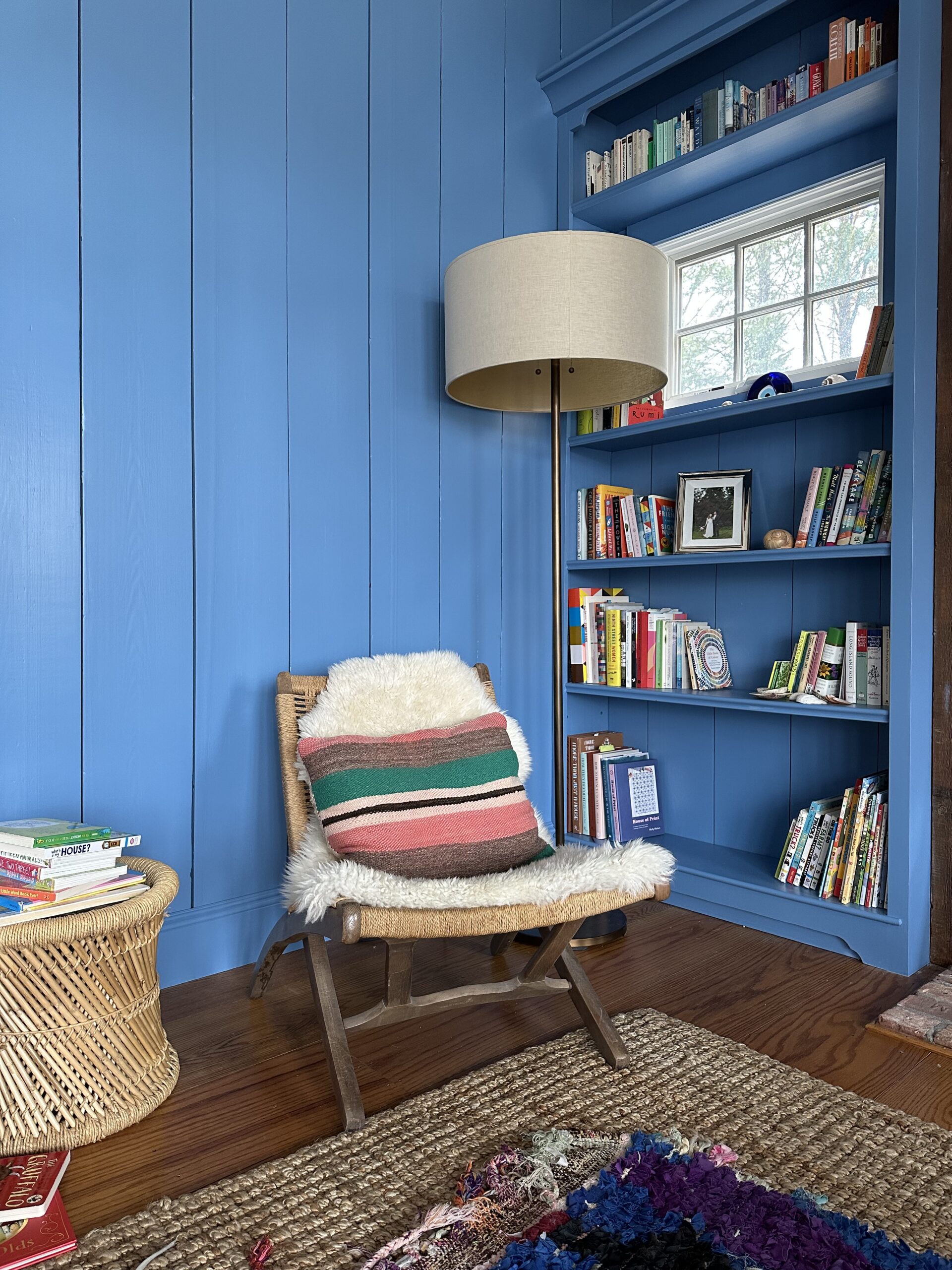
color strategies in Our current home
In our current home — still a work in progress — we’re employing both strategies. The upstairs bedrooms, with their high ceilings, don’t lend themselves well to strong-colored walls. So we’ll be keeping those white, perhaps with a pop of color on the trim. The downstairs spaces, on the other hand, are full of wainscoting and paneling that offer a perfect canvas for color. We’re slowly giving those rooms, like our living room above, a vibrant makeover.
Tips for using color in the background:
- Don’t be afraid of brown and other earth tones. These more natural hues help balance out the intensity of large blocks of color.
- Use white strategically. White trim can provide some relief in a strongly colored space, but it can also intensify the contrast, making your other colors look darker or more intense. Notice how in many of these spaces, the ceiling is painted the same hue as the walls, which avoids that effect.
- Use color to define zones, but be mindful of pulling the colors through different spaces so it doesn’t feel too blocky. You may want to define one color to be a common thread that appears in multiple rooms, a gentle echo that ties the spaces together.
Ultimately, the goal of using color in your space is to create a certain kind of feeling. I find these two color strategies helpful because they give language to two very different feelings you can create with color in a space — a more effervescent, punchy feeling or a more immersive, absorbing one.
What color strategy are you using for your current home?
Want more tools that will help you create a home you’re proud to call your own? I got you!
Ready to create your dream home, right where you are? Join the waitlist for Design a Joyful Home.


Discussion (3 Comments)
Your work is pure Joy!
Thanks for this perspective! Although we own our home and could paint, we’re reluctant to make it a financial priority, and we’d feel wasteful given it was all new when we moved in. (Not that I’d judge others for choosing to paint in the same circumstances, but our existing colour scheme provides a fairly neutral canvas – eg walls in a warm white, pure white trim, grey carpets – so we don’t feel a strong need to change.) So I have been working on a ‘colour in the foreground’ approach – it’s nice to have a name for it! It’s also a nice reminder that this strategy means to go for bold, bright choices in other places.
Other than a small splash of colour in our kid’s bedrooms our house is magnolia or very very soft blue. We have a brand new garden office and we went bold, deep rich forest green and painted the wainscot the same colour. The painter recommended an off white for the ceiling to soften the contrast and he was right! It’s a wonderful grown up space. I’m now ready to bring this learning into the main house. I’m embracing colour in the background!