Joyful interactions
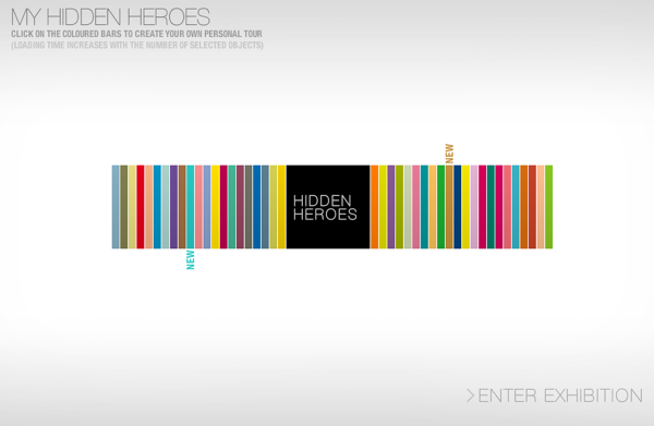
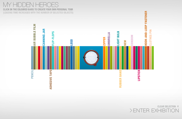
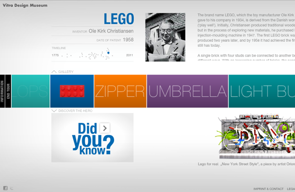
I can’t stop playing with this site. The online home of a traveling exhibit about everyday functional objects like the pencil and zipper, Hidden Heroes takes what could be a dull experience and makes it delightful – vibrant, sensorial, playful. Visit the site and see for yourself. The screenshots can’t communicate the pleasure of the transitions, the little joys of the sounds and swishes that bring elements in and out of view. Hidden Heroes, curated by the Vitra Design Museum (a joyful place in its own right), recently won a Webby for navigation, an element of interaction design that typically strives for clarity over enthusiasm.
But I love how the nav manages to incorporate color and whimsy without sacrificing clarity at all. In effect, the nav structures reflect the intention of the exhibit: to elevate the ordinary, to celebrate the stories of simple things. This is no mean feat. Abstracted from the tangibility of the artifacts, online exhibits often feel like poor cousins of the real thing, more effective as documentation than experience. But with all its abundance and brio, the Hidden Heroes exhibit feels like an experience first and foremost for the web, and I wonder if it’s perhaps more pleasurable even than the bricks-and-mortar version.
Web design is inherently constrained by the medium of the screen, and its power to evoke emotion is hindered by this constraint. It’s sensorially limited. It can’t stimulate the senses of touch, smell, or taste, three senses we know to be powerfully linked to our emotions. (Though a smell-o-vision inspired website is still a popular fantasy.) A neuroscientist I spoke with once went so far as to say that he didn’t think art on a screen could ever light up the emotional brain the way a painting could.
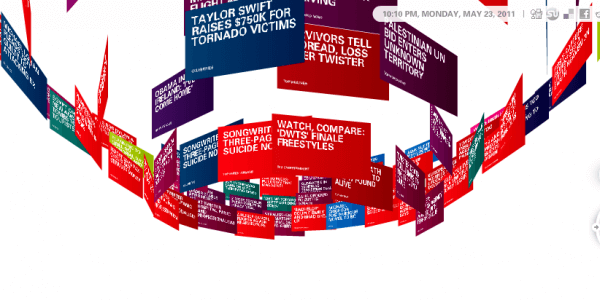
But what design for the screen lacks in texture and tangibility, it makes up for in dynamism, movement, and interactivity. At their best, designers who work in this field – interaction designers – floor me with the way they transform mundane experiences into joyful ones. I’m thinking of the Spectra visual newsreader, a uniquely colorful way to peruse the headlines, or the HEMA, a department store in the Netherlands that has created a Rube Goldberg-esque home page that must be experienced to be believed. (Seriously. I’m not even going to try to screenshot it.) More simply, I also love Supermarket Sarah, an online retailer that eschews the grid in favor of a clickable photo array for its navigation.

And finally, as I think of navigation and the web, I can’t help but think about this wonderful project by Alexander Chen, which is not at all about online navigation, but about using the online medium to give us a new perspective on offline navigation. Conductor: mta.me reenvisions the subway map as a string instrument. It is in effect a map come alive, drawing itself with charming lines, tones, and vibrations to overlay a lyrical quality onto something most city dwellers take for granted. Three separate people sent it to me with Aesthetics of Joy in mind, so I know this really spoke to people about delight! It certainly reminded me of the inherently joyful quality of transit maps, their colorful lines and intersections, and all the happenings you can imagine at their junctures. (The video is ok but again, go to the site to really experience it.)
[vimeo video_id=”19372180″ width=”600″ height=”338″ title=”Yes” byline=”Yes” portrait=”Yes” autoplay=”No” loop=”No” color=”00adef”] Have I missed other joyful interfaces? Which websites bring you joy?



Leave a Comment