Neutral canvas, pops of color

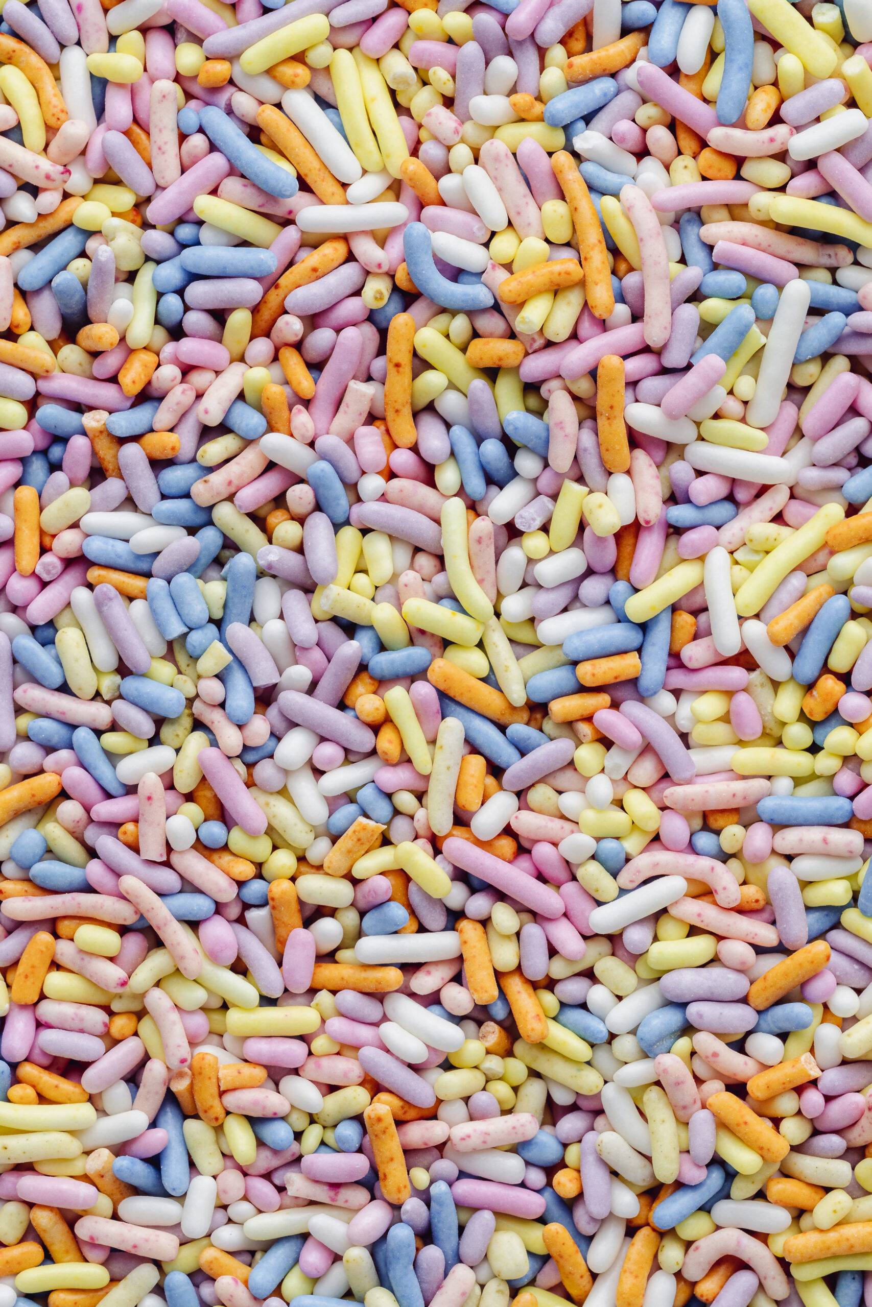
This house is a great example of the way pops of color on a white or neutral canvas create an aesthetic sense of joy. Writer Douglas Coupland’s polychrome collections could look like a circus in a house with a lot of color. Showcasing them against a mostly white or otherwise muted background creates moments of intense color with enough room to breathe.
In this way, design should mimic emotion. You don’t want to be feeling intense joy all the time — it would be exhausting, and it wouldn’t be possible to appreciate it. As one wave of joy recedes, you want a little bit of stillness, the rest that allows you to rediscover the joy and feel it all over again. This principle echoes the Japanese aesthetic idea of ma, the white space that is essential to any composition or design. Ma can be spatial or temporal, visual or textural, and in all cases results in an emotional feeling that allows a design to achieve the right level of poignancy.
Another joyful aspect is the unexpected nature and placement of these collections. Mundane spools of thread are elevated to high art by their gridded placement on a white wall. Dice, when laid out above an entryway, become a surprising lintel. Taken out of their usual context, these objects become fodder for unanticipated moments of delight.


NYT: The House Next Door, via Ouno

Leave a Comment