Object of affection: Popcorn Monsoon
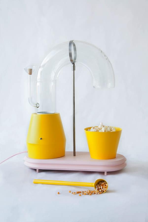
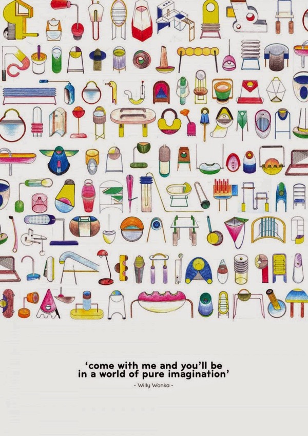
I dare you not to smile when you watch the video of designer Jolene Carlier’s Popcorn Monsoon, a machine that makes the experience of making a simple movie snack a little more playful. Interestingly, Carlier didn’t set out redesign the popcorn popper. She started with color and form, looking for shapes that appealed to her. (You can see her whimsical sketches below.) In other words, she was looking for joy first, and utility second. Once she had landed a form she found appealing, she looked for an application for it, and realized the process of popping corn is inherently exciting, yet most popcorn poppers are dull-looking.
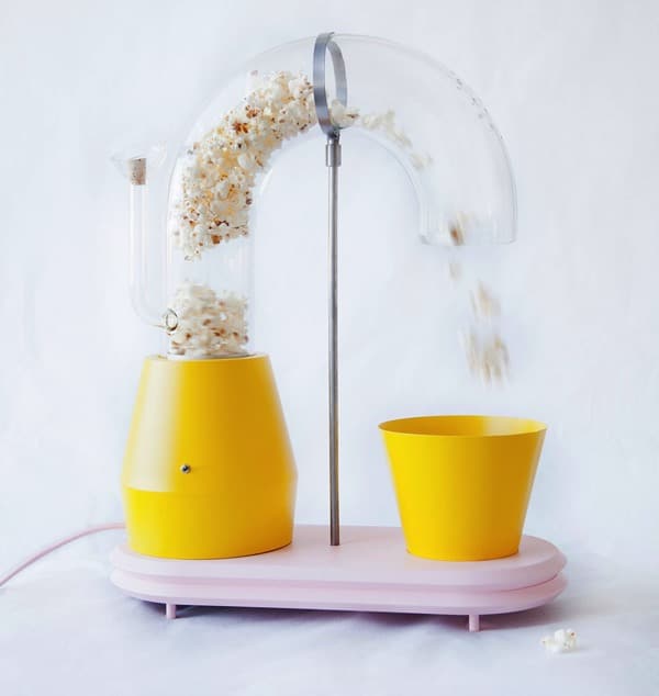
The result is a machine that enhances, rather than obfuscates, an already joyful experience. It’s bright, shiny yellow, a joyful color, and with lots of circular forms and swooping curves. But the most important part of the design is the glass tube, which takes an opaque process and makes it transparent. Popcorn is exciting because it feels like magic to watch something tiny and hard transform into something light and fluffy with just a touch of hot air. But normally that magic happens behind the closed door of the microwave or in the enclosed belly of a machine that is as mundane as a toaster or a food processor.
But in Popcorn Monsoon, we get to see as the first kernels scatter and leap, and a few intrepid pieces make it through the tube. And then a whirlwind forms, popped kernels swirl about in the tube, and finally push through to the bowl. The whole thing builds anticipation and appetite, and I bet that first handful tastes so good! (That music is so right on too: the plucky strings mirror those first little pops so perfectly.)
While it might be commercially impractical, Popcorn Monsoon is a great provocation for designers. What joyful things are we hiding through our designs? How could we surface more joy just by revealing what’s currently hidden?
Images: Jolene Carlier


Leave a Comment