The color of time
Seems it is a week for thinking about time. Perhaps it’s the heat, which slows the afternoons to a thickness, reminding us of the elasticity of hours. Or perhaps the long days of summer leave us more light to read and think. Whatever the reason, in the past few days for me have brought a confluence of aesthetics of time.
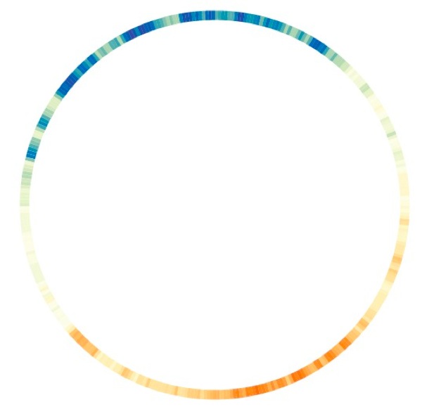
This visualization is a fitting place to start. A piece by the designer Nicolas Troncoso, Colordar represents the average temperature of Helsinki over the course of 2010 by color. There is something satisfying and joyful about seeing the year represented this way, the intensity of the summer and winter tempered by the mildness of the transitional seasons. Of course there is a natural relationship between temperature and color, evident in the way we refer to colors as cool and warm, that makes this visualization feel perfectly natural. It is another type of color language, akin to the ones I have written about in the past, distilling the ambience of time. It might be fun to do this with other geographies (equatorial, desert, polar) as well, nested as concentric circles for comparison, to see space, temperature, and time all at once.
If color here is an output of our experience of time, in other ways color serves as an input, a language that communicates time to our body and brain. We know that the color of light changes through the course of the day, the short-wave bluish rays of the early hours giving way to the longer wavelength light that gives the sunset its rosy hue. But what research now suggests (as reported in a recent article in the NYT) is that these color signals are the basis for our body’s regulation of Circadian rhythms. In other words, our eyes tell time by color.
As the color-receiving cone cells in our eyes absorb different wavelengths of light, they regulate the production of melatonin, a light-sensitive hormone that controls our alertness. (Melatonin is often indicated as a natural remedy for jet lag.) We’ve long known that melatonin levels vary based on exposure to light, but recent research shows that the color of the light makes a dramatic difference. In one study at the University of Basel in Switzerland, thirteen men were asked to sit in front of a computer in the evenings before bed. Both groups of participants sat for five hours in front of a computer screen. But one group looked an old-style fluorescent monitor emitting a range of colors of light from the visible spectrum, while the other group looked at an LED-backed monitor that emitted twice as much blue light. For the blue-light group, melatonin levels took longer to rise, and stayed lower throughout the evening. Other studies have found similar results, one indicating that men exposed to bluer light had melatonin levels 40 percent lower than those exposed to incandescent light.
These discoveries force us to question the consequences of our increasingly illuminated world. As we replace our old CRTs and incandescent bulbs with more efficient light sources, we’re also inadvertently increasing our exposure to the bluer light these devices emit. And as we introduce more and more screens to our world, we add still more blue light to our days. (Through this lens, reading by the cozy glow of an iPad or Kindle is very unlike reading a book with a bedside lamp.) If the world communicates time by its color, our devices speak to our bodies in tongues.
This may be alarming news, but there’s also a positive story here. Blue light increases alertness, and has been shown to have effects on cognition and alertness. One study showed that elderly nursing home residents exposed to just 30 minutes of blue light showed improvement in cognitive abilities in just four weeks. This could be useful from a design perspective, for everything from helping shift workers manage their schedules to promoting alertness for those operating vehicles or machinery (a fact called out to me by Dr. Charles Spence, the director of the Crossmodal Research Lab at Oxford University). Even for sleep-deprived office workers, better lighting could mean more energy and a break from the need for caffeine. One of the researchers behind these studies, neurologist George Brainard, hopes that designers will rise to the challenge and get to work on creating screens and lights that adjust their wavelengths to reinforcing our natural rhythms.
In the end, I come back to the mechanism itself, and the latent poetry of it. Light is merely energy, and blue light, with its short waves, is high-energy luminance. Vibrating and alive, these rays excite the molecules of pigment in our retinas, a revelie that calls our cells to the attention of the day. There’s a beauty in this energetic language, one that reminds us that blue has an inherent joy. Though typically perceived to be a calming color, blue is revealed by these studies to have an intensity we don’t often give it credit for. The brilliant sky of a clear day moves us with a force that speaks directly to the chemistry of our blood. We are helpless to resist. And why would we want to? It’s a primal kind of delight, and we are made for it.
{via @brainpicker and @vaughanbell}




Discussion (1 Comment)
“Though typically perceived to be a calming color, blue is revealed by these studies to have an intensity we don’t often give it credit for. ”
Wonderful post. As a color designer/interior designer, I am soooooo tired of the cliche that blue is calming, It CAN be – it’s not an absolute. You put the WHY so clearly and eloquently. Thank you.