Aesthetics of joy or eyesore? happy roses
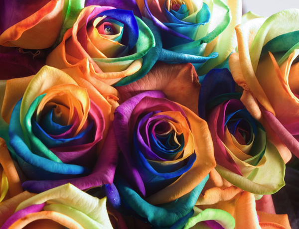
A friend sent me this link to a company selling these strange, multicolored “happy roses.” They’re presumably made by dye absorption, which you may have tried in a lower school science experiment with a couple of carnations and a few drops of blue food dye. (If you’re so inclined, directions are here.) The company says,
The Happy Rose is unique due to its rich and exuberant colour combination and the special colouring technique that lies hidden behind this. One look at this cheerful rose and you will feel happy.
Is it happy? Or just tacky?
On the one hand, bright color is associated with joy, so perhaps it’s as simple as: more color = more joy. And the “coloring process” is certainly magical, illuminating a normally hidden aspect of plant construction. But at the same time there’s something unappealing about the artifice of it.
Aesthetics of joy has an odd tension here. The brightest colors are rare in nature, so when we find them, they’re often in synthetic materials like paints and plastics. But joy also embraces the aesthetics of unfettered nature: the exuberant wildness and wonderful mystery of nature’s accidental creative process. Sometimes our interventions in nature produce great joy. I’m thinking of Samuel Francois’s charming tree art or Carol Hummel’s whimsical knits. You could also look at earthwork, like Jim Denevan’s sand paintings or Maya Lin’s Wave Field, as this type of joyful intervention.
I wonder if it has something to do with proportion. All of the artists I just mentioned seem to work with a great reverence for nature. Nature is their canvas and regardless of the scale of their efforts, it is the dominant element in their compositions. If anything, their work serves to call our attention to nature’s beauty, not to mask it. These “happy roses” walk the line for me. Some of those colors are deliciously intense, but I think their frenetic application obscures the natural form of the flower too much. I lose the beauty of the circular gesture and the bouquet becomes a collection of random ruffles.
All of this is an attempt to parse rationally what is a reflexive, visceral response for me. I vote eyesore. What do you think?
Thank you @_MattMorris for the link and inspiration for this post


Discussion (2 Comments)
EYESORE definitely – form, colour, texture must come together aesthetically to create a “perfect” object (and I think the rose comes close to being “perfect”) – these psychedelic roses seem to be on a permanent marijuana trip, seem to scream “look at me”, seem to be happy on prozac.
EYESORE definitely