Are round logos more joyful?

What’s in a logo? It turns out, quite a lot.
That’s the takeaway from a recent study in the Journal of Consumer Research, which suggests that the shape of a company’s logo can have a strong influence on how we perceive the product or company that logo represents. The study examined the difference between circular and angular logos on the way participants assessed product attributes and service experiences, concluding that the logo’s shape had an unconscious influence on participants’ judgments.
In one experiment, participants were given an image of a pair of shoes with either a circular or an angular logo (or no logo, for the control condition), and asked to rate the shoes on a number of dimensions. Participants who saw the circular logo rated the shoes significantly more comfortable than the other groups, while participants who saw the angular logo rated the shoes as more durable. The researchers then replicated the experiment with sofas instead of shoes, finding similar effects.
Researchers speculate that angular forms have an unconscious association with durability because many angular objects are made of hard materials that wear out more slowly. And they believe that round forms tend to be softer, and therefore comfortable. These associations support earlier research (some dating back to 1921!) that has shown people will spontaneously draw angular shapes to represent ideas like hard, harsh, and cruel, and curved shapes to represent ideas like weak, gentle, and mild.
Based on these associations, the researchers speculated that logo shape might have an influence on perceptions of a company, not just a product. They concocted a scenario in which a customer was struggling with an airline’s checked baggage policy. Participants who had been primed by looking at circular logos were more likely to believe the airline would be empathic and accommodating to the passenger. This suggests that circular imagery might make a company seem more customer-focused. (A word of caution here: this particular experiment was muddied by the fact that the logo wasn’t assigned to the airline itself; participants saw a series of twelve circular or angular logos before they heard the story about the airline passenger. So the mechanism here is priming rather than direct association.)
None of this research, of course, directly implies that a round logo is more joyful than an angular one. But it tends to be true that companies with empathic, flexible service tend to have happier employees, so perhaps there is a link. And I’ve written quite a bit in the past about roundness and joy, and the power of neutral curves (like the ones found in circles) to evoke playfulness. I’d love to see a study where participants rate fictional logos of different shapes paired with a generic company name on a range of different emotional attributes. Certainly, it’s an area ripe for more exploration.
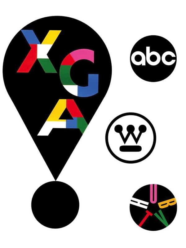
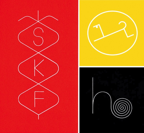
After reading about the study, I also spent some time thinking about round logos that stick out in my memory, and enlisted my better half (who, lucky for me, is a graphic designer) to do the same. He reminded me about the many circular logos crafted by legendary designer Paul Rand, which you see at the top of this post. Rand’s body of work is one of the most joyful in the world of graphic design (and you can expect more words here about him in the future). But for now, I wanted to highlight the classic, joyful identities he designed for companies ranging from Westinghouse to ABC. He made abundant use of circles in his logos, but he also did identities with helical s-curves and spirals, as in some of the below.
Feel it out for yourself: how do the logos make you feel? And how do they affect your perceptions of the companies they represent?

Images: Identity designs all by Paul Rand; top set, clockwise from top left: XGA technology for IMB, ABC, Westinghouse, Hub TV; middle: Gentry Living Color; bottom set, clockwise from left: Smith, Kline and French Laboratories, Borzoi Books, Helbros Watch Company.
Study: “Does Your Company Have The Right Logo? How and Why Circular and Angular Logo Shapes Influence Brand Attribute Judgments”
Via: FastCo


Leave a Comment