Color around every corner

For a reserved culture, the Japanese certainly aren’t shy about color. Everywhere in Tokyo you find pops of the brightest hues, on doors and signage, traffic cones and taxicabs. The color comes in broad swathes and little bursts. Sometimes it’s functional color, telling you where to go or what to pay attention to. A big, bold color system like the one above makes an incredibly complex train system effortlessly navigable by non-Japanese speakers. At other times it’s purely joyful, a gratuitous flick of the paintbrush, a little dance of neon whose only purpose is to make you feel good.
Where along the way to becoming a civilized society did we lose color? This is the question I’ve been asking myself since the trip, as I’ve tried to understand the differences in how Americans and Japanese use color in our environment. Seriously, in the West our relationship to color is utterly dysfunctional. In office cubicles, condo complexes, subways, highways, sidewalks, malls — the contexts we spend most of our time in — the palette is a monochromatic blur of industrial taupes and dingy greys.
It would be wrong to say there’s no color in our urban landscapes. But look down a highway or in a city center and take notice: where do you see it? In the ads, of course. We damp down our rooms and streets so that the billboards can pop out, ensuring we can’t miss their consumerist banners. We are stingy with color where it could benefit the collective good; we are profligate with it when it’s a conduit to corporate gain.
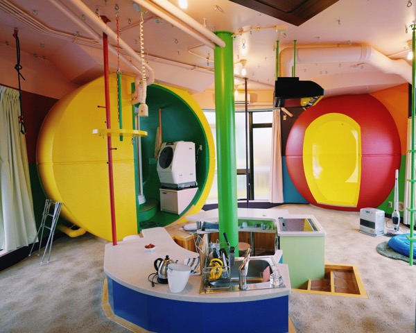
In Japan, it is as if everyone understands the value of color, and adheres to a code to use it in a sensitive yet exuberant way.


This “book bar” at the Tsutaya Books in Daikanyama (one of the absolute don’t miss spots if you’re planning a trip to Tokyo) strikes me as a perfect example of relevant, natural color, harnessed in a delightful way.

These to-die-for lamps in the lobby of the Claska hotel are a perfect example of thoughtful color use. It’s so Japanese to put the color on the inside, where it isn’t aggressive and where the light can bring the color alive with its soft glow. More pops of color below (a few of which couldn’t help but make their way into my suitcase): the gallery at the Impossible Project, lighting from the amazing Danish flower shop Nicolai Bergman in Aoyama, a Patricia Urquiola chair in the roof garden at the Tokyu Plaza shopping center, colorful washi tapes at Tokyu Hands, colored pencils at stationery mecca Itoya, and joy stickers from Kiddyland.


The taxicabs! We spent an inordinate amount of time taking pictures of taxicabs, with their vibrant colors and playful stripes, checks, and patterns. They look like giant toy cars driving around the city. I can’t complain, living in a city that paints its taxis cheery yellow, but I do think there is something about the Japanese taxi palette that is really charming.

I saw dots everywhere in Tokyo. The joy of polka dots is probably another post entirely, but I loved seeing these various spots around the city. My absolute favorite was happening upon the red and white spotted packages of Tsumori Chisato outside the store (bottom left), ready for pickup. Can you imagine receiving one in the mail? How boring an Amazon box seems by comparison… On the bottom right is work by Koichiro Kimura, from his quirky and amazing gallery space in Aoyama.

It was also fun to stumble upon a Tokyo installation of Damien Hirst’s dots exhibit in the new Hikarie center. I had seen them at the two Chelsea Gagosian galleries earlier this year, but seeing them in Japan, they just seemed so perfectly at home. I love how even the exhibit key (bottom left) has a charming quality to it.

Images: mine and Erika Lee’s


Discussion (1 Comment)
love the colorful pictures as always 🙂 can’t wait to go visit Japan