The personalities of colors

If you like colors, I think I’m about to make your day. You’re about to meet all the personalities of the colors of the rainbow. Did you know that Fuschia’s a fussbudget and that Magenta’s a gossip? That Coral is “an absolute flip?”
Back in the 60s, a voiceover artist named Ken Nordine recorded a series of short beat poems about colors, backed by free-form jazz. The poems began as advertisements for the Fuller Paint Company, but when radio listeners began to call in requesting to hear them played again, Nordine decided to record an album of them. Once I started listening this weekend, I couldn’t stop — they’re just so delightfully odd.
Nordine spins stories like he’s letting you in on a secret. “You know how Green can be,” he says confidentially, before expounding on that color’s mercurial nature. Some stories are plot-driven, like the story of how Blue saved Yellow from being cut out of the spectrum. Others are like oddball love letters. On Lavender, with the resonant sounds of woodwinds in the background, a sultry Nordine husks: “Lady of the soft edges, tell us all. Or tell me. Where day goes with night, and what they do there.” Some colors are upbeat, like Orange, while others are slow and heavy, like Burgundy, which is depicted as a “fatly soft, softly fat” gourmand. (I laughed out loud when I heard Nordine purr, “Come, come, big Burgundy, what do you weigh?” like a sly celebrity journalist. It seems most charming when he speaks straight to the colors in direct address.)
If you spend as much time thinking about colors as I do, I think you’ll have fun with this. The tracks play like parodies, and yet there’s a soulful kind of truth to them. The music, the tone, the weight of Nordine’s voice — they’re all visceral illustrations of how colors make us feel. A dark rich color like burgundy does feel heavy. A color like coral does feel vivacious and engaging. Green is dynamic and changeable. So it’s wonderful to hear the consonance between color and attitude in these funny little tone poems. After all, the better we understand color, the more useful it will be to us in creating a more vibrant, joyful world. That, and they’re a whimsical brightener for any midweek blues — or ecrus, or olives, as the case may be.
More: Here’s the link to listen to the full album on Spotify
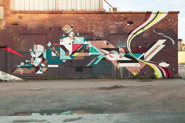
Image: I love this wall of color set free in Göteborg by Nelio
Via: @ayepea


Discussion (3 Comments)
This reminded me of the song Death of a Shade of a Hue by Of Montreal, about the color Scarlet dying. http://www.youtube.com/watch?v=I2vvxbvKv7s
Lyrics below:
Over a sea of grief Scarlet died
Above her dying mind were fossilfied memory imprints of her favorite day
For a minute I stayed watching this brilliant display
Until a god with a broom came and swept them away
In their bereavement all of her colorful friends
Turned to a milky grey depressing blend
Which incidentally made Grey feel inane
So he set off to find a less trite identity
One as stunning and bold as Scarlet used to be
Thank you so much for sharing this, Ingrid! Wow. Wow. Wow. Never have I seen/heard/felt color quite like THIS before!! Listening to the lavender one right now. Oh my. So funny.
Thanks, Kelly. Lavender is one of my favorites!