food
6 small ways to make a home feel cozy
The radical act of releasing judgment
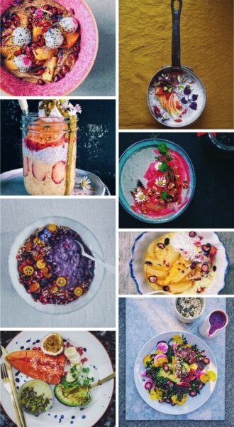
Colorful, delicious Friday finds
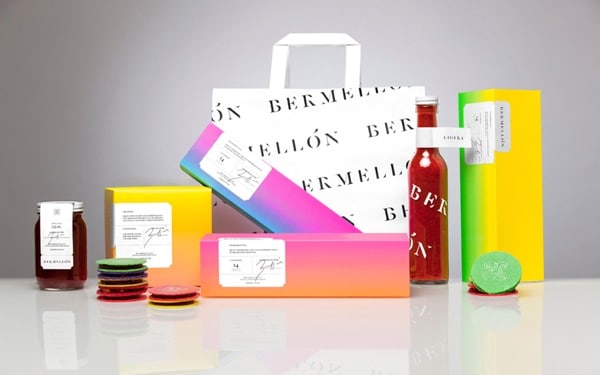
Joyful packaging: Bermellón
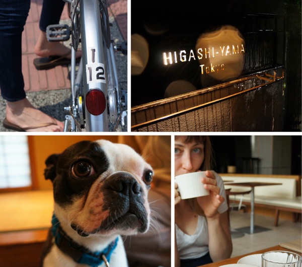
Tickled by Tokyo
Joy in the news: Small wonders
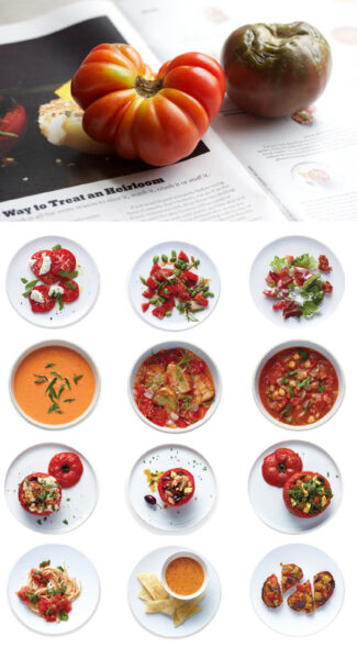
The joy of good food, in abundance
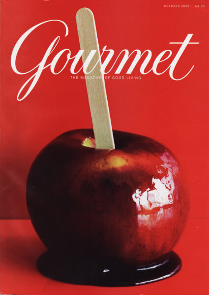
Gourmet + the joy of food
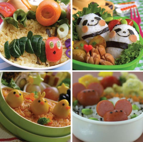
Joyful lunching
Find more joy every day
Our free workbook has 5 simple strategies that will make life better right now.
You'll also receive periodic updates on new things from The Aesthetics of Joy. We respect your privacy. Unsubscribe at any time.