Joymaker: Emmanuelle Moureaux, architect
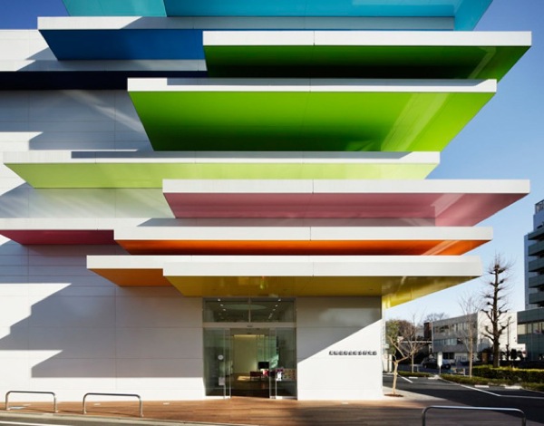
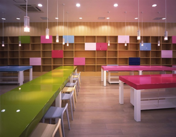
I spend a lot of time looking for joyful things to write about — but sometimes they just manage to fall into my lap. I arrived back from Japan to a note from Emmanuelle Moureaux, a Tokyo-based French architect who works with colors in stunning ways. (I’m particularly enamored of this design above, for the Sugamo Shinkin Bank in Shimura, which she describes on her site as a “rainbow mille-feuille.” Isn’t it just exactly that?) It kills me that I missed seeing her work in person there, but I thought she’d make a great “Joymaker” profile, and she kindly agreed to answer a few of my questions. As you’d expect from looking at her work, she has a deeply thoughtful, intentional approach to working with color. Here’s what she had to say.
How do you want people to feel when they encounter your work?
“Color” is the concept of all my works. With colors, I design new concepts, new atmospheres which will give emotions to people. I use colors in order to give emotions.
What is the role of color in your work?
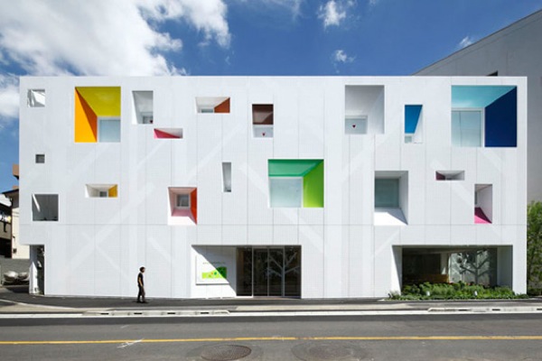
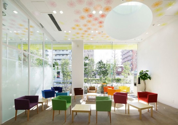
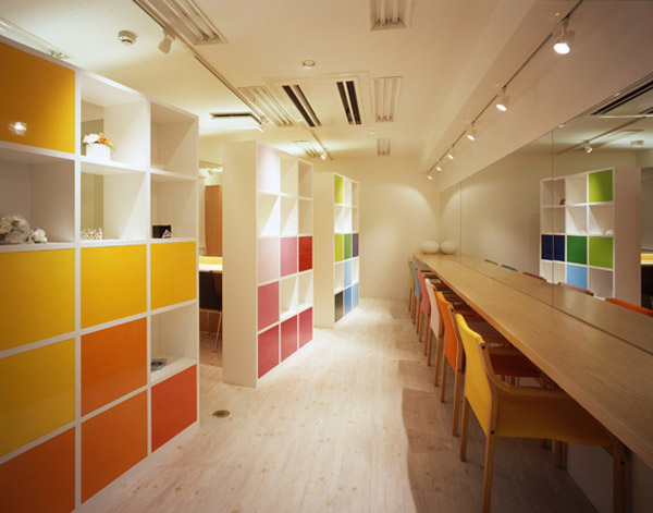
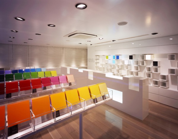
I use colors as three-dimensional elements, like layers, in order to create spaces, not as a finishing touch applied to surfaces.
When I first visited Tokyo, I was shocked by the city brimming with colors. Bright colors overlapping and intermingling with each other, buildings with different volumes and layers of electric cables forming the cutout sky. To my eyes that grew up in a town made of stone, they appeared beautifully like a painting. I want with my design people feel emotion as I felt when I saw the beautiful colors of Tokyo.
I also feel in the city of Tokyo a sense of layers (buildings with different volumes, electric cables, signboards… overlapping like layers in the space). This layered structure of Tokyo gives me the feeling of depth.
These two elements (colors and layers), inspired by Tokyo, are the basis of my design. “Colors” and “layers” are expressed in a concept I develop in all my projects, the concept of “shikiri”, a made-up word literally meaning “dividing (creating) space using colors” in English. The colors, detached from two-dimensional walls or other surfaces, seem floating in the space and structure it. For example, in the Sugamo Shinkin Bank / Niiza Branch, “squares of colors ” floating in the space structure it, giving it its form and depth. For the Tokiwadai Branch, “leaves of colors” play the same role.
Ed. note: I absolutely love that so many of these projects are banks, places we think of as dry and corporate. (And pretty much the last place you’d expect to find a rainbow!)
“Shikiri” is a colorful partition series, inspired by the Japanese traditional sliding screens. Sliding paper or wood partitions used in the past in all the Japanese houses have almost disappeared now. I feel sad to see these very functional and beautiful Japanese traditional sliding screens fading away now days, so I continue to bring out the essence of the old, and turn them into something modern and practical, which still can be used today. I am trying to reintroduce them in a different way with the concept of “Shikiri”.
If you were a color, what color would you be?
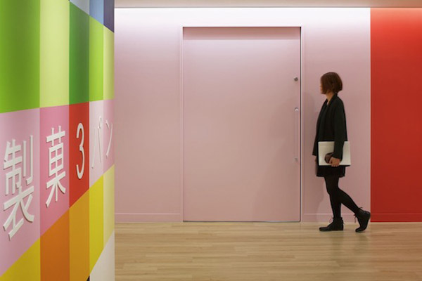
Multicolor : I never use one color but always combine several colors.
What are some objects that symbolize joy to you?
Color palettes (Pantone etc…), color samples (color acrylic, color textile…)… Everything which has a lot of colors in the palette makes me happy.
What is one project hiding in your sketchbook that you’d love to build one day?
“Shikiri house”: its concept is defined so I would like to build it. Also, there are very strong relations between the products I design (better to call them “mini architectures) and architecture. Stick chair, shibafu table are designed as buildings. Puzzle box too. Toge would be the structure for a building…. So I would like to realize them in a big scale.
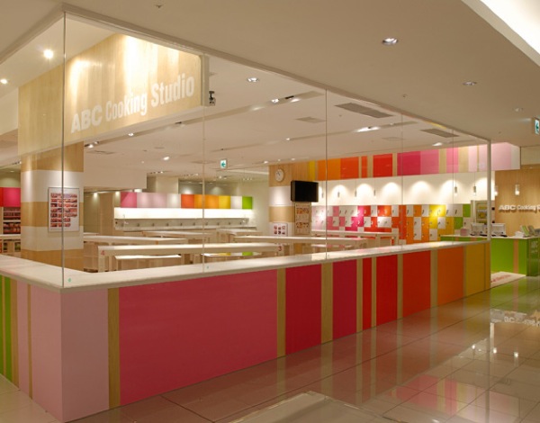
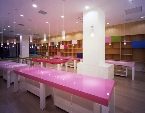
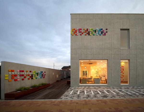
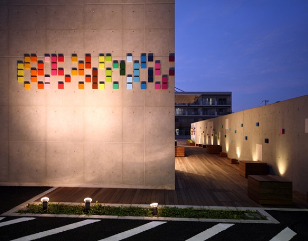
I could only post a small fraction of Moureaux’s joyful work here — there are so many more vibrant works on her site. See more here. Incidentally, her thoughts on Tokyo color mirror my reactions to the place, which I posted last week. See here, if you missed it.
Images: courtesy Emmanuelle Moureaux


Discussion (2 Comments)
Absolutely lovely and absolute bliss – I love colour.
The shades and depths surprise the eye and heart most pleasantly.