Intangible color
These last few weeks I’ve been steeped in color. Literally, with the effusion of bright summer hues in the city, and figuratively, as I’ve been devoting many a spare moment to researching it. Color is the subject of chapter two and, as evidenced by the colorful nature of this blog, a nearly endless topic when considering design and joy.
Right now I’m reading a very thoughtful, scientific little book from the 1980s called Colour: Why the World Isn’t Grey, which covers everything from why rainbows appear to why flames are orange to why the sky is blue. As the author Hazel Rossotti demystifies these phenomena, she’s reminding me that some color seems particularly mysterious.
Intangible color – the color of the horizon, of an oil slick on a rain puddle, of a match-strike – has a trickiness to it. We perceive the color, but it is either too distant, too evanescent, or too changeable to feel certain in our impressions. The color feels deceptive, yet tantalizing. Though we know that pursuing it will leave us empty-handed, sometimes we go after it anyway. Like burying one’s nose in a magnolia flower only to find the thrum of fragrance all around, but pale within, we find our rainbows and sunsets accessible only from afar. I suppose we should feel grateful that their photons journeyed such a long way to our eyes in the first place.
Maybe there’s more joy to this kind of elusive chroma, or if not more, then certainly a distinct kind of joy – a delight mingled with longing. And that’s of course what joy should be from an evolutionary perspective. Not perfect satiation, but satiation plus motivation to continue seeking that “passage from lesser to greater perfection,” as Spinoza wrote. With its spiritual airiness, intangible color feels something like a promise, a reminder that still greater beauty is out in the world to be discovered.
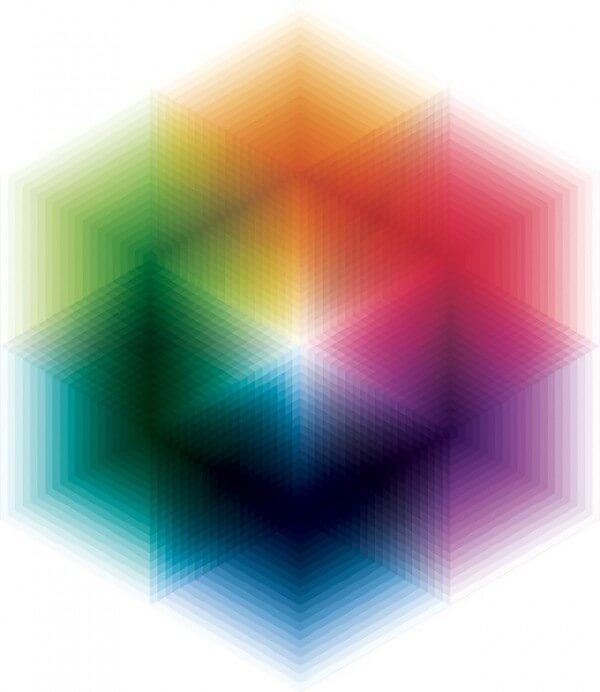
With these thoughts on my mind, I wanted to share a few works that create a similar kind of intangible color, despite being constructed from tangible materials. The first, above, is a recent piece by Andy Gilmore, whose kaleidoscopic works I’ve long enjoyed and have posted in the past. This piece seems to vibrate in those light spaces where the hues fade out in steps. It’s almost as if it’s moving, and therefore impossible to fully take in all at once.
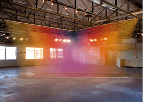
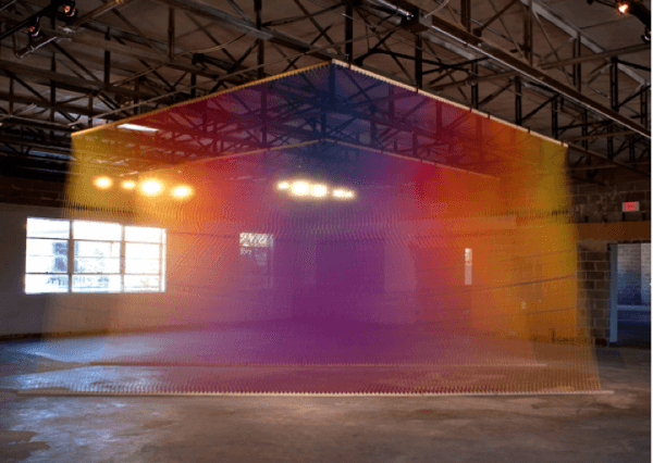
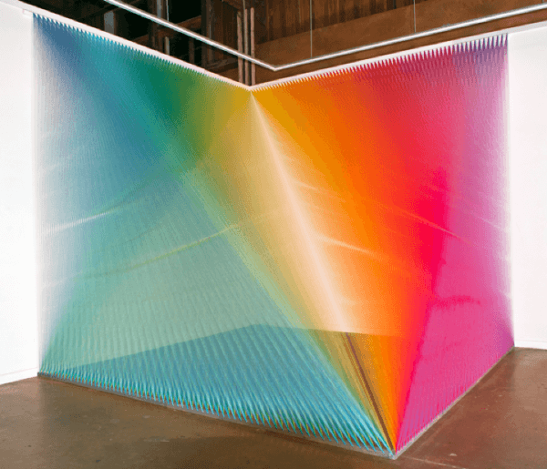
Below is a kind of 3D counterpoint to Gilmore, from artist Gabriel Dawe’s Plexus 4 and Plexus 5 series. These are similarly vibratory, almost spatial rather than material, like a dense chromatic fog. You almost feel as if you could walk right through them, though in fact they’re constructed from thousands of strands of thread. Like many natural examples of intangible color, these installations seem to radiate their own light, making them even more ethereal and compelling.
I hope you’re out enjoying a colorful weekend somewhere, intangible or otherwise…
Xx Ingrid


Leave a Comment