Architecture
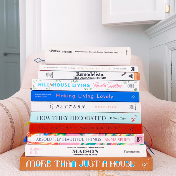
14 Essential Books for Home Design Inspiration
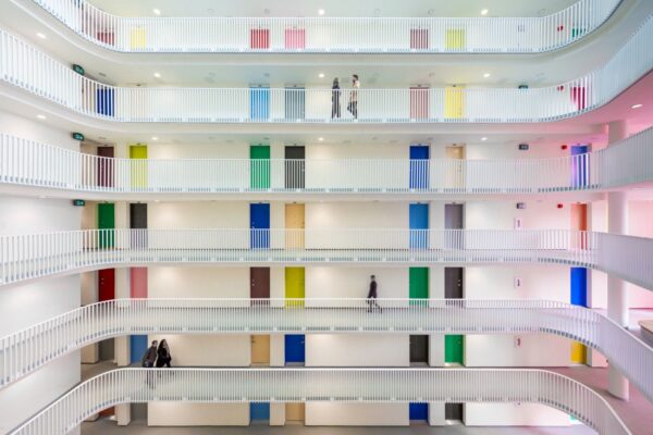
15 Beautiful Public Housing Developments From Around the World
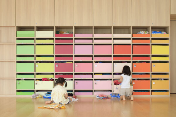
How to Design a Better School Building
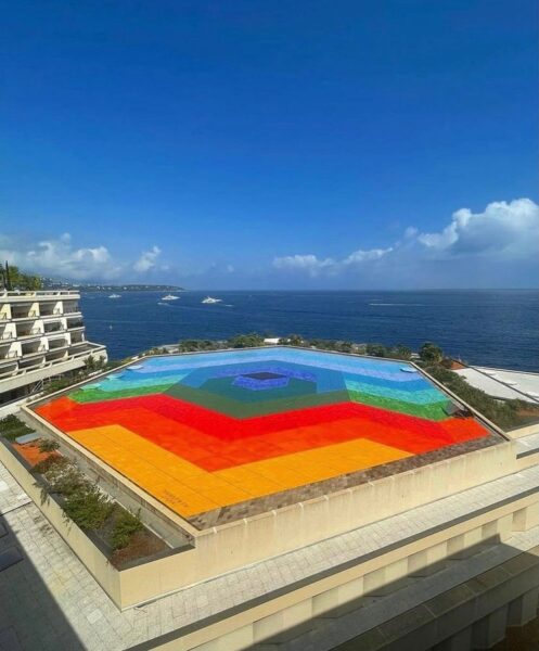
7 Awe-Inspiring Swimming Pools From Around the World
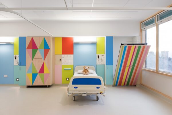
Imagining a more joyful Children’s Hospital
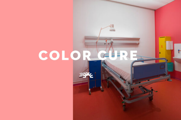
A Danish Hospital That Heals With Color
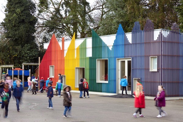
Five joyful elementary schools from around the world
A Tokyo apartment complex designed to reverse aging
A landscape as alive as you are
Find more joy every day
Our free workbook has 5 simple strategies that will make life better right now.
You'll also receive periodic updates on new things from The Aesthetics of Joy. We respect your privacy. Unsubscribe at any time.