How to Design a Better School Building
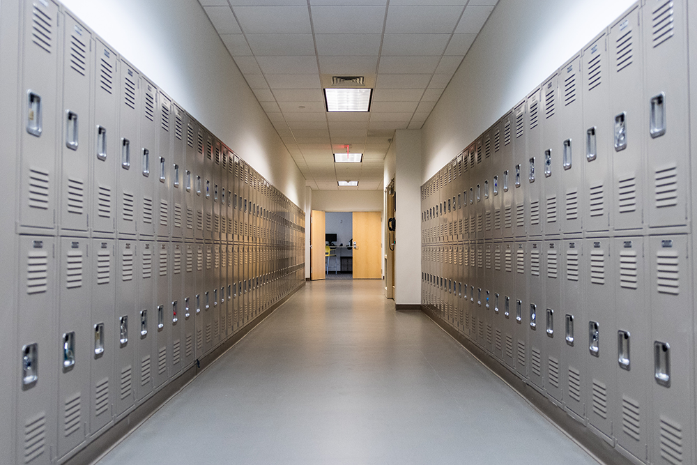
I’ll never forget the moment in my TED talk when I clicked onto a slide showing an image of beige lockers lining a dull, gray hall. “Why do we send our kids to schools that look like this?” I asked. A low rumble of uncomfortable laughter rippled through the auditorium.
If you have a kid, or were a kid, maybe you’ve asked yourself the same question. Why are most school buildings so bland and ugly? Why do they look more like warehouses or prisons than places of excitement and curiosity?
It would be easy to blame costs, and you could certainly point to the fact that underserved school districts often feature some of the worst architecture as support for this theory. School boards are, of course, accountable to citizens who are also taxpayers, always ready to redline another budget item. But in fact, there are many cost-effective ways to make a school joyful, and many expensive ways to make one miserable.
Why Are Schools So Ugly?
A more likely explanation comes from Laura Wood, of the Thinking Housewife blog: our buildings reflect what we value, and as a society, we don’t value beauty (or joy), at least not when it comes to education.
This is not to say that schools are deliberately and consciously made ugly today. It’s just that beauty has never, from the dawn of modern compulsory schooling, been considered important. And, anything controlled by centralized authorities, essentially out of the hands of local communities, does not take account of the immaterial needs of human beings. Safety, crowd-processing, convenience – these are the highest goals of school architecture.
Where I live, the schools are very well-funded, and yet even in the richest of communities they are appallingly ugly, with flourescent [sic] lighting, unadorned brick facades, cinderblock walls painted yellow and green, and dusty yards bereft of ornamental planting. They’re as soulless as urban parking garages.
It’s fascinating to me that even quite educated people don’t think children have any appetite for beauty. They do seem to accept this early credo of educational experts that beauty or ornament is distracting. And, that’s the problem with modern schooling in a nutshell. It doesn’t view children as human beings nor could it possibly identify what beauty is.
Laura Wood, The Thinking Housewife Blog
I have to pause on this idea that “people don’t think children have any appetite for beauty.” This insight, I think, stems from a broader misconception that has long contributed to the undervaluing of children in society — the blank slate. The blank slate, or tabula rasa, is a notion that dates back to the ancient Greeks, but takes its modern expression from John Locke. It suggests that we are born without any innate programming, our minds effectively blank slates to be written on by our life experiences. In the world of the blank slate, children are just inferior adults, empty vessels waiting to be filled up with information and ideas.
But of course we now understand that our brains come with all kinds of hardwiring. From the capacity to learn language to an innate understanding of the laws of physics, even a basic natural sense of morality. And this extends to our appreciation of beauty in our environment. Children naturally gravitate toward nature, color, curves, and so many other manifestations of joy in their surroundings. If anything, it would be more accurate to say that we arrive with these proclivities, only to have them suppressed by life experiences that teach us to ignore them.
7 Ways to Design a Better School Building
We can do better. In fact, architects and communities are doing better in many places around the world. When I originally started working on this post, my aim was simply to highlight inspiring, joyful school buildings and the designers who created them.
But as I studied the examples, I realized that there are clear lessons to be drawn from these school designs, ones that I would love to see applied more broadly. In this post, I’m sharing seven design principles for creating better schools, highlighting twenty stunning school designs. I like this approach because while these are architect-designed buildings, there are ideas in here that could be applied by teachers, school administrators, and local communities to improve existing schools right away. It’s not about the building. It’s about an environment for learning, which can be shaped in many different ways.
Also, it’s notable that of these twenty schools, only two are in the U.S. I don’t often offer such blunt assessments, but on this one, I just have to say it: American architecture seems to struggle with public space, always bringing a touch of corporate schlock that makes even the most interesting concepts feel like a suburban office park. Flooring and cladding are a big part of this — there’s always a mottled or speckled texture that gets thrown in, the surface equivalent of TV static from my 1980s childhood.
We seem to be petrified of dirt. And in our attempt to camouflage it, we deprive ourselves of the clear negative spaces that make a space feel bright and cheery. Everywhere has a tinge of the airport lounge. Notice, in contrast, the use of solid colors, warm woods, and clean whites in designs from Europe, Asia, and Latin America. I long for more of this in American public space.
So let’s get into it. Here are seven ways to design a better school building.
Make Storage Beautiful
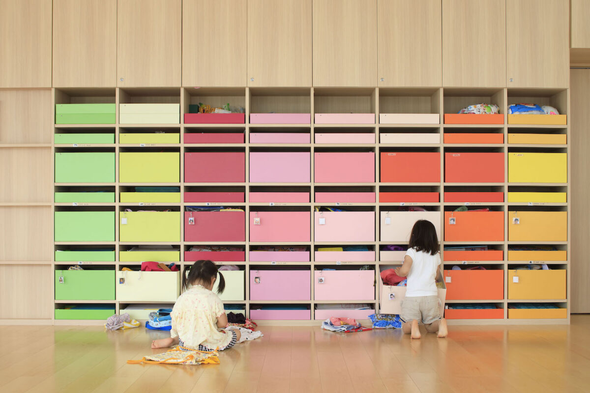
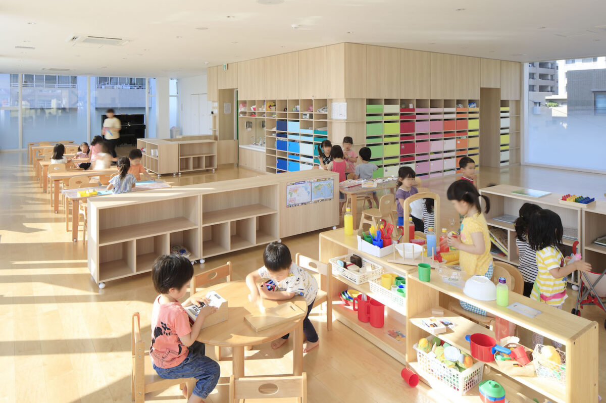
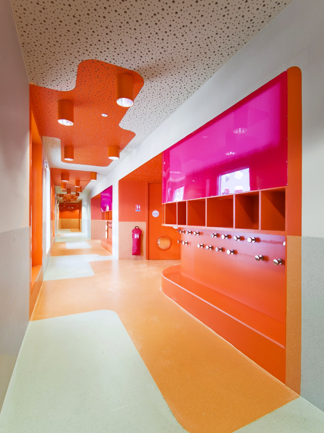
Storage is so often an overlooked aspect of classroom design. In this design by Emmanuelle Moureaux, color-coded cubbies help children store and find their belongings, while also creating a vibrant focal point in the otherwise subdued classroom.
Joyful readers will be familiar with Moureaux’s work from the chapter on abundance. And in particular her joyful bank branches and nursing home designs. It’s no surprise that she brings her theory of shikiri — color as a tool for dividing space — into great effect at the Creche Ropponmatsu in Japan.
use strong colors in smart ways
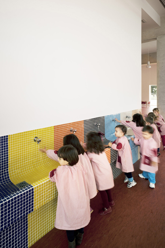
So often when I talk to people about design for children, I hear concerns about overstimulation. But one way to ensure that color isn’t overstimulating is to use it intentionally in the space. Either to guide the flow of activity through a space or to call attention to certain essential features. In this case, Cor & Associates highlight a long sink where kids can wash up, emphasizing hygiene and tidiness in the space.
If you worry about color being overstimulating, whether in your school or in your home, take note of how the architects concentrate the color in one area, leaving white space around it. Often when we aren’t intentional about the use of color, we end up with little bits of it scattered around a space. The result is that the space feels neither colorful (because the color is in such little bits) nor calm (because the color lacks order). Instead, concentrate the color in one place with white space around it to give the eye room to breathe.
follow the curve
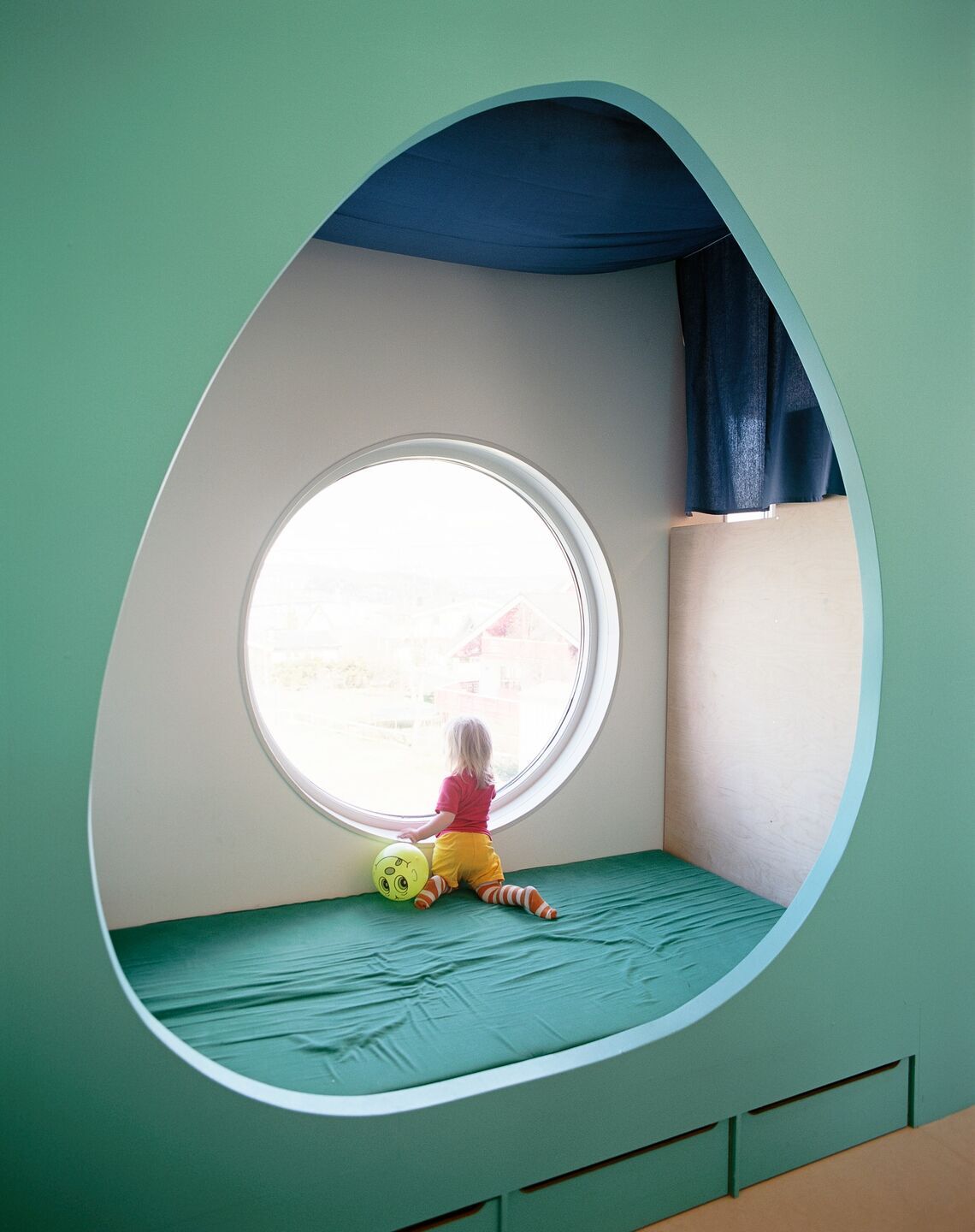
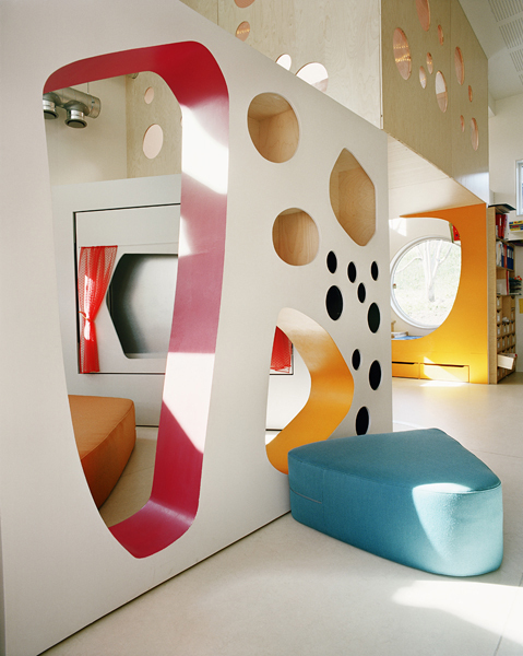
The curve is the shape of play — literally, children move their bodies in curved arcs when they’re engaged in play — so how did we end up with so many schools being big rectangular blocks?
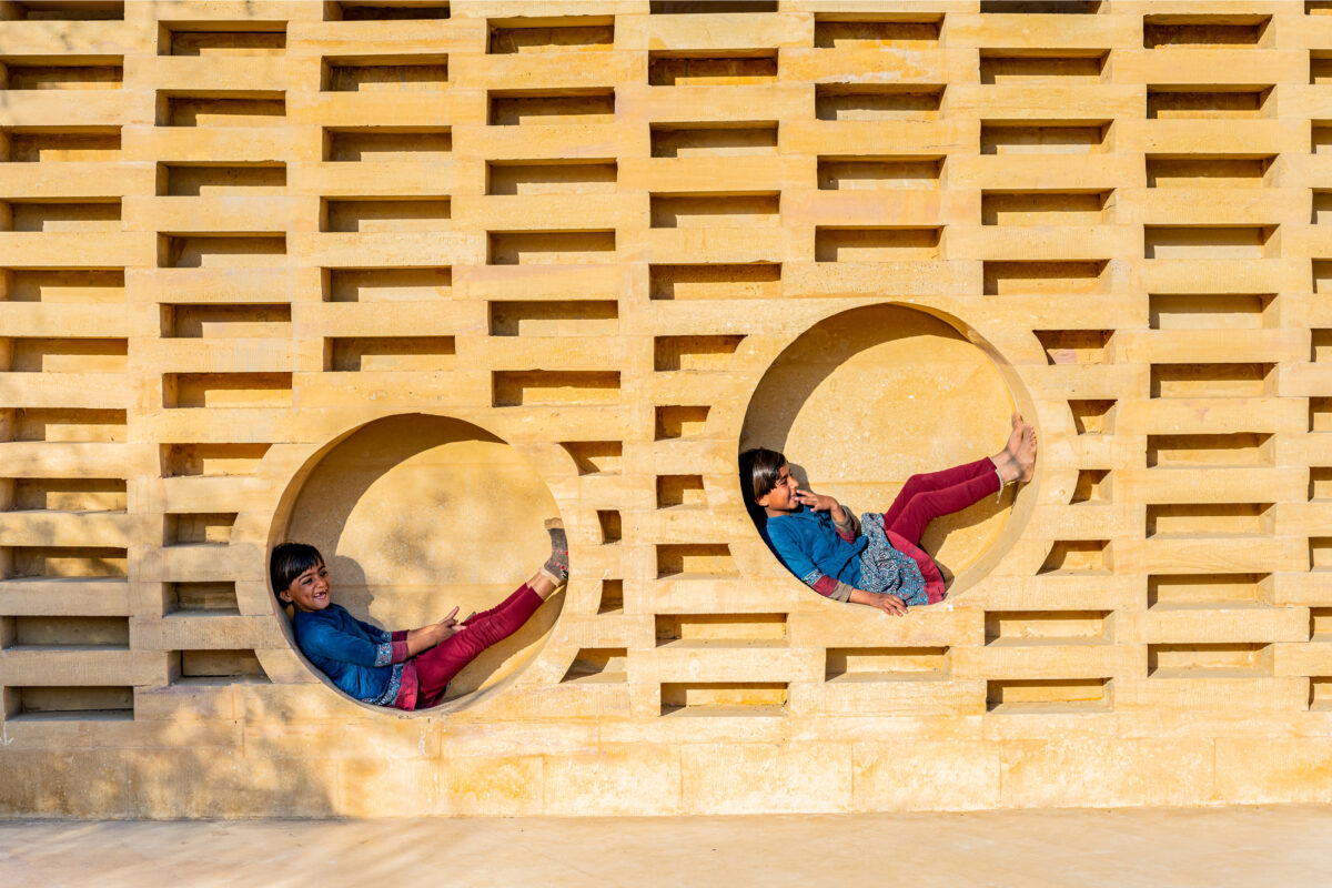
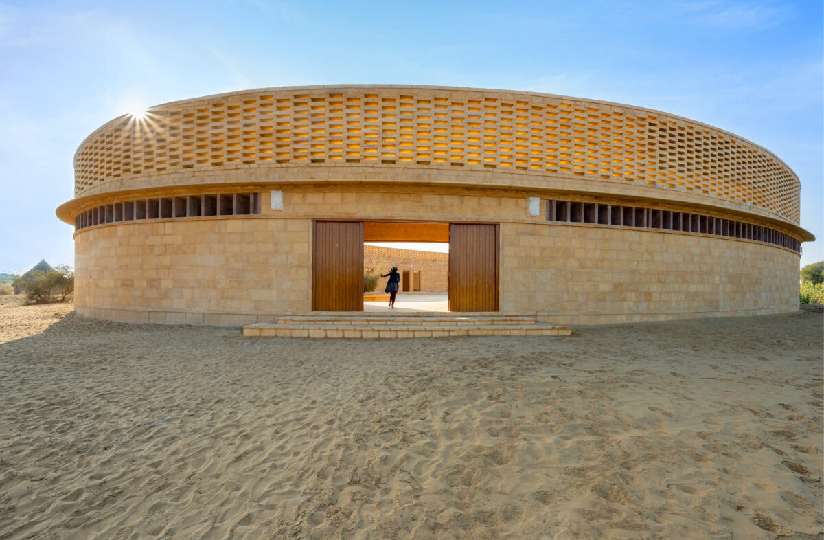
These two examples, a kindergarten in Tromso, Norway, above, and the Rajkumari Ratnavati Girl’s School, Salkha, India, below, show how curves can help to break the rigid frame of a school’s architecture, and encourage playful interactions. Curved elements can be circular or more organic. But either way, they tap into a natural neurological circuit that sets our brains at ease and brings out our urge to play. (More on this research in the Play chapter of Joyful.)
design with open affordances
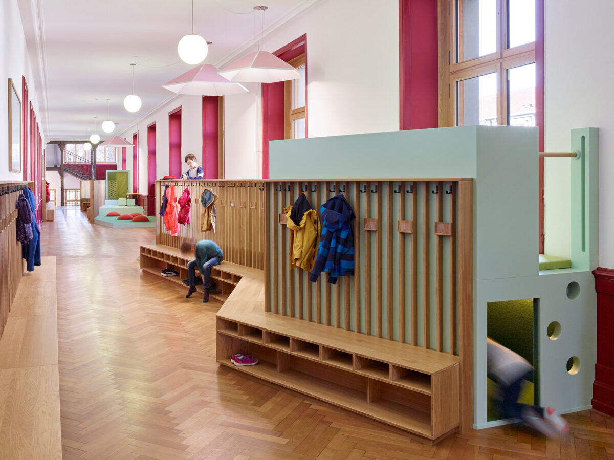
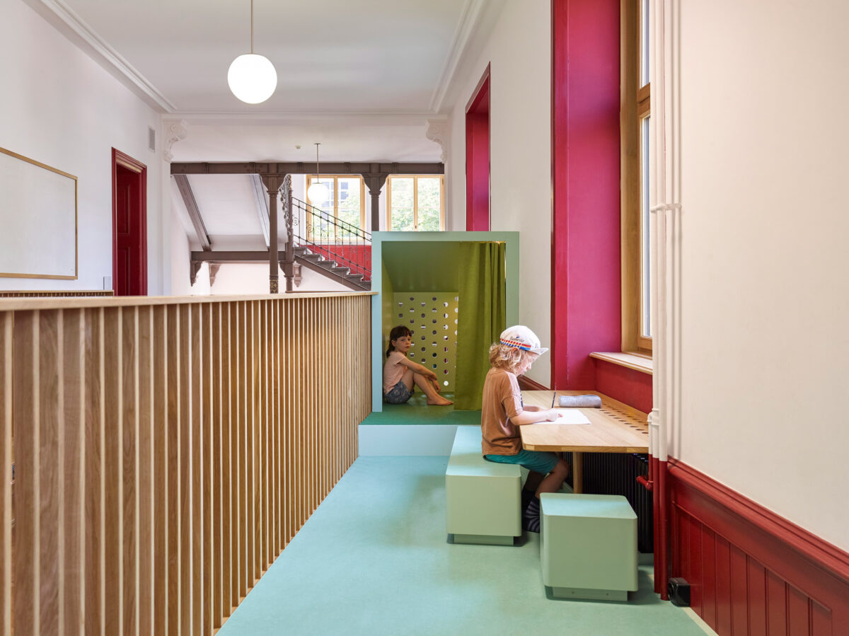
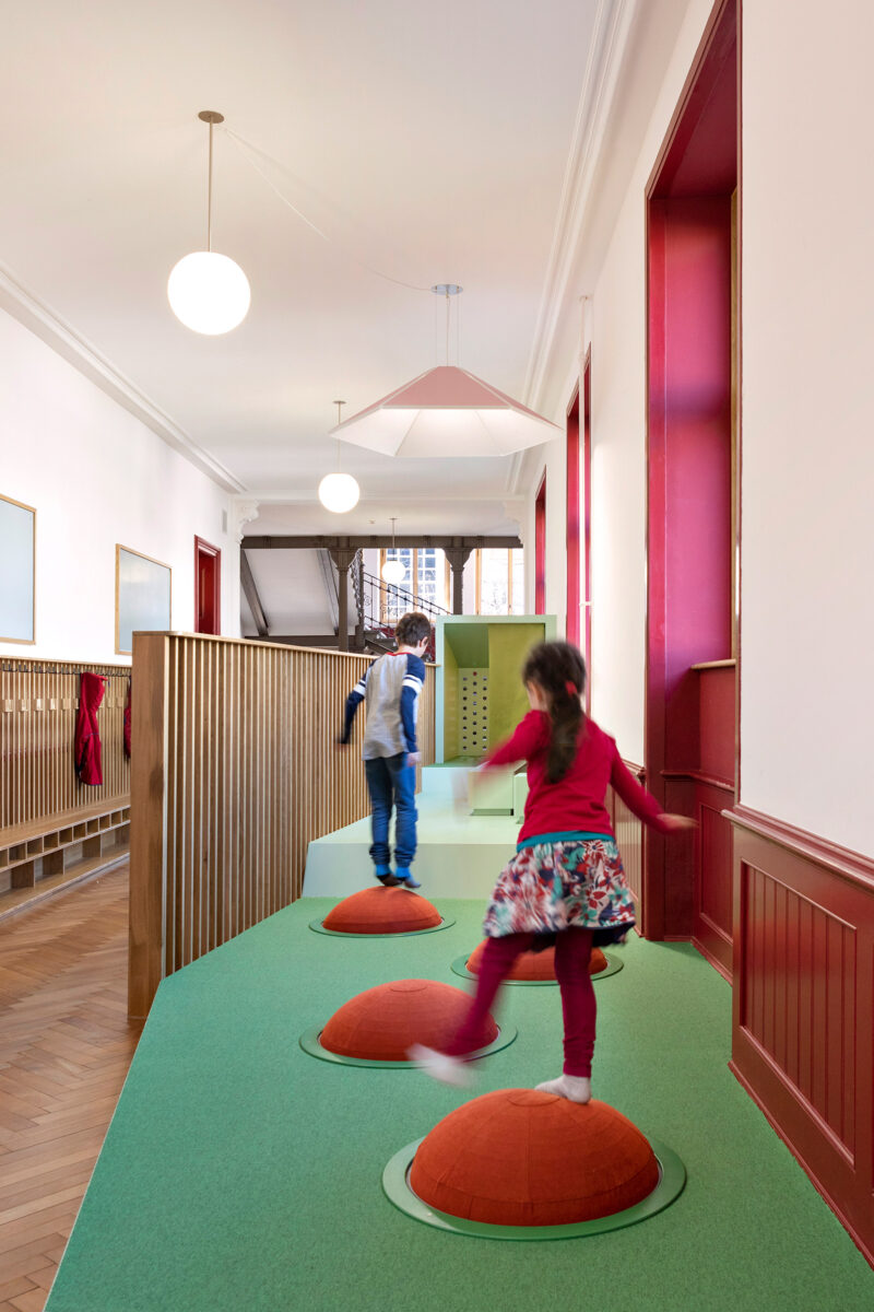
The idea of affordances is an important one in design, but little-discussed in everyday life. Affordances are essentially the variety of things we can do with an object. The best doors have closed affordances — you know just by looking at them whether to push or pull. Closed affordances eliminate confusion. But when it comes to play, open affordances are better. When a structure has open affordances, we can use it in lots of different ways. It becomes multipurpose, facilitating different needs and promoting a sense of creativity. Simply put: schools need more open affordances.
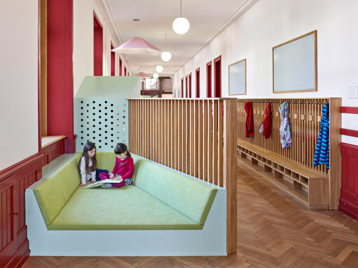
Which is why I’m borderline obsessed with this hallway at the St. Johann School, in Basel, Switzerland. It’s not a vast space, but look how many uses ZMIK incorporated into this narrow area. There are hemisphere balancing structures, little nooks to tuck in and read a book. And casual desk areas to work on a solo or shared project. There are spaces to play, to socialize, and rest. (Wouldn’t you trade any of those metal locker hallways for this in a heartbeat?)
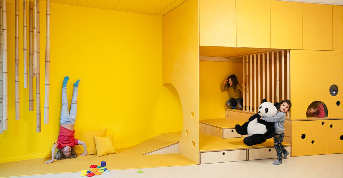
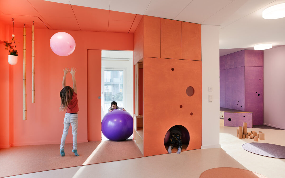
Similarly, this daycare center in Berlin, features varied play structures that let kids determine how they want to use the space.
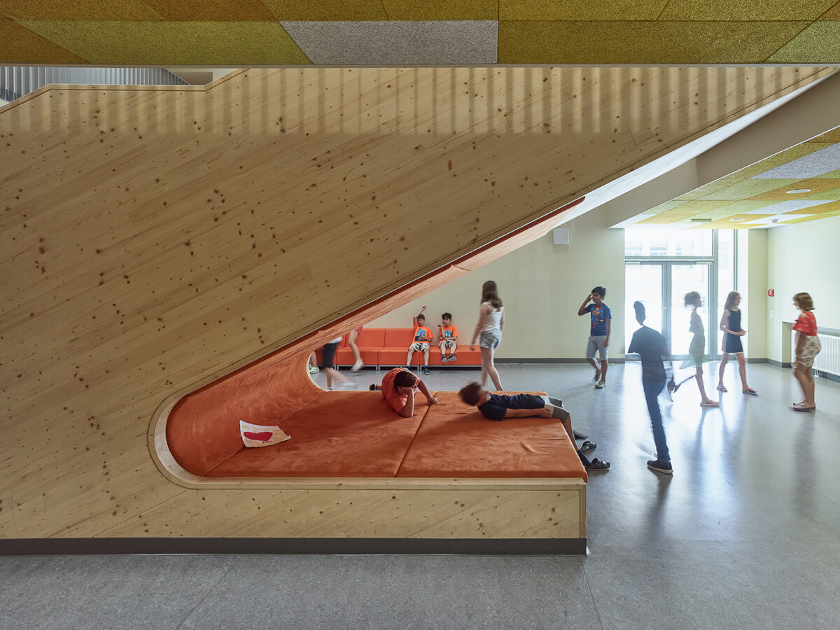
At this school in Vienna, Dietrich Untertrifaller Architekten cleverly utilizes the disused space under a staircase to create a multi-purpose lounge/play area.
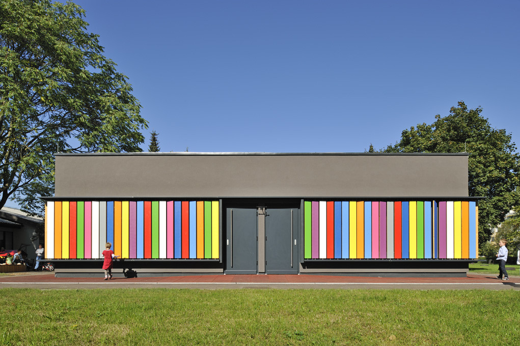
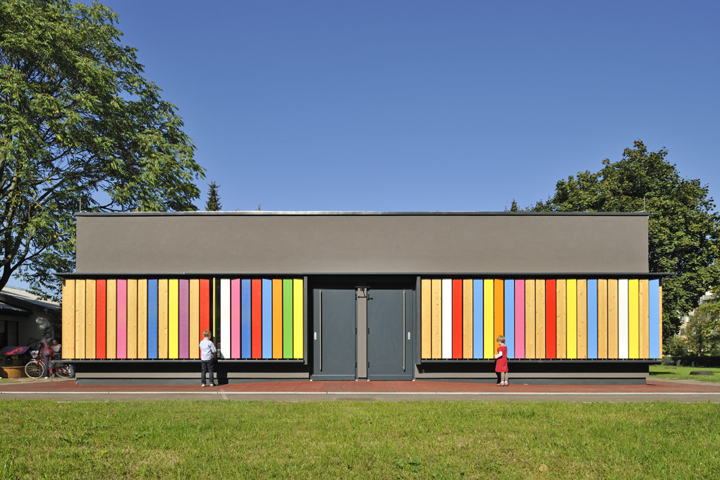
Facades can also have playful affordances, as in the example below, the Kindergarten Kekec, Ljublana, Slovenia. Colorful louvers lining the exterior of the school can be turned to reveal a wood interior. The result is a kind of matching game (turn over only greens) and a way of modulating how much color appears on the outside vs. the interior.
Be Bold In Transitional Spaces
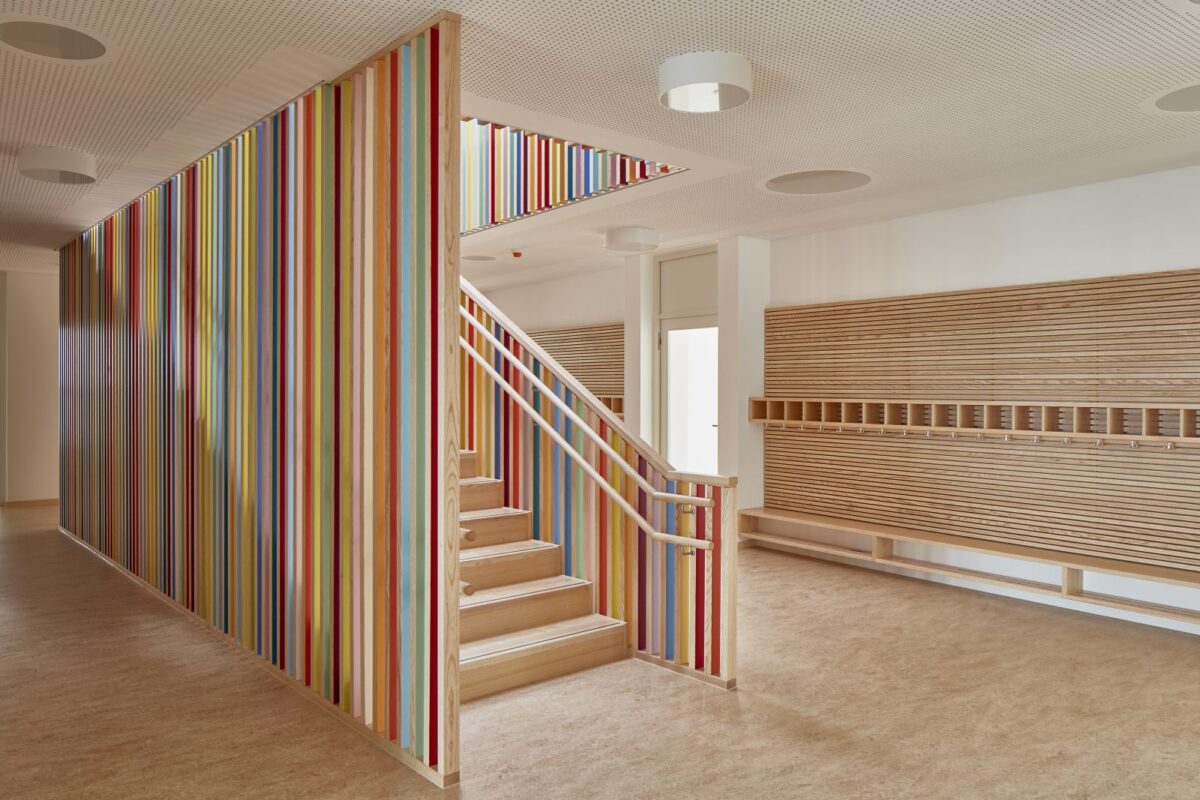
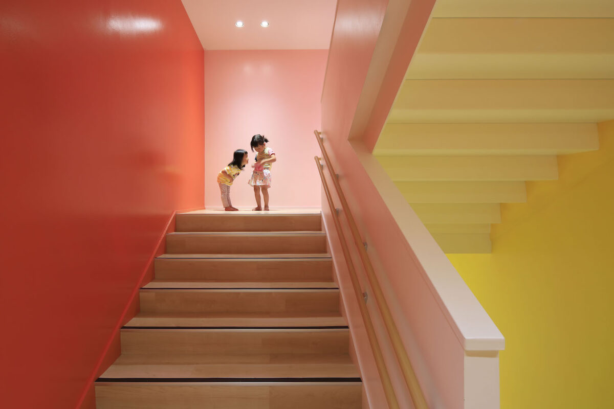
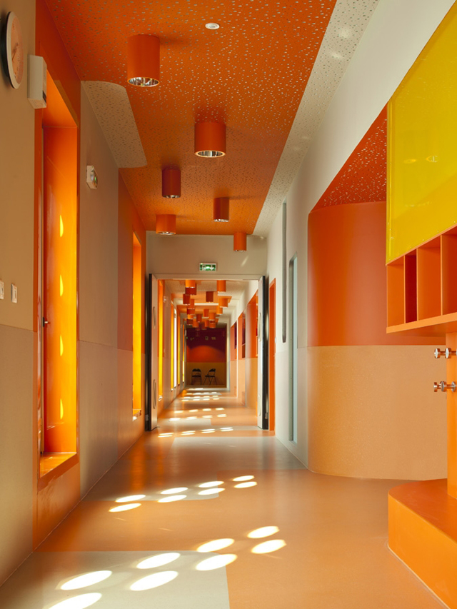
Transitional spaces, such as hallways and stairs, are often overlooked in school design. Yet these are perfect places for strong use of color, especially for those worried about the potential for color or pattern to be a distraction in the learning spaces themselves.
When students enter hallways, it’s usually when they are between activities, the perfect time for an energizing refresh. Having a strong color in hallways helps to mark that transition and break the monotony of a long day of learning.
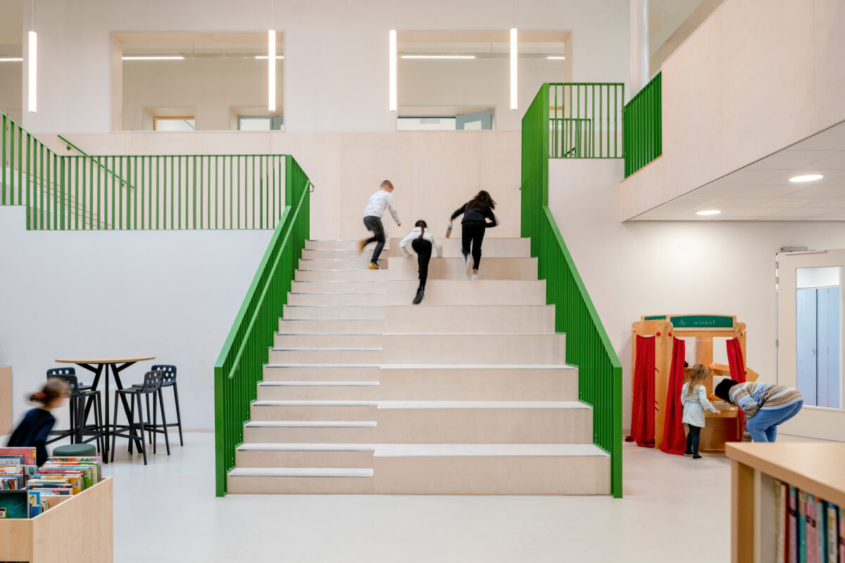
I love the subtlety of this staircase at the School by a School, above. One side incorporates the natural tendency of kids to go two steps at a time, but also serving as a kind of informal seating (open affordances for the win!).
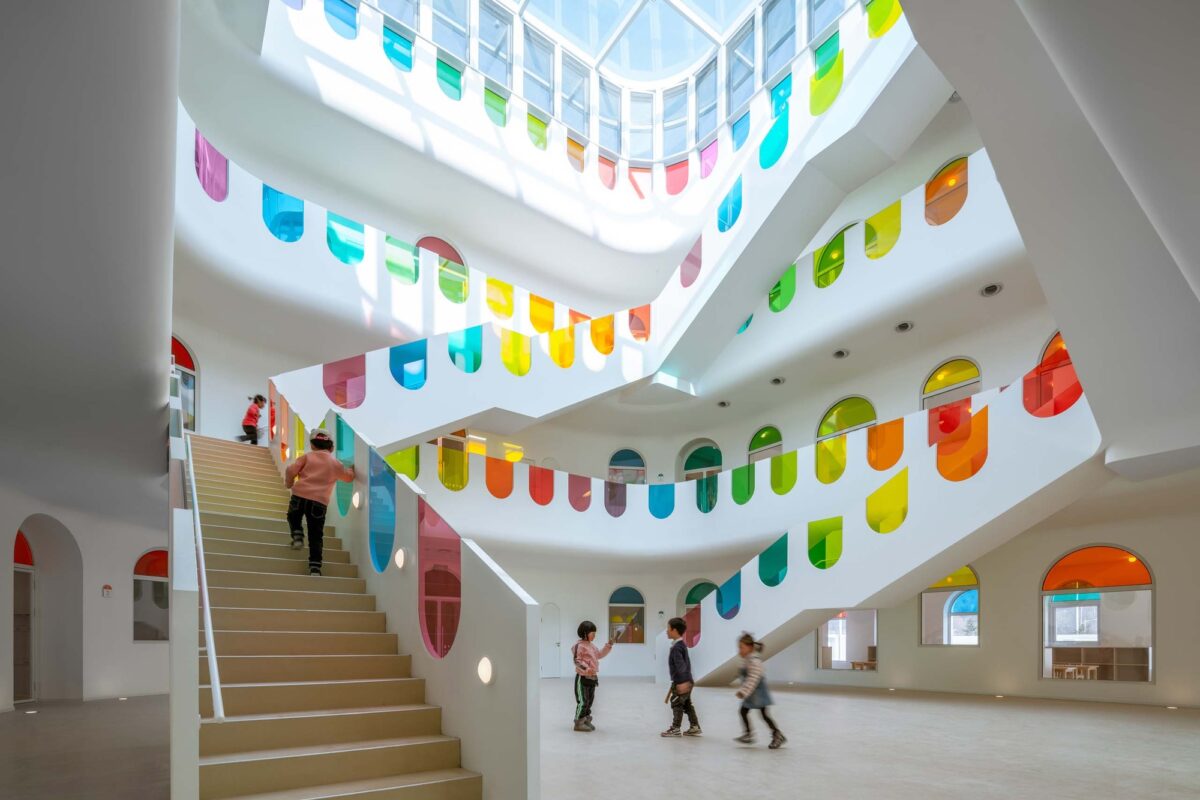
And below, the staircase to rule them all, at the Kaleidoscope School, designed by SATO Architects in Tianshui, China. This design also highlights the use of daylight in school design, which is an under-leveraged tool, particularly when studies show that children in more brightly lit classrooms advance more rapidly than those in dim ones.

have fun with wayfinding
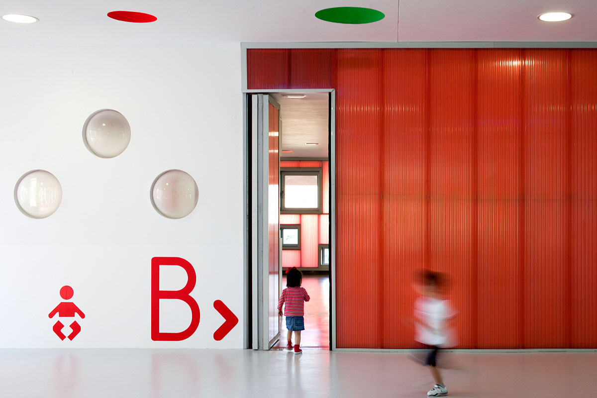
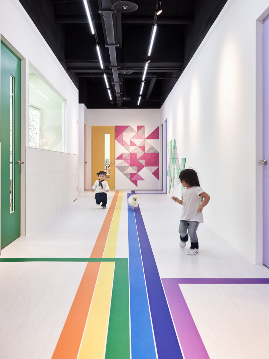
Do you remember that feeling of being new at a school and worrying how you’d find your way? Well-designed schools get around this problem by using the design to orient kids in their space. These wayfinding devices are visual, to be accessible at a glance to kids of all ages and abilities, and also incorporate playful elements. And they echo the principle of using color intentionally, maximizing white space and using color as a navigational device.
I love how the school below uses the device of a rainbow, with colored lines leading kids toward their classrooms, and then joining up together to point toward common space.
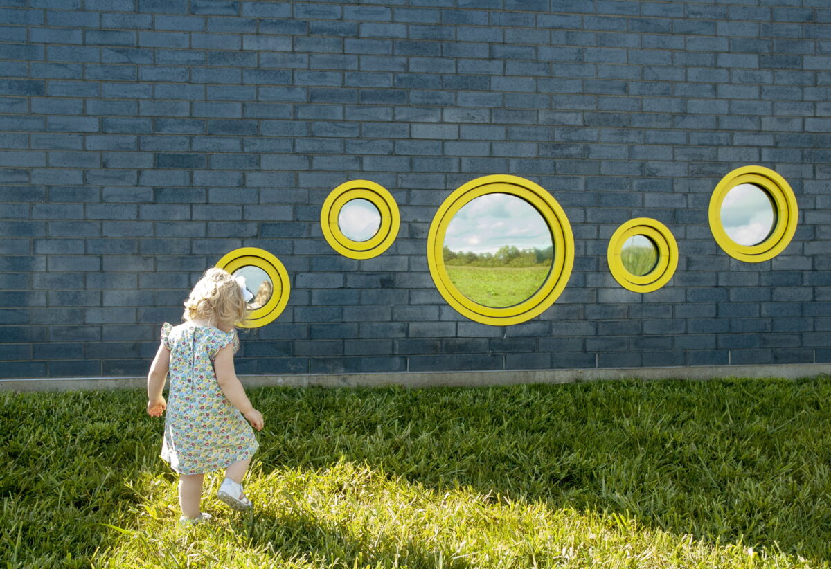
Wayfinding can also be a form of placemaking: helping kids connect indoors and out to understand where their part of the school fits in the whole. This project is an unusual one — a prototype school in Rockford, Illinois, where architects CannonDesign worked with fourth grade students to design the school building. In this space, the colorful circles translate into the classroom, so kids can locate their space even while outside playing in the yard.
Co-creation isn’t a magic bullet. We shouldn’t necessarily just ask kids what they want and then go build that. But when smart design interpretation is combined with kids’ natural sense of joy and play, magical things can happen.
Don’t forget to have fun
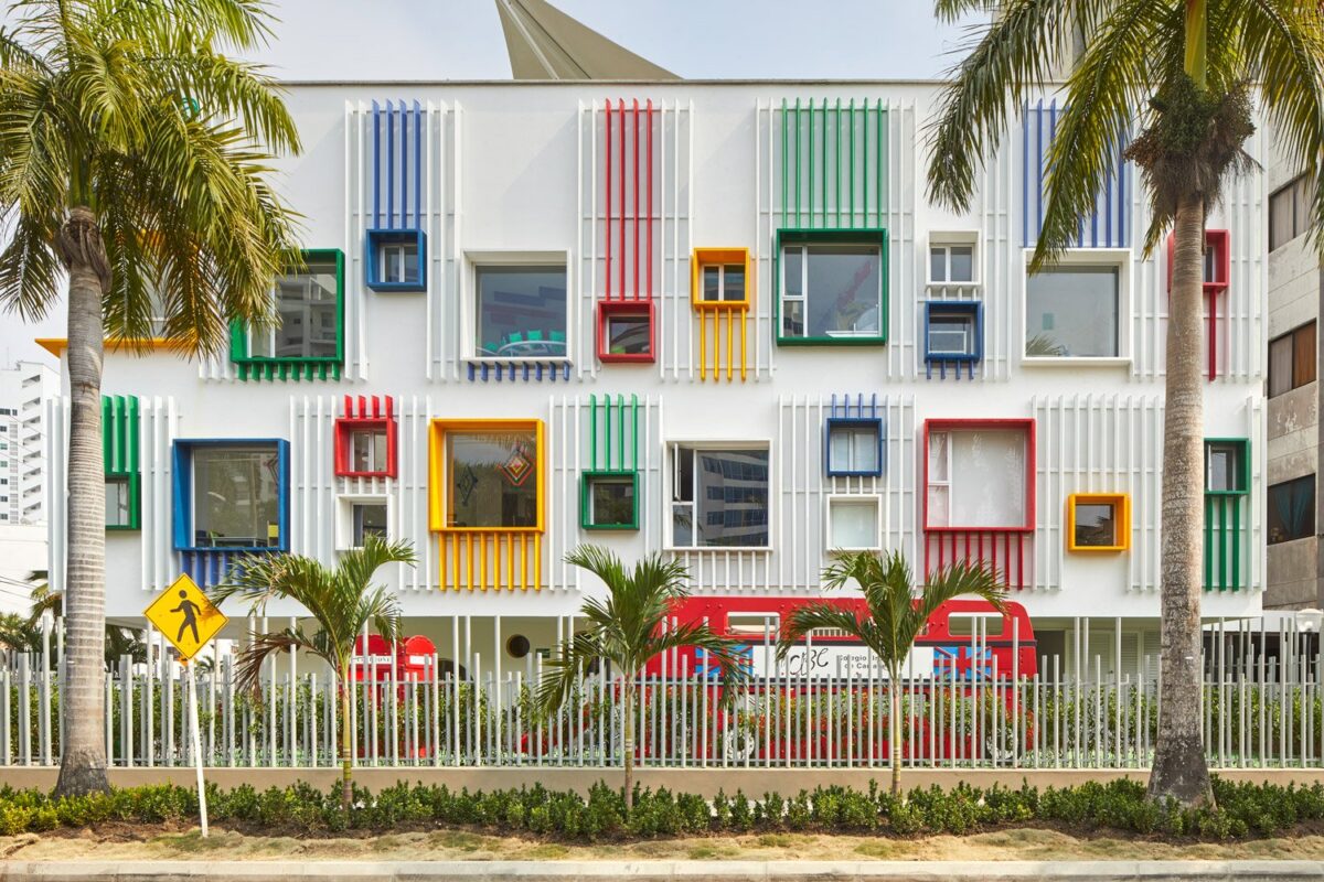
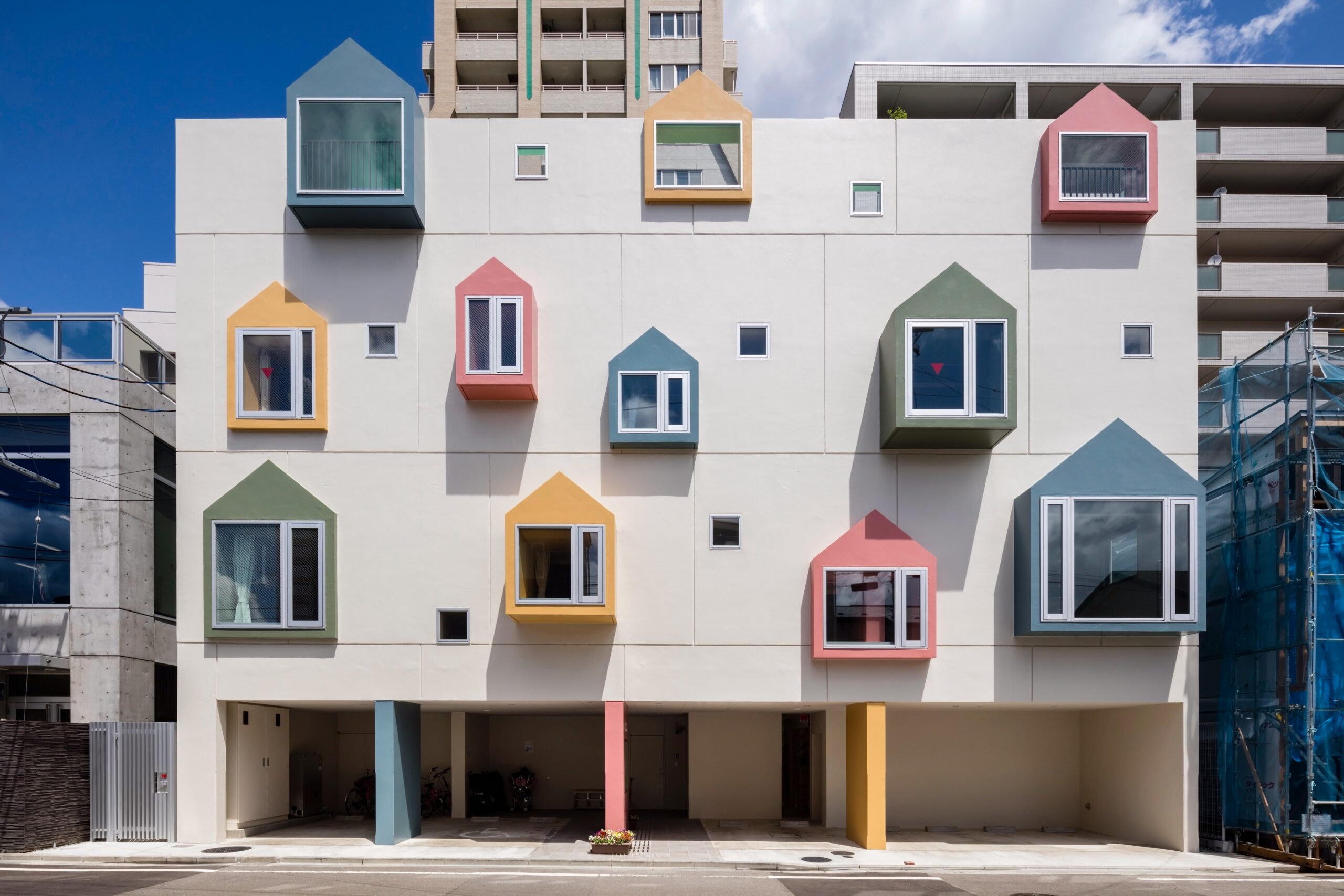
And of course, there’s that component that often gets lost in the shuffle of test scores and metrics: fun! I love how these schools bring whimsy into their facades through pops of color. The Morinoie Nursery School, below, is particularly clever in that it brings a child-scale element to the facade. These house shapes become little nooks on the interior of the building for rest, reading, and cozy time with friends.
This left me thinking that when it comes to schools, it’s better to err on the side of homey rather than institutional (the opposite of how most schools are designed). Institutions are big and imposing, while homes feel easeful and welcoming — and more conducive to joy and fun.
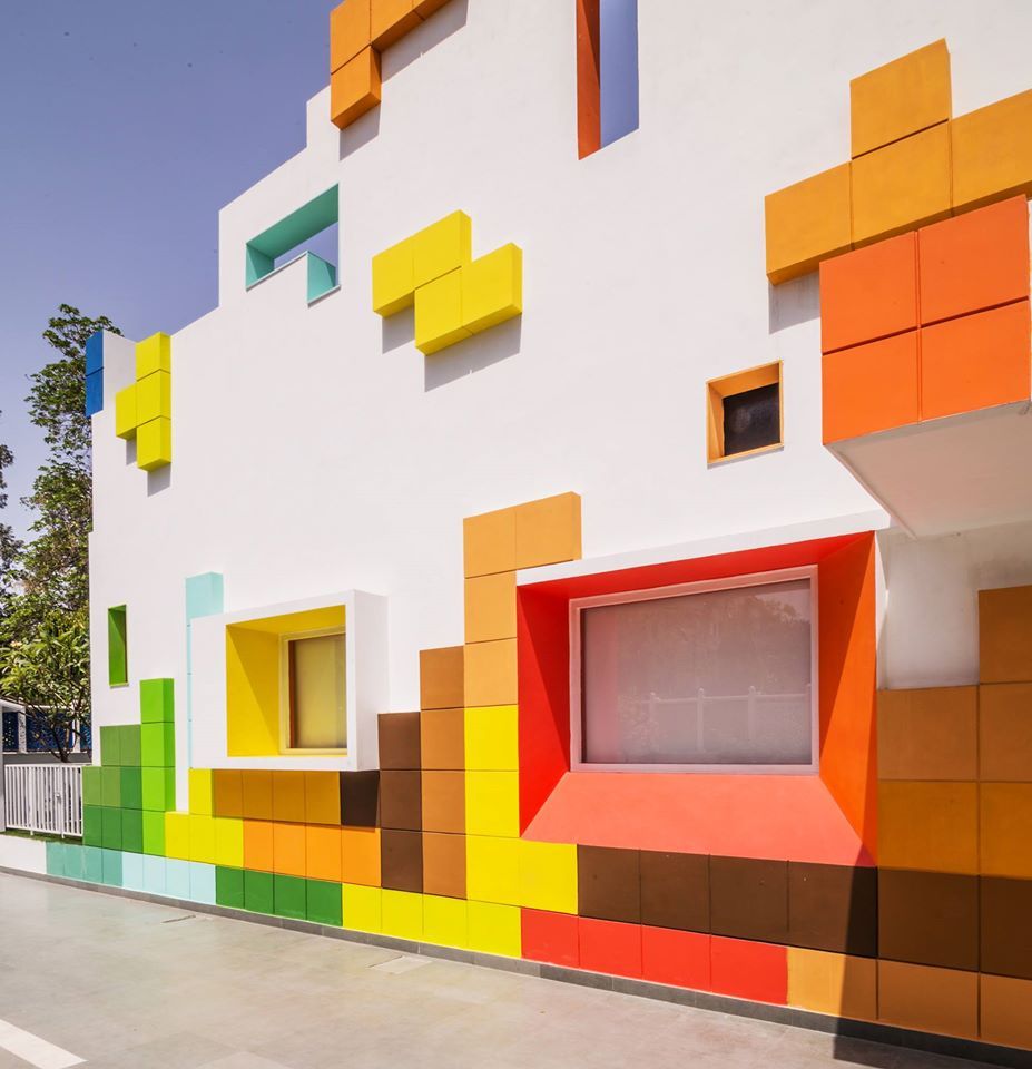
Extra points to Renesa Architecture Design Interiors for this Tetris-inspired facade, above!
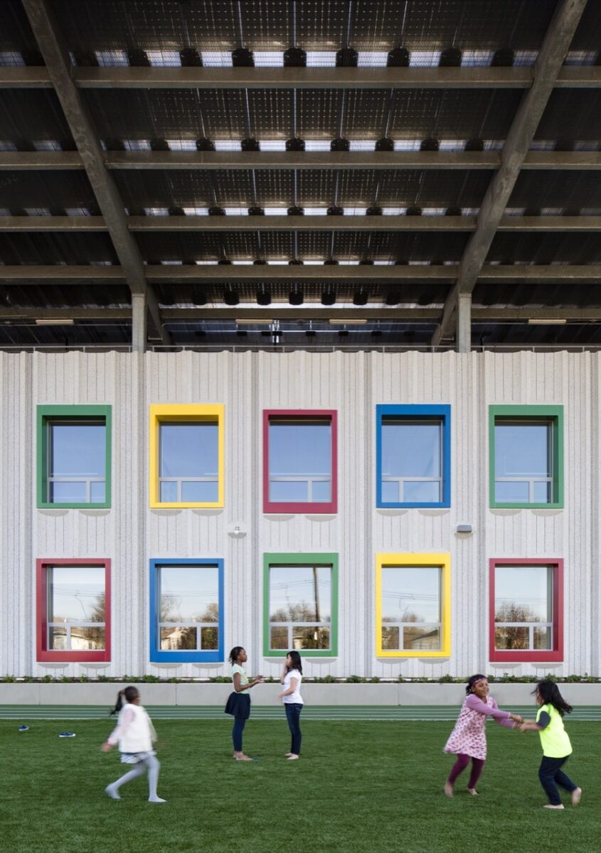
Ok, and here’s a great example of what I meant above about how public spaces in the U.S. always include some sort of texture. I happen to love the Kathleen Grimm School design, above, but notice how all the other examples in this section have solid facades with colored elements in contrast? And this one has a striated concrete? Maybe someone can explain to me why we can’t seem to handle solids and white space in this country, because for the life of me, I can’t figure it out. (And again, for the record, I like this design! But it’s a rare example where the color manages to not be overwhelmed by the texture.)
Lastly, as I looked at these vibrant exteriors, I found myself thinking (with horror) about school shootings, and whether colorful exteriors are actually a good idea in school architecture. How tragic that we should even be prompted to think about it. But this reflection prompted my interest in this example, the Ecole Maternelle Pajol in Paris, France. I like the simplicity of the rainbow over the doorway of the old building, and the way paint is used in the rear to bring it to life. I also love the snails in the bathroom, a reminder that even utilitarian spaces deserve a little fun.
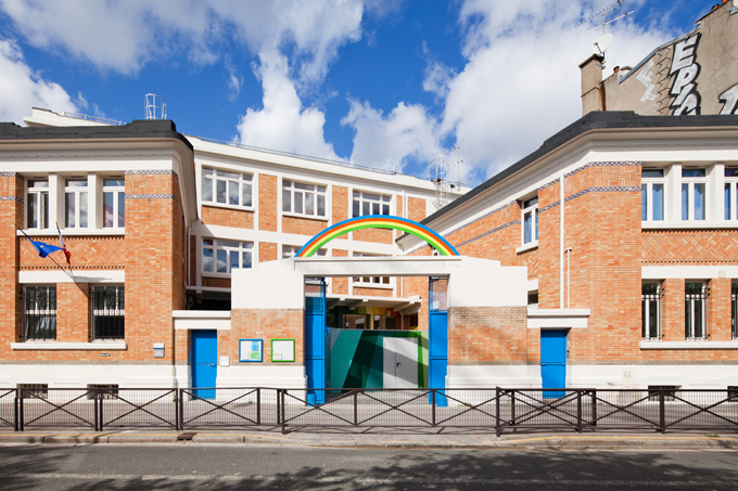
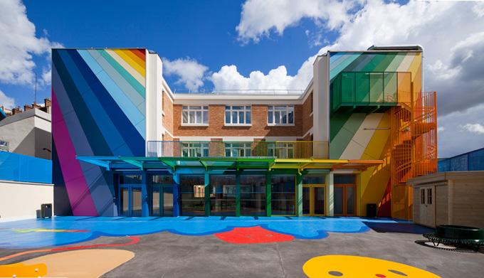
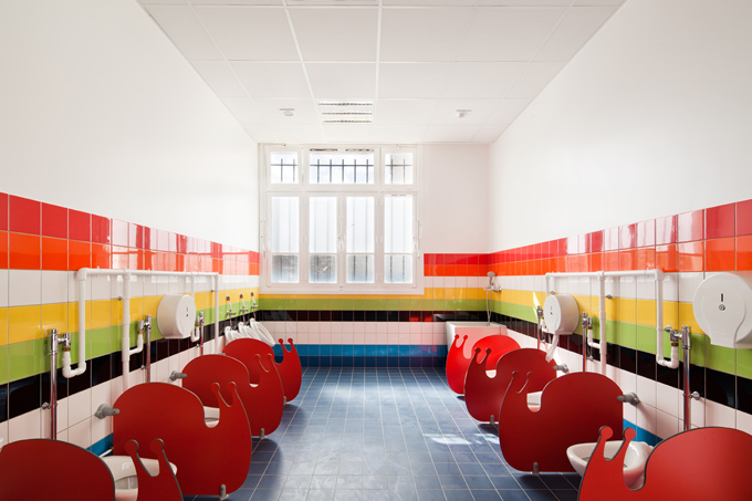
When I see these schools, it reminds me that the design of our schools is a choice. We can decide that our kids deserve beautiful, inspiring places to learn, and the more we know about how to create those spaces, the more we’ll be able to advocate for these spaces within our communities.
How would you design a more joyful school? I’d love to hear your thoughts in the comments.

Discussion (10 Comments)
See Atelier Cho Thompson’s work with San Francisco Unified School District’s cafeterias – such joy!
https://www.chothompson.com/architecture/graphics/sfusd-future-dining
what an inspiring – and sobering – post! thank you so much for sharing… i find it so interesting that great effort and cost is applied to the design & build-out of child-centric retail and entertainment spaces (like children’s museums and lobbies of children’s hospitals) that are used sporadically, and yet the millions of classrooms that children inhabit every day are stuck in a post-WW2 industrial design failure. the inclusion of happy colors and welcoming lighting, textures, and furniture arrangement could bring transformation to existing spaces – without a huge price tag. (i know because i’ve done it as a consultant to small retail businesses for decades).
i truly hope you send your post out to a wide scope of media sources – because people in education departments across the globe need to read this and think hard about how to implement these ideas in their own communities!
I’ll never forget the first PTA meeting I went to when my kids were small. A parent, who had moved to our town from Italy, wanted to know why the play ground/field was so “ugly.” She said it with such conviction(and a lovely accent), I couldn’t help but agree. Most of the others looked at her like she had three heads. I never saw that parent at another meeting, but never stopped agreeing with her and wondering why indoor and outdoor spaces for children can’t be thought of in a more holistic manner. It’s possible! @littleschoolart
Dear Ingrid, this is a great attempt by you. Your love of children stands out in this article. Designing schools is a passion to which you have added a substantial inputs. Children across the world deserve every bit of your artistry.
I think as older more institutional schools are getting rebuilt in the US we’re getting more of these design elements.
2 examples from my hometown of Austin, TX:
1) My daughters’ school — a middle school/highschool:
https://r-o.com/portfolio/k-12/96
(not shown: slide & ampitheater like steps in the library)
2) An elementary school that was converted from warehouse space (!!): https://methodarchitecture.com/work/padron-elementary-school-aisd/
Thankfully, school design IS getting better but still has a long way to go. Some districts need a lot of convincing but many are open-minded, especially, since cost does NOT need to be a factor when simply changing up the colors selected – green laminate doesn’t cost more than grey speckled laminate. But in my experience, there are a two things that prevent our schools from being their best (or even just good).
Schools typically have very tight budgets which translates to both the improbability that you will have an interior designer on the project, as well as, a fairly limited (kid-abuse-friendly) material palate.
Without an interior designer, the selection of these limited materials is left to the architect and as Architecture is a profession that is dominated by pragmatism, the straight-laced, straight-faced (mostly of the cis white male type) struggle to prioritize color, beauty and fun and may not even possess it’s application as a skill set.
As the profession evolves to one more fully integrated with women, non-white and non-conforming cultures, our future spaces have the potential to embody warmth, joy and personality.
In order for school design to evolve, designers and architects must be willing to push the boundaries within budgets, and school boards must be willing to explore alternate designs, all parties prioritizing students and teachers well-being.
I’m a high school teacher in Oregon, and I have advocated for this since I read your book 5 years ago. I would love to hear about any studies proving this that beautiful spaces are better for students or that they measurably improve learning or belonging to try to prove to my school board and principal that this is an idea worth investing in. Unfortunately, us knowing that this will improve student wellbeing isn’t always enough. I love your work and thought this was a great article with great tips!
Great article (and comments) – thought provoking as usual! I fully agree that school environments should inspire, spark joy and curiosity, and help nurture the future generations. I can’t help but notice that the majority of schools featured are either private or at the preschool level. I’d love to see some examples of public elementary, middle school, high schools I know they exist but are definitely in the minority. Another aspect to consider is the outdoor environment. I’m a landscape architect so I am always noticing the quality of outdoor spaces. There is huge opportunity here – the interventions are far less expensive than constructing a new building, and adding green spaces (tree, shrubs, colorful seating, interesting play structures) really can be impactful to the students. This is a great topic Ingrid, thanks for sharing your thoughts. This discussion is so important, I hope it continues!
This is such an inspiring and thoughtful piece on designing schools that foster joy and creativity! I love how it emphasizes the importance of aesthetics in creating spaces that inspire learning and happiness. The ideas shared here are both innovative and practical, reminding us how design can shape experiences. Thank you for shedding light on this important topic—it’s a must-read for educators and designers alike!
Too many new schools in the U.S. are heavy on the steel, glass, and concrete. Very antiseptic, cold, and hard–very ‘tech’ oriented. Many older buildings were built more like monuments to education. Pillars, brick or stone, and large windows for lots of natural light. My high school also had brightly colored lockers so you cold remember which hallway was which–green hall, blue hall, etc. We had courtyards between the different hallways so all the rooms could have lots of natural light. In one courtyard there was a greenhouse and a small pond with plantings. At two of my schools there was a native flower area…