Happy Friday everyone, and hello from Miami, where I’m working for the next two weeks. Today I’m all about the many joyful odds and ends that nearly got lost in the craziness of this week.
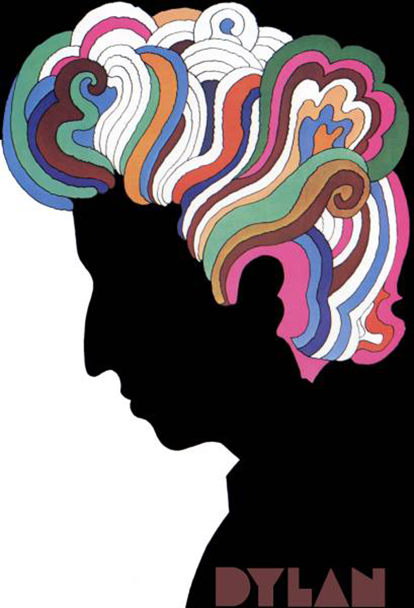
This post on the evolution of the typeface used by Michael Beirut in the design of the MAD logo (a logo I love) references this joyful poster done by Milton Glaser for Bob Dylan. The psychedelic swirls and colors just vibrate right off the page.


Leave a Comment